Saristi Tea Packaging by Antonia Skaraki |
Home > Winners > #80596 |
 |
|
||||
| DESIGN DETAILS | |||||
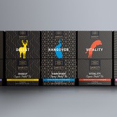
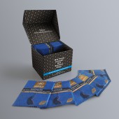
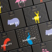
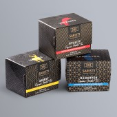
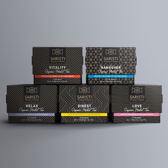
| DESIGN NAME: Saristi PRIMARY FUNCTION: Tea Packaging INSPIRATION: The power of nature unleashed into the best herbal mixtures... In Greece, the place where the notion of harmony was born, the design process for the packaging that should embrace the art of preparing special beverages has to follow the principles of geometric balance, simplicity and harmony. UNIQUE PROPERTIES / PROJECT DESCRIPTION: The minimalistic design and style of the packaging, inspired by the simplicity of the geometric complexity and the magic and power of black and dark shades,represents the premium,extravagant and one-of-a-kind nature of the blends; an impeccable gift in itself. OPERATION / FLOW / INTERACTION: Consumers can enjoy a premium, elegant, pleasant to touch and beautifully colored packaging. PROJECT DURATION AND LOCATION: The project started and finished in 2018 in Athens, Greece. FITS BEST INTO CATEGORY: Packaging Design |
PRODUCTION / REALIZATION TECHNOLOGY: The material used is paper for all the boxes. CMYK Pantone 872U Metallic. SPECIFICATIONS / TECHNICAL PROPERTIES: Paper boxes: 86 mm x 70 mm x 69 mm. TAGS: SARISTI, packaging, design, animals, tea, blends, infusions, herbs, the botany of harmony RESEARCH ABSTRACT: During the research period, the designers combined a representative of the animal kingdom with each infusion. The ideal colors were then found, each one representing a specific mood that matches the drastic features of each blend. Geometric motifs and linear shapes research was the next step for the design team. CHALLENGE: The challenge was to create modern and premium packaging that would attract all target-audiences (all ages and tastes), and would appeal to consumers who truly appreciate sophisticated and elegant packaging. ADDED DATE: 2019-02-27 16:23:48 TEAM MEMBERS (2) : Creative Director: Antonia Skaraki and Designer: Andreas Deskas IMAGE CREDITS: Antonia Skaraki, 2018. |
||||
| Visit the following page to learn more: http://bit.ly/2Vy03nZ | |||||
| AWARD DETAILS | |
 |
Saristi Tea Packaging by Antonia Skaraki is Winner in Packaging Design Category, 2018 - 2019.· Read the interview with designer Antonia Skaraki for design Saristi here.· Press Members: Login or Register to request an exclusive interview with Antonia Skaraki. · Click here to register inorder to view the profile and other works by Antonia Skaraki. |
| SOCIAL |
| + Add to Likes / Favorites | Send to My Email | Comment | Testimonials | View Press-Release | Press Kit |
Did you like Antonia Skaraki's Packaging Design?
You will most likely enjoy other award winning packaging design as well.
Click here to view more Award Winning Packaging Design.


