DESIGN NAME:
Museum Salon
PRIMARY FUNCTION:
Hair Salon
INSPIRATION:
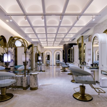
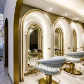
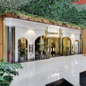
On our first site visit, we noticed that there are lots of natural elements in this art mall. A grand vertical green wall is installed at the top of the shopfront and two entrances. Plenty of natural light come through the façade window. The inspiration, Classic art museum concept, conceived by the owners together with Designers. Designer wishes to project a space that people visiting a museum in forest. to illustrate the elegant atmosphere, arch feature with metal trim is the major element.
UNIQUE PROPERTIES / PROJECT DESCRIPTION:
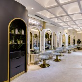
This salon is located in art hub, when refined leisure with core concept of art and community in heart of CBD Zhujiang New Town in Guangzhou. It offers up-market hairstyling services to prestige population in this dynamic region.Typically the design in salon is crowd with close distance between customers. In our design, every styling station is stand alone, this can give a more private area and prestigious identity for each customer.
OPERATION / FLOW / INTERACTION:
The first experience while seeing the shop is always important, we aimed to create a classical place (like going to museum), but coherent to the huge forest-like green wall on top of shopfront. For VIP customers, they can directly go to their lounges after entering the shop. Private area for hair washing is also provided. For general customers, they could also enjoy a level of privacy when enjoying the hair styling journey. Each styling cabinet is stand alone and built with private cabinet for their storing the clothes (eg. Jacket, coat) and belongings like bags. This gives a more private area and prestigious identity at each customer experience journey. In traditional salon, they put their merchandise on a big display shelf at reception. In this salon, jewelry-vision display case with pull out deck is made at each styling station. This brass and glass is designed to present the merchandise (eg. Hair styling tools, shampoo, treatment oil) in a way just like illustrating a luxury art piece or jewelry. Customer could sit well and viewing the products while he/she is having styling services. At raise area, we chose to use arch-shape screen instead of solid walls to separate hair washing and hair styling area, the rationale is not only to enhance and the penetration of space but also providing a calm atmosphere in a traffic environment. In normal operation, trolley is used to transport relevant tools (eg. hairdresser styling tools, dying material, iron set, roller and curling set etc.). Designer especially reserve lower spaces in custom-made cube shape cabinets, so stylist can park the trolley to cabinet and keep the space tidy all the time.
PROJECT DURATION AND LOCATION:
The project started in January 2018 in Guangzhou City and finished in May 2018. It is located at an art mall in No. 6 Zhujiang Dong Road, Tianhe District, Guangzhou, China.
FITS BEST INTO CATEGORY:
Interior Space and Exhibition Design
|
PRODUCTION / REALIZATION TECHNOLOGY:
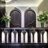
Firstly, during the operation at Salon, there is a relative high humidity place. we employed special treatment on the wood panel at reception counter. The material (Cedar wood) has been burnt and finished with special coating. This property could strengthen the durability in high humidity environment. Secondly, the ceiling is custom-built in arch form and come with concealed mono-tone lighting on every single arch. This is relative rare in hair salon design. This feature is not only to create a tall spatial but also coherent to the design element- “arch”.
SPECIFICATIONS / TECHNICAL PROPERTIES:
The floor area of this salon is 210 sqm.
TAGS:
Salon, Arch, Museum, Elegance, Lifestyle, Commercial design, Privacy, Clean, Mono tone, Styling Station, Grand vertical green wall, Shopfront design
RESEARCH ABSTRACT:
In our primary search, the context of lifestyle in Guangzhou CBD, with emerging trend of international lifestyle, people in here are energetic and desired for social recognition. Hair styling is one of way to reflect the social status and lifestyle. It gives a background that international and up-market hair salon chain come to start up their business in here. People are not just come for styling services, but also looking for prestige customer experience journey.
When we have the first site visit at project research stage, we walk around the art hub which the salon is located, this art hub refined leisure with core concept of Art and Community in the heart of CBD Zhujiang New Town in Guangzhou.
Huge forest-like grass wall are placed at the top of shopfront. Plenty of sunlight comes from the façade window. Thus, we decide to create a shopfront that could coherent with the big, green and natural atmosphere.
In traditional salon, they always have untidy tools and insufficient spaces for customers. In this salon, sufficient spaces for parking the equipment, tool and private usage are strengthened. Trolley and tools could be parked in a storage space nearby easily after used.
CHALLENGE:
The biggest obstacle of this project is the shop is long but narrow. It is not easy to divide multilevel zoning and spatial design at both open area and VIP lounge. Furthermore, there are two concrete blocks at the shopfront. Several elements (eg. building a round cabinet masking up the block and parking space for trolley) were built to develop a coherent atmosphere. Designer also has to create a balance in providing a sight that allow outsider could view through inside but maintaining a level of privacy for customers. One of fun thing is the design of two arches at the entrance, it is not 100% facing the entrance, this allows people to watch over the arch at different angles. The other fun thing is, we decided not to place a standalone company signage, we use repetitive graphics. Repetitive but different size of logo is made on this long façade bulkhead. In addition, we hope the lightings of this graphic could project a feeling like shinning leaves in open area. The second challenge would be the location of fire hose. It is located at an area which is very close to the entrance. Designer has tailored an arch-cabinet to hide away the hose, and make it coherent with the classical design at reception counter.
ADDED DATE:
2019-02-27 10:49:17
TEAM MEMBERS (1) :
Interior Designer: Chan Sau Cheuk
IMAGE CREDITS:
Image #1: Photographer Harold de Puymorin, 2019.
Image #2: Photographer Harold de Puymorin, 2019.
Image #3: Photographer Harold de Puymorin, 2019.
Image #4: Photographer Harold de Puymorin, 2019.
Image #5: Photographer Harold de Puymorin, 2019.
|
