Chez Claire Bakery Shop by WeWantMore |
Home > Winners > #80308 |
 |
|
||||
| DESIGN DETAILS | |||||
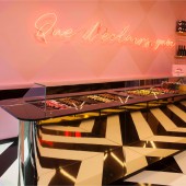
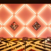
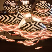
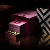
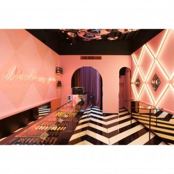
| DESIGN NAME: Chez Claire PRIMARY FUNCTION: Bakery Shop INSPIRATION: Taking the name as a starting point for our conceptual approach, the logo became a personification of Claire transforming the word eclair into Chez Claire, expressed not only by the name, but by the lipstick font in bright red as well. UNIQUE PROPERTIES / PROJECT DESCRIPTION: Eclairs are normally bought in supermarkets or bakeries, but that was exactly what this brand and its shop shouldn't look like. We wanted to create a moment of escapism from modern life combined with a moment of indulgence, oozing pure food luxury. A luxurious boutique filled with éclairs hosted by Claire with a visual identity to match our perspective. This resulted in an eclectic mix of high-end materials like gold and marble with a poppy harlequin motif and strong black and white patterns. The interior design of the shop reflects the brand identity and was enriched with led lines, neon, curtains and a ceiling of mirrors. OPERATION / FLOW / INTERACTION: The Boutique experience starts with a triggering and eclectic view from the outside. Consumers may enter and have the opportunity to order one of the 13 éclairs from the counter while standing below a cloud of mirrors which is the most Instagrammed view of the store. Consumers have the option to pair their éclair with a glass of champagne, eating in or takeaway. Taking the éclairs home with you, doesn't weaken the experience since the éclairs are beautifully wrapped as a real gift to yourself or others in luxurious boxes. If consumers want a real vip experience they can indulge in a taste explosion in the curtained vip spot in the store. PROJECT DURATION AND LOCATION: The first stores opened in Antwerp and Ghent in February 2018 A pop-up opened up Brussels Airport in December 2018 FITS BEST INTO CATEGORY: Interior Space and Exhibition Design |
PRODUCTION / REALIZATION TECHNOLOGY: We used an eclectic mix of high-end materials like gold and marble with a poppy harlequin motif and strong black and white patterns. The interior was enriched with led lines, neon, curtains and a ceiling of mirrors. SPECIFICATIONS / TECHNICAL PROPERTIES: 70M2 TAGS: branding, interior design, logo, wewantmore, éclairs, gold, eclectic, pink, patterns, concept RESEARCH ABSTRACT: Inspirational field research was conducted in Paris, the birth place of the éclair. CHALLENGE: The creative challenge was to break out of the boundaries of the typical bakery feeling (the eclectic boutique of Claire) but still wanting to make it unmistakably clear to people what is being sold, while maintaining an appetizing feeling all at the same time. It's all about the premium, mouthwatering éclairs as stated in the baseline of the logo. ADDED DATE: 2019-02-27 09:54:10 TEAM MEMBERS (4) : Creative Director: Ruud Belmans , Creative Director Branding: Michiel de Vreede, Design Director Interior: Carine Aussems and Graphic Designer: Juul Janissen IMAGE CREDITS: Image 1 : BILD Studio Image 2: BILD Studio Image 3: BILD Studio Image 4: BILD Studio Image 5: WeWantMore |
||||
| Visit the following page to learn more: https://wewantmore.studio/work/chez-clai |
|||||
| AWARD DETAILS | |
 |
Chez Claire Bakery Shop by Wewantmore is Winner in Interior Space and Exhibition Design Category, 2018 - 2019.· Read the interview with designer WeWantMore for design Chez Claire here.· Press Members: Login or Register to request an exclusive interview with WeWantMore. · Click here to register inorder to view the profile and other works by WeWantMore. |
| SOCIAL |
| + Add to Likes / Favorites | Send to My Email | Comment | Testimonials | View Press-Release | Press Kit |
Did you like Wewantmore's Interior Design?
You will most likely enjoy other award winning interior design as well.
Click here to view more Award Winning Interior Design.


