DESIGN NAME: Resplendent Feast
PRIMARY FUNCTION: Restaurant
INSPIRATION: This project is the planning design of a two-storey building for the commercial space for a teppanyaki restaurant. Teppanyaki was derived from Japanese traditional Sukiyaki.
UNIQUE PROPERTIES / PROJECT DESCRIPTION: The concept of relocating the culinary counter to the outside allows the chef to communicate with the customers, it is a dining style where one may admire the chef’s culinary skills while dining.
OPERATION / FLOW / INTERACTION: It is a combination of Western dining restaurants with Japanese cuisines. Such dining culture has developed and improved into a new dining approach combining French, Chinese and Japanese styles after being introduced to Taiwan 3 decades ago. Based on this foundation, this project has created a dining environment fused with the elegance of the French language as well as American recreational sentiment.
PROJECT DURATION AND LOCATION: The project finished in 2018 in Taoyuan City, Taiwan.
FITS BEST INTO CATEGORY: Interior Space and Exhibition Design
|
PRODUCTION / REALIZATION TECHNOLOGY: The space is endowed with resplendent quality with the use of stone materials and dry walls in some of the areas. The second floor is the recreational and modern enterprise dining area. The seating is without grids and reserves sufficient space for enterprise gatherings. The large format printing with vivid colors together with the industrial trend creates the American-style environment favored by young people, demonstrating a completely different user environment.
SPECIFICATIONS / TECHNICAL PROPERTIES: The space is 330 square meters
TAGS: Interior Design,Commercial Space,Public,Restaurant
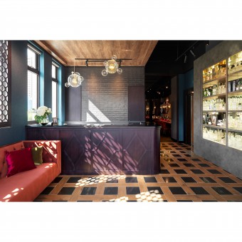
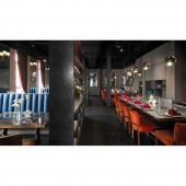
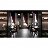
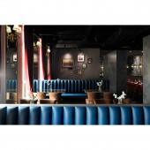
RESEARCH ABSTRACT: The ground floor is designed into a space with slightly resplendent sentiment of French bistro, where bold colors and wine cabinet at the foyer accentuates the spatial quality. The central dining area features fixed seating area as well as seating area presented by the iron plate counter, the allocation of two spatial forms allows users to choose between independent dining space or hoping for a close-distance experience. The elegant and majestic atmosphere is introduced to the interior through points of light and high quality curtains.
CHALLENGE: The unique part of this project is the connection between the overall colors and the brand itself; black, red and gold are used for the interior to bring out the brand language, implying the resplendence and grace of the space. Different design styles are adopted for the two floors to satisfy different usage needs. Whereas the improved traditional Teppanyaki seating is jointly constructed using independent seating as well as Teppanyaki seating. This allows customers to have more privacy, while customers who enjoy watching the chef cook may also have fun, thereby allowing groups with several usage needs and different user needs to be satisfied.
ADDED DATE: 2019-02-27 09:26:10
TEAM MEMBERS (1) : Chang Hsin
IMAGE CREDITS: Kyle Yu
|