Studio Music Video iOS App by Ismael Barry |
Home > Winners > #80120 |
 |
|
||||
| DESIGN DETAILS | |||||
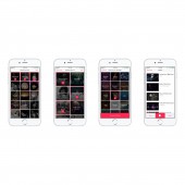
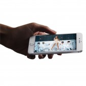
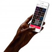
| DESIGN NAME: Studio PRIMARY FUNCTION: Music Video iOS App INSPIRATION: Listening to music is a personally visceral experience that influences our emotions. Further, watching music videos associated with their respective songs profoundly affects our emotions because it involves an additional sense. From research, we learned that people are creating playlists with music they already know rather than creating playlists with newly discovered artists. We hypothesized how we might address this by guiding people to discover new artists based on their changing moods? UNIQUE PROPERTIES / PROJECT DESCRIPTION: Discovering new music is fun. Thus how might people's imaginations be pushed with an interaction that's just as fun? 30 unique icons form the genre/mood screens. Each is initially hidden to encourage people to create various playlists by tapping to discover the icons. Direct manipulation spurs curiosity, therefore elevating the feeling and experience of personal discovery of music. The design was inspired by translating the feeling of touch from the physical space into the digital. OPERATION / FLOW / INTERACTION: Studio is designed around the user's goals and curiosity. 3 simple steps to watch videos: pick genre(s), artist(s), and mood. The interaction implements high-level feedback in the form of visuals that serves two purposes. 1. It communicates information regarding the acknowledgment, confirmation, and visibility of an action as it transitions from an inactive state to an active one. 2. The new state spurs curiosity in the user, encouraging them to discover what the other inactive states will reveal. PROJECT DURATION AND LOCATION: The project spanned 3 weeks and was completed at The Flatiron School in New York City. Studio was successfully submitted to the Apple AppStore (to demonstrate proof of concept) and was exhibited during our final cohort demo presentation. FITS BEST INTO CATEGORY: Interface, Interaction and User Experience Design |
PRODUCTION / REALIZATION TECHNOLOGY: 1. Production: Interface and keyframes were iteratively designed and wireframed using Sketch. Prototyping was done using InVision. Final high fidelity designs and assets were exported from Sketch into Xcode where the app was coded using Swift and Objective-C. 2. Design: Interface and interaction was based on Don Norman's 7 Stages of Action in order to achieve usability and user experience goals. 3. Methodology: Genre and mood graphic icons to evoke a range of emotions and felt experiences. SPECIFICATIONS / TECHNICAL PROPERTIES: Responsive mobile UI/UX design for iOS. Human-centered design adhering to and demonstrating Jakob Nielsen 10 usability design heuristics and the metric-ISO system. ISO 9241-12:1998 Ergonomic requirements for office work with visual display terminals (VDTs) - Part 12: Presentation of information. ISO 9241-13:1998 Ergonomic requirements for office work with VDTs - Part 13: User guidance. ISO 9241-210:2010 Ergonomics of human-system interaction - Part 210: Human-centered design for interactive systems. TAGS: Music, Music Videos, iOS app, music playlists, discover new music, interaction, interactive, interface, UX, UI, human centered design, design thinking RESEARCH ABSTRACT: We analyzed and conducted a competitive audit into Apple Music, Spotify, Pandora, and Amazon Music. Next, we examined our own experiences and pain points in these music services that we use, how they might be improved, and a market opportunity. We asked: What is the story of the experience we want others to have? What is happening before people interact with Studio? After interacting with Studio, how do we want people to feel? What do we want them to have taken from away from their experience? CHALLENGE: The challenge was to design an experience for users to discover music that speaks to them in times they need it the most. Is it best for users to search, or should an algorithm find music for them? We designed the former. Watching music videos uses 2 senses, sight/sound; using Studio requires 1, touch. With people already touching, we realized an interaction could be designed to further elevate the feeling and experience of music through personal discovery by immersing 3 senses rather than 2. ADDED DATE: 2019-02-27 04:22:24 TEAM MEMBERS (6) : Engineer: Joseph Ugowe, Engineer: Erica Gutierrez, Engineer: Matt Amergie, Project Supervisor: Joel Bell, Product Manager: Danny Gallardo and Designer/Engineer: Ismael Barry IMAGE CREDITS: All photographs are free to use according to Creative Commons. The photographs are free to share (copy and redistribute the material in any medium or format) and adapt (remix, transform, and build upon the material for any purpose, even commercially). Apple iPhone Images by Design+Code's Angle, used under purchased Angle License. Apple iPhone device hands by Sketch Magic Mirror and are free to use for commercial purposes. |
||||
| Visit the following page to learn more: http://callmeismaelbarry.com/studio-ios- |
|||||
| AWARD DETAILS | |
 |
Studio Music Video Ios App by Ismael Barry is Winner in Mobile Technologies, Applications and Software Design Category, 2018 - 2019.· Read the interview with designer Ismael Barry for design Studio here.· Press Members: Login or Register to request an exclusive interview with Ismael Barry. · Click here to register inorder to view the profile and other works by Ismael Barry. |
| SOCIAL |
| + Add to Likes / Favorites | Send to My Email | Comment | Testimonials | View Press-Release | Press Kit |
Did you like Ismael Barry's Mobile Design?
You will most likely enjoy other award winning mobile design as well.
Click here to view more Award Winning Mobile Design.


