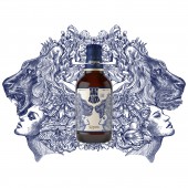
Snow Lion Beer Beer by Tiger Pan |
Home > Winners > #80006 |
 |
|
||||
| DESIGN DETAILS | |||||
| DESIGN NAME: Snow Lion Beer PRIMARY FUNCTION: Beer INSPIRATION: The client names it Snow Beer Lion in Chinese, targeting the market of bars, taverns and nightclubs, where the environment is unconstrained and convivial and people, mostly young, are inclined to be social and let loose. Therefore, the new design is asked to be made into one that conveys the feeling of nightclub-consumptio UNIQUE PROPERTIES / PROJECT DESCRIPTION: Snow Beer is a top-ranking brewery brand in China. Through global mergers and acquisitions, and its own solid and rapid development of course, the client is now a focus of attention in Chinese alcohol market. As, even with a good quality, its previous products are mostly sold with a fair price, Snow Beer now decides to extend its high-end product line. This new product is a premium Weissbier, aka white beer. OPERATION / FLOW / INTERACTION: The Lion Snow beer illustration meant to draw consumer attention and trying to encourage mostly the young to enjoy lives, make friends, and go wild. From the first glance, the composition of our illustration can be looked as if its symmetrical although it is not in reality. A woman and lion is conducting our story, when taking a closer look into details of the illustration we can obviously see that the drawing itself create before and after experiencing effect. Before tasting the beer, you feel formal, one side of the illustration is very solitude but once you are having a zip of beer then you let loose and your day has been filled up. PROJECT DURATION AND LOCATION: The project done within 3 months. The design is finished in Shenzhen, production in Shanghai. FITS BEST INTO CATEGORY: Packaging Design |
PRODUCTION / REALIZATION TECHNOLOGY: As Lion is a brand new brand, we determined to visualize the actual lion on the beer so as to enhance the branding image. The illustration is done by 2 illustrators as we need to blend in 2 personalities in the artwork, as it is shown in the illustration, which is non-absolute symmetry. SPECIFICATIONS / TECHNICAL PROPERTIES: To look into the painting, consumers will find the difference between the right side and the left, where different moods of targeted consumers are visualized on the bottled. Out of the consideration of realizing the actual product, we have made sure through repeated revisions that every single lines can be printed out clearly. Together with the colors of blue and white, the images created in-between are to form a style of Abbey Beer, with which, the design is completed and fulfilled with both aesthetic and marketing meanings. TAGS: brewery, beer, bottle, snow beer, lion RESEARCH ABSTRACT: A lot of online research about the taste has been made before portraying them into the design. As we are aiming to promote the new image of the product amongst the young while pushing it to the premium quality, getting rid of the old-fashioned picture. Therefore, we decide to make use of the historical background and organize them with modern aesthetics. CHALLENGE: There are not many Chinese beers that have successfully been displayed in nightclub market. Therefore our design challenge for this project has put extra attention on to how do we achieve in putting a Chinese beer to stands out among other foreigner brand of beers. As well as making the packaging rich enough in both design value and usage in order to extend its to a high-end product line ADDED DATE: 2019-02-27 01:31:02 TEAM MEMBERS (4) : DESIGNER TEAM: 潘虎包装设计实验室, Design Director: 潘虎 Tiger Pan, Creative Director:阎东 Dong Yan and IMAGE CREDITS: Tiger Pan, 2019 |
||||
| Visit the following page to learn more: http://www.tigerpan.com | |||||
| AWARD DETAILS | |
 |
Snow Lion Beer Beer by Tiger Pan is Winner in Packaging Design Category, 2018 - 2019.· Read the interview with designer Tiger Pan for design Snow Lion Beer here.· Press Members: Login or Register to request an exclusive interview with Tiger Pan. · Click here to register inorder to view the profile and other works by Tiger Pan. |
| SOCIAL |
| + Add to Likes / Favorites | Send to My Email | Comment | Testimonials | View Press-Release | Press Kit |
Did you like Tiger Pan's Packaging Design?
You will most likely enjoy other award winning packaging design as well.
Click here to view more Award Winning Packaging Design.


