DESIGN NAME:
The Exquisite Touch
PRIMARY FUNCTION:
Cutter Knife
INSPIRATION:
Why do all cutter knives look the same? I started my project from this question. Many stationery forms became boring and were chosen only by function. I wanted to propose a new form to these things and offer better, evolved objects to users. Cutter knife is one of the most frequently used items among office supplies. However, all of the current designs are crude and mundane. Thus, I wanted to make values more than just functional and practical.
UNIQUE PROPERTIES / PROJECT DESCRIPTION:
Exqi is a sophisticated cutter knife fit for a modern lifestyle. Exqi, which means ‘refined, delicate’ in french ‘exquis’, strive for ultimate elegance. Exqi which proposes a new type of stationery, not only focuses on function but also shows a more refined design. The shape of diagnol cutting is applied as a whole consistently and also all visual elements were designed delicately. It was visualized from the elaborated action of cutting something. Furthermore, the multiple blades of Exqi are interchangeable according to the user's intention and the object to be cut. So this project has both aesthetic and functional qualities and values.
OPERATION / FLOW / INTERACTION:
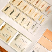
Blade: The core of Exqi is its multiple blades, which can be chosen according to the user and the object to be cut.
Body: The size of the knife body can be selected by the size of the user’s hand, and the color depending on taste.
Application: The various materials which can be cut have been archived. It shows the information on which blade is adequate to each purpose.
PROJECT DURATION AND LOCATION:
The project started in November 2016 and finished in June 2017 in Seoul, Korea. And it was exhibited in Ewha woman university in june 2017.
|
PRODUCTION / REALIZATION TECHNOLOGY:
In order to express sharpness, precision, and sophistication, I used metal spray painting on acrylic. I focused on making the connection as simple as possible between the knife body and the multiple blades. After trials and errors, the body was made by combining two acrylic 3T, with a slender groove in the middle to place the blade. A leather case was also made to cover the sharp exposed blade.
SPECIFICATIONS / TECHNICAL PROPERTIES:
Knife body for Slim type:140*10mm*3T acryl / Bold type: 150*13mm*3T aryl
Blades for Slim type: 8*30mm / Bold type: 10*40mm
Main package: 220*90*30mm / Blades package: 65*40mm
TAGS:
Branding, Identity, Brand design, Graphic, Package, Communication, Cutter knife, Stationery design
RESEARCH ABSTRACT:
In today, functions and technologies have been upgraded, so what designers should think is the way they were shown. Through many interviews and research on this project, I concluded that the more I focused on the essence, the better the design. I've been thinking what could be better from here through investigating existing cutter knives.
CHALLENGE:
My first struggle was how to show the brand identity effectively and to find the simplest way to bond the acrylic and blades. Also, I put a lot of effort on how to show the logo on the product. After various trials, I chose to engrave with laser on the end of the knife. And also it tooks many attempts to find appropriate color of spray for the blades. Because it was personal work, so it cost a lot.
ADDED DATE:
2019-02-26 18:14:02
TEAM MEMBERS (1) :
Hyorin Olivia Lee(1)
IMAGE CREDITS:
Hyorin Olivia Lee. 2018
PATENTS/COPYRIGHTS:
Copyrights belong to Hyorin Olivia Lee, 2018
|


