DESIGN NAME:
Less is More
PRIMARY FUNCTION:
Reception Hall
INSPIRATION:
The space planning and design decorates this reception hall with the static artworks that manifest the records of time, lights, shades and nature.
UNIQUE PROPERTIES / PROJECT DESCRIPTION:
The textures, arrangements and colors, as elements of interior design, are exhibited in the forms of artworks that denote, by means of displaying the shapes, the designer’s minds, affections and implications.
OPERATION / FLOW / INTERACTION:
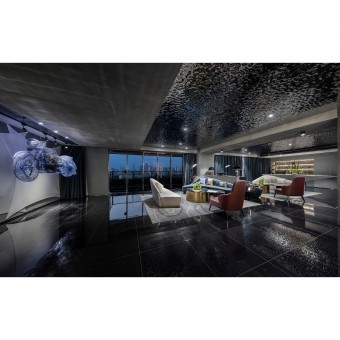
The artworks are the static exhibitions of the dynamic art. The arrangement of artwork, being observed and used by people, generates greater interaction value than does the artwork. In the building, which has the great view to the outdoor landscapes, the ceiling decorated with the water ripple metal plate artistically simulates the raining scene in the house, where leaves people the wonderful moment and memory of the heavy rain.
PROJECT DURATION AND LOCATION:
The project finished in May 2018 in Shenzhen,China
FITS BEST INTO CATEGORY:
Interior Space and Exhibition Design
|
PRODUCTION / REALIZATION TECHNOLOGY:
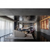
The reflections, from the water ripple ceiling, on the black matt floor consist of every action and existence in this space. The landscape window, meanwhile, embodiments the third dynamic mood changing over time and generates the natural light that create more dramatic characters in the space.
SPECIFICATIONS / TECHNICAL PROPERTIES:
The space is 670 square meters
TAGS:
Commercial,Space,Exhibition,Reception Hall
RESEARCH ABSTRACT:
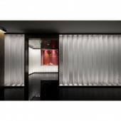
The replication skills using the diverse geometric variations create the consistent applications of shapes. The suspended curved object is the reception counter, behind which the wall decorated with the patterns of waves in flowing water exposes the delicate textures. The white sofa corresponding to the reception counter announces the geometric features with the reverse design. The scattering seats and artwork arrangements, furnished in the main space, disclose the laid-back charisma. The dangling installation art resembling the Harley motor greater manifests the imaginary space. The curved hallway, meanwhile, consistently conforms the geometric element as well.
CHALLENGE:
Strictly speaking, that the less is more means either a design attitude or skill, rather than a style. The real delightful design should be multi-dimensional and jointly complements that the inner amiable dialogues grow outwards reciprocally, some of which carry the intriguing conflictions. Casually using the unobtrusive material and further enlivening it with sentiment, applied from the building to the indoor space, sometimes need courage and sometimes moreover need calm life.
ADDED DATE:
2019-02-26 17:22:03
TEAM MEMBERS (1) :
WANG XIN-SHI
IMAGE CREDITS:
Xin Shi Wang, 2018.
|


