Kirinzan Momiji Kin Sake - Japanese Rice Wine by Ryuta Ishikawa |
Home > Winners > #79622 |
 |
|
||||
| DESIGN DETAILS | |||||
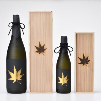
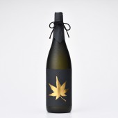
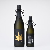
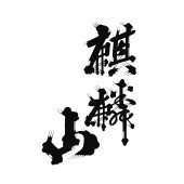
| DESIGN NAME: Kirinzan Momiji Kin PRIMARY FUNCTION: Sake - Japanese Rice Wine INSPIRATION: Kirinzan is a time-honored sake brewery. While their aged sake is normally savored after 3-year aging period, the premium rice wine, “Momiji-Kin”, has been aged for over 20 years to have a mellower flavor. The logotype represents the history that the quality liquor has spent in the brewery. UNIQUE PROPERTIES / PROJECT DESCRIPTION: In Japanese, “Momiji” means autumn foliage, and “Kin” represents gold. Therefore, the name of the product reads, as a whole, golden autumn foliage. We express the dignity of the quality sake by putting a golden maple leaf in the black background. OPERATION / FLOW / INTERACTION: - PROJECT DURATION AND LOCATION: A November sales start in 2016, in Niigata Japan FITS BEST INTO CATEGORY: Packaging Design |
PRODUCTION / REALIZATION TECHNOLOGY: The traditional black Japanese paper which is Japan in a special bottle which has peculiar brightness SPECIFICATIONS / TECHNICAL PROPERTIES: - TAGS: KIRINZAN, MOMIJI RESEARCH ABSTRACT: Despite about eight times the price of regular sake, it sold out simultaneously with the sale CHALLENGE: - ADDED DATE: 2019-02-26 13:10:37 TEAM MEMBERS (1) : Art Director & Designer: Ryuta Ishikawa, Production: frame inc. IMAGE CREDITS: Ryuta Ishikawa, 2018. |
||||
| Visit the following page to learn more: http://frame-d.jp | |||||
| AWARD DETAILS | |
 |
Kirinzan Momiji Kin Sake-Japanese Rice Wine by Ryuta Ishikawa is Winner in Packaging Design Category, 2018 - 2019.· Read the interview with designer Ryuta Ishikawa for design Kirinzan Momiji Kin here.· Press Members: Login or Register to request an exclusive interview with Ryuta Ishikawa. · Click here to register inorder to view the profile and other works by Ryuta Ishikawa. |
| SOCIAL |
| + Add to Likes / Favorites | Send to My Email | Comment | Testimonials | View Press-Release | Press Kit |
Did you like Ryuta Ishikawa's Packaging Design?
You will most likely enjoy other award winning packaging design as well.
Click here to view more Award Winning Packaging Design.


