Shapetime Dairy Identity and Package by Jan Creation |
Home > Winners > #79459 |
 |
|
||||
| DESIGN DETAILS | |||||
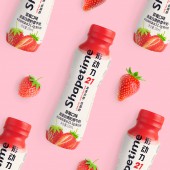
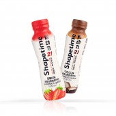
| DESIGN NAME: Shapetime PRIMARY FUNCTION: Dairy Identity and Package INSPIRATION: The inspiration of Shapetime comes from change in action, which encourages passionate young people to make daily effort in managing their health and shape invisibly. The designer conducts plenty of subtractions in the visual elements to match the concept of light fitness. The exposure of brand and product information is simple and explicit, while the splashing in the branding area is also neat and clean. The overall visual design features a sense of simplicity and elegance, which is also highly effective in conveying information. UNIQUE PROPERTIES / PROJECT DESCRIPTION: Shapetime is a high-protein low-fat beverage produced by Food Union Group, dedicated to provide high-quality products for people in demand of a healthy lifestyle. Jan Creation managed to build the brand core visual image and design the product packaging. Bold exploration and experiments were made to choose pink as the main color system. As for the main visual, the brand information is magnified and highlighted, while other elements of the product and category are integrated, so as to achieve a more efficient brand dissemination with the media of packaging. OPERATION / FLOW / INTERACTION: Open the lid and just drink. PROJECT DURATION AND LOCATION: The project started in April 2018 in Chengdu and finished in November 2018 in Chengdu. FITS BEST INTO CATEGORY: Packaging Design |
PRODUCTION / REALIZATION TECHNOLOGY: The design is printed on heat shrinking film covering the plastic bottle. SPECIFICATIONS / TECHNICAL PROPERTIES: The design is printed on heat shrinking film covering the plastic bottle. The size of the film is 196mm x 200mm. TAGS: Dairy, Diet, Energy drink, Health, Fashion RESEARCH ABSTRACT: Through a wide range of research on the lifestyle of the target group, their social habits stand out as highlight. Therefore, Jan Creation adopts social habit as the breakthrough point and conducts an intensive exploration. Then the resonance on social attributes is found and presented in the visual image. CHALLENGE: To feel the resonance with the target group is a creative challenge. The designers need to know their trigger points in their career life and use the language of their generation. A lot of efforts and attempts are made to fulfill creative content output. ADDED DATE: 2019-02-26 08:30:45 TEAM MEMBERS (3) : Creative Director: Lan Mou, Dongqi Li, Designer: Pan Xiao, Yaming Wu, Yi Zhao and 3d Designer: Kai Zhang, Junlan Duan IMAGE CREDITS: Image #1: Designer Pan Xiao Image #2: Designer Pan Xiao Image #3: Designer Pan Xiao Image #4: Designer Pan Xiao Image #5: Designer Pan Xiao PATENTS/COPYRIGHTS: Jan Creation Boutique Co., Ltd., 2019. |
||||
| Visit the following page to learn more: http://www.jancreation.com.cn/ | |||||
| AWARD DETAILS | |
 |
Shapetime Dairy Identity and Package by Jan Creation is Winner in Packaging Design Category, 2018 - 2019.· Read the interview with designer Jan Creation for design Shapetime here.· Press Members: Login or Register to request an exclusive interview with Jan Creation. · Click here to register inorder to view the profile and other works by Jan Creation. |
| SOCIAL |
| + Add to Likes / Favorites | Send to My Email | Comment | Testimonials | View Press-Release | Press Kit |
Did you like Jan Creation's Packaging Design?
You will most likely enjoy other award winning packaging design as well.
Click here to view more Award Winning Packaging Design.


