Freshly Chopped Smithfield Flagship Store by Millimetre Design |
Home > Winners > #79002 |
 |
|
||||
| DESIGN DETAILS | |||||
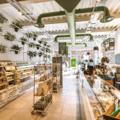
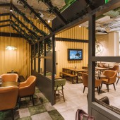
| DESIGN NAME: Freshly Chopped Smithfield PRIMARY FUNCTION: Flagship Store INSPIRATION: Surface finishes and textures, including exposed red brick, rustic timber, concrete and corrugated steel, were inspired by the industrial surroundings of the store location. A bespoke Graffiti wall was inspired by an old shipping container. The Greenhouse concept, another significant interior design feature, evolved from the freshness of ingredients of the Freshly Chopped healthy food offer. UNIQUE PROPERTIES / PROJECT DESCRIPTION: Since its first store opened in May 2012, Freshly Chopped has rapidly expanded both domestically and internationally. Having a strong brand identity and a distinctive retail environment has underpinned the Freshly Chopped success story to date. Chopped 2.0 is the latest evolution of this food retail offer. In addition to an enhanced food and drink offering, it provides a unique and memorable space in which customers can eat, relax and even use as a casual work hub. OPERATION / FLOW / INTERACTION: The overall concept for the project was to create an environment that encouraged customers to purchase a wider range of products and where possible, to stay longer and relax, and a place where meetings and collaboration could take place. A moving flow concept allows the store to handle peaks and troughs throughout the day. Flexibility in the available furniture options and also in the display allows the physical environment to alter as required through the day. PROJECT DURATION AND LOCATION: The design project commenced in October 2017. Onsite work commenced in February 2018 and the venue opened in April 2018. FITS BEST INTO CATEGORY: Interior Space and Exhibition Design |
PRODUCTION / REALIZATION TECHNOLOGY: The project was a number of firsts for the Freshly Chopped brand including digital screen menu displays, controlled lighting and an audio system. The seating arrangement is both playful and functional. This ranges from high stools and industrial trolleys ideal for a cooking demo or informal lunch, comfortable sofas and arm chairs as well as more traditional dining tables and chairs. SPECIFICATIONS / TECHNICAL PROPERTIES: Chopped 2.0 was launched on the 12th of March in 2018, at Unit 18, Smithfield Plaza, Dublin 7. The unit size is 242 square meters. This area in Dublin, Smithfield, has undergone a revival with many corporate enterprises relocating and expanding there in recent times and thus was seen as the ideal location to roll out the revitalized and enhanced Freshly Chopped proposition. TAGS: Freshly Chopped, Brand Evolution, Retail Fit Out, Retail Design RESEARCH ABSTRACT: As both branding and interior designers for this client since the offer was launched in 2012 we were excited to take this healthy fast food offer to the next level. Working with the client over the years to roll out over 60 outlets across the UK and Ireland meant that we had an intimate knowledge and love of this brand. And with significant experience in designing cafes and restaurants we did not have to go far to understand what would be needed to deliver their enhanced retail proposition. CHALLENGE: A significant challenge of the project was to evolve the existing Freshly Chopped brand while developing a new concept and commercial proposition, without neglecting or deviating too much from the existing and hugely successful brand. The biggest challenge of this design project was how much the client wanted to achieve within the space. Originally Freshly Chopped was a healthy fast food offer only. The space needed to be multi functional so a clever interior layout was imperative. ADDED DATE: 2019-02-25 12:50:10 TEAM MEMBERS (1) : IMAGE CREDITS: Millimetre Design, 2018. |
||||
| Visit the following page to learn more: http://bit.ly/2PNVQJD | |||||
| AWARD DETAILS | |
 |
Freshly Chopped Smithfield Flagship Store by Millimetre Design is Winner in Interior Space and Exhibition Design Category, 2018 - 2019.· Read the interview with designer Millimetre Design for design Freshly Chopped Smithfield here.· Press Members: Login or Register to request an exclusive interview with Millimetre Design. · Click here to register inorder to view the profile and other works by Millimetre Design. |
| SOCIAL |
| + Add to Likes / Favorites | Send to My Email | Comment | Testimonials | View Press-Release | Press Kit |
Did you like Millimetre Design's Interior Design?
You will most likely enjoy other award winning interior design as well.
Click here to view more Award Winning Interior Design.


