Choclab Store by Bin Ye |
Home > Winners > #78774 |
 |
|
||||
| DESIGN DETAILS | |||||
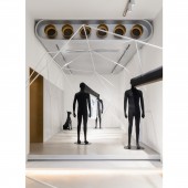
| DESIGN NAME: Choclab PRIMARY FUNCTION: Store INSPIRATION: People wants their own privacy, yet cannot control their urge to pry into other’s privacy. This is the concept that the designer and Choclab want to express. This design attends to private space, yet is not entirely sealed off, therefore triggers the desire of wanting to go explore inside. UNIQUE PROPERTIES / PROJECT DESCRIPTION: Unlike most multi-brand stores that expose huge internal areas from outside, Choclab abandons an open design in the storefront; but instead, uses a facade with geometrical combination, and a door that seems to be permanently closed. This ritualistic entrance is an attempt on the contradicting experience of private and prying. Only through a closer look can people discover a line of golden holes, and a window with the store's name written on it. OPERATION / FLOW / INTERACTION: The first floor of CHOCLAB uses a simple and bright structure: by using white that gives plenty of space to imagination, and a vibrant lively gold, the visual entity becomes more spacious; while using criss-crossing geometric patterns to divide the space into several zones to enhance a visual connection. PROJECT DURATION AND LOCATION: The project started in 2018 and finished in the same year in Hangzhou, China. FITS BEST INTO CATEGORY: Interior Space and Exhibition Design |
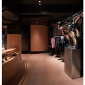
PRODUCTION / REALIZATION TECHNOLOGY: The way that the fashion designers treat materials has inspired YEBIN DESIGN to think about the importance of the sense of handcrafting, three-dimensional cutting, and deconstruction that creates conflicts. Coming up to the second floor, the use of iron black wall, stalls, and slightly warm toned leather in large areas are all filled with traces of craftsmanship, as the materials are all polished by hand. The various possibilities of the materials unintentionally bring more mystery into the space. SPECIFICATIONS / TECHNICAL PROPERTIES: The staircase that goes to the second floor hides behind the projection wall. This goes along the concept of concealing, which is manifested on the storefront. TAGS: Retail, Restaurant, Interior Design, Geometric Patterns, Commercial Space RESEARCH ABSTRACT: CHOCLAB is a multi-brand boutique that brings together hot seasonal items from trendy brands and fashion weeks all over the world. Unlike most multi-brand stores that expose huge internal areas from outside, CHOCLAB abandons an open design in the storefront and creates a kitchen in the second floor. CHALLENGE: Except for the innovated facade design. The Choclab Kitchen is another creative part. It is especially difficult to handle the relationship between the restaurant and the clothing store due to smell. The designer erects surface as wall, yet breaks the wall to create order: in the original space, several vertical independent walls are built to function as the dividing surface between the space. On the wall, as well as exhibiting props, the various cut, convex, and concave, reconstruct a new order of the surface. This order is again broken by adding the transparency on the lower part of the wall, implicitly building an overlap among the two spatial entities. ADDED DATE: 2019-02-25 05:16:52 TEAM MEMBERS (1) : Designer: Ye Bin IMAGE CREDITS: Image #1: Photographer Yebin Interior Design, Hangzhou, 2018. Image #2: Photographer Yebin Interior Design, Hangzhou, 2018. Image #3: Photographer Yebin Interior Design, Hangzhou, 2018. Image #4: Photographer Yebin Interior Design, Hangzhou, 2018. Image #5: Photographer Yebin Interior Design, Hangzhou, 2018. |
||||
| Visit the following page to learn more: https://mp.weixin.qq.com/s/9386Kyie6df-P |
|||||
| AWARD DETAILS | |
 |
Choclab Store by Bin Ye is Winner in Interior Space and Exhibition Design Category, 2018 - 2019.· Read the interview with designer Bin Ye for design Choclab here.· Press Members: Login or Register to request an exclusive interview with Bin Ye. · Click here to register inorder to view the profile and other works by Bin Ye. |
| SOCIAL |
| + Add to Likes / Favorites | Send to My Email | Comment | Testimonials | View Press-Release | Press Kit |
Did you like Bin Ye's Interior Design?
You will most likely enjoy other award winning interior design as well.
Click here to view more Award Winning Interior Design.


