Chun Shi Medical Beauty Clinic by Feng Guoqiang and Chen Yan |
Home > Winners > #78304 |
 |
|
||||
| DESIGN DETAILS | |||||
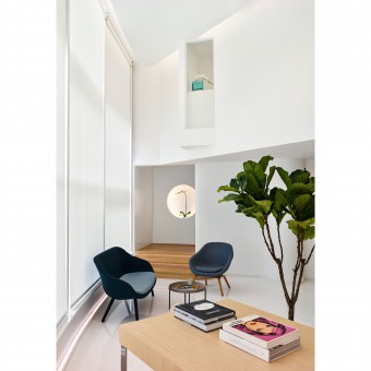
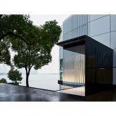
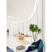
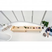
| DESIGN NAME: Chun Shi PRIMARY FUNCTION: Medical Beauty Clinic INSPIRATION: This design was inspired by some small but beautiful art galleries, and we hope that this medical clinic has a gallery temperament, so that guests can feel the elegant beauty and a relaxed atmosphere, not a stressing clinic. We designed the reception desk of the hall and the self-service drink table into one, which can be used as a buffet table during events, just like the opening party of the art exhibitions. UNIQUE PROPERTIES / PROJECT DESCRIPTION: The design philosophy behind this project is "a clinic unlike a clinic", as it is a medical clinic with a gallery temperament, so that guests can feel the elegant beauty and a relaxed atmosphere, not a stressing clinic. OPERATION / FLOW / INTERACTION: The Designers added a canopy at the entranceway and an infinity edge pool. The pool visually connects with the lake and reflects the architecture and daylight, attracting guests.Stepping through the front entrance, the first thing that catches the eyes of guests is a coffee table and a lamp in a distant corner, which would inspire the curiosity of the guests. As the guest turns the corner, they are presented with the reception desk, and its background is the lakeside view. PROJECT DURATION AND LOCATION: 1 Guanfeng St., Suzhou, China. The project started its design phase in Dec 2017, and construction was complete Nov 2018. FITS BEST INTO CATEGORY: Interior Space and Exhibition Design |
PRODUCTION / REALIZATION TECHNOLOGY: The building's original facade is irregular colored glass, and we adopted a method that is easy to construct and environmentally friendly of sticking white outdoor advertising film, which covers the outer and inner layers of the original building's glass. Thus it can easily restore to its original state. The interior floor is made of bright white resin material, since the white increase the reflection of light in the whole space, which reduces the need for artificial lighting during daytime. SPECIFICATIONS / TECHNICAL PROPERTIES: The area of the space is 500 square meters. Main Materials: Glass, Resin Floor Paint, PVC Flooring Material, Oak Wood. TAGS: beauty medical clinic, lakeside, serenity, clean space, artistic RESEARCH ABSTRACT: The clinic is partitioned into various areas - the reception area, the treatment area, and the service area. The reception area includes the reception hall, diagnostic rooms, skin-testing rooms, etc.; the service area includes treatment rooms, dressing rooms, etc.; and the service area includes the pantry, restrooms, disinfection room, storage, and offices. Each area is self-contained and at the same time connected, as the pathway allows the flow of both customers and staff. CHALLENGE: The building's original facade is irregular colored glass, but to the owner's request, we cannot change any structure and form of the original building. After repeated deliberation, we adopted a method that is simple and easy to construct environmentally friendly of sticking white outdoor advertising film, which covers the outer and inner layers of the original building's glass and is also easy to return to its original state when the lease expires. ADDED DATE: 2019-02-23 13:36:40 TEAM MEMBERS (2) : Creative Director: Guoqiang Feng and Designer: Yan Chen IMAGE CREDITS: Image #1: Photographer Hai Zhu, Chun Shi, 2019. Image #2: Photographer Hai Zhu, Chun Shi, 2019. Image #3: Photographer Hai Zhu, Chun Shi, 2019. Image #4: Photographer Hai Zhu, Chun Shi, 2019. Image #5: Photographer Hai Zhu, Chun Shi, 2019. PATENTS/COPYRIGHTS: Copyrights Belongs to Yan Chen and Guoqiang Feng, 2019 |
||||
| Visit the following page to learn more: http://fengandchen.com | |||||
| AWARD DETAILS | |
 |
Chun Shi Medical Beauty Clinic by Feng Guoqiang and Chen Yan is Winner in Interior Space and Exhibition Design Category, 2018 - 2019.· Read the interview with designer Feng Guoqiang and Chen Yan for design Chun Shi here.· Press Members: Login or Register to request an exclusive interview with Feng Guoqiang and Chen Yan. · Click here to register inorder to view the profile and other works by Feng Guoqiang and Chen Yan. |
| SOCIAL |
| + Add to Likes / Favorites | Send to My Email | Comment | Testimonials | View Press-Release | Press Kit | Translations |
| COMMENTS | ||||||||||||||||||||||||||||
|
||||||||||||||||||||||||||||
Did you like Feng Guoqiang and Chen Yan's Interior Design?
You will most likely enjoy other award winning interior design as well.
Click here to view more Award Winning Interior Design.


