Studio I 2D Animation by Wim Dijksterhuis

Home > Winners > #78063


DESIGN DETAILS
DESIGN NAME:
Studio I

PRIMARY FUNCTION:
2D Animation

INSPIRATION:
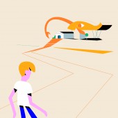
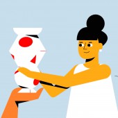
I was inspired by several artworks in the Stedelijk Museum Amsterdam and the bright colour and contrast in them. This fitted the theme of inclusion, because we needed to show how many different, colourful, people exist in our society. The clean and bright illustrations also draw focus to the message and theme of the animation.

UNIQUE PROPERTIES / PROJECT DESCRIPTION:
This animation was created for STUDIO i, the platform for inclusive culture of the Stedelijk Museum Amsterdam and the Van Abbe Museum Eindhoven. The goal was to call attention to the theme of inclusion, spread awareness and introduce inclusive thinking among museum workers. The design of the animation is clear and bright, and features inclusive characters. The video was released on the platform’s website, and promoted through social media of the affiliated museums, and shown on conferences

OPERATION / FLOW / INTERACTION:
Interaction can be achieved by watching the animation online or at conferences. We aim to change the mindset of the viewer, even if it is just a small beginning of change.

PROJECT DURATION AND LOCATION:
The project started in July 2018 in Amsterdam and finished in September 2018.

FITS BEST INTO CATEGORY:
Movie, Video and Animation Design

PRODUCTION / REALIZATION TECHNOLOGY:
The project was realized using Illustrator and After Effects, some scenes involving perspective changes were previsualized in 3D or 3D renders were used as a basis for the 2D animation.

SPECIFICATIONS / TECHNICAL PROPERTIES:
The film was made for use online and at conferences in two languages; Dutch and English. Several GIF loops were also made to promote the campaign on social media.

TAGS:
2D Animation, Inclusion, Museum, Illustration

RESEARCH ABSTRACT:
-

CHALLENGE:
As STUDIO i is the platform for inclusive culture, the story and illustrations of the animation should be inclusive as well. The main challenge was to incorporate this into the story and illustration. In order to address this we used an open storyline that raises questions rather than stating dry statistics, and in the illustrations we focused on designing intersectional characters that do not just represent stereotypical groups in society. The colour palette was decided with this in mind as well.

ADDED DATE:
2019-02-22 13:31:11

TEAM MEMBERS (5) :
Director: Wim Dijksterhuis, Copywriter: Boy Hulsteijn, Illustration: Steffie Padmos, Animation: Adrian Moran, Wim Dijksterhuis and Sounddesign: Jeff Moberg

IMAGE CREDITS:
Wim Dijksterhuis, 2018.

Visit the following page to learn more: https://wim.studio/en/studio-i/


CLIENT/STUDIO/BRAND DETAILS
NAME:
STUDIO i

PROFILE:
STUDIO i is a project initiated by two modern art museums in the Netherlands, the Stedelijk Museum Amsterdam and the Van Abbemuseum in Eindhoven. The aim of the project is to generate and promote diversity and accessibility in the Dutch cultural sector.


NOMINATION DETAILS

Studio I 2d Animation by Wim Dijksterhuis is a Nominee in Movie, Video and Animation Design Category.

· This project is currently confidential as results have not been announced yet. Images and further details of the project is not available for public yet, please check back later. If you are the owner of this design, please login to view the images.

· Click here to register today inorder to be able to view the profile and other works by Wim Dijksterhuis when results are announced.


AWARD DETAILS

Studio I 2d Animation by Wim Dijksterhuis is Winner in Movie, Video and Animation Design Category, 2018 - 2019.


· Press Members: Login or Register to request an exclusive interview with Wim Dijksterhuis.

· Click here to register inorder to view the profile and other works by Wim Dijksterhuis.


SOCIAL
+ Add to Likes / Favorites | Send to My Email | Submit Comment | Comment | Testimonials | View Press-Release | Press Kit


COMMENTS
Giulia Esposito Comment #9025 on December 26, 2022, 1:43 pm
I am absolutely mesmerized by the beauty of Studio I. The 2D animation design is an example of pure excellence and creativity. It's fascinating to see how intricate details and vibrant colors come together to create a masterpiece. Every frame is a masterpiece of its own, making the whole animation truly captivating. I'm in awe of the effort and skill that must have gone into the production of this work. This animation is a testament to the power of artistry and the impact it can have. It's inspiring to witness such an amazing work of art. Kudos to the designer for creating such a beautiful piece of art. Congratulations Wim Dijksterhuis!
Thomas Anderson Comment #33167 on January 3, 2023, 10:36 am
The animation created for STUDIO i is an incredible example of how powerful visuals can be to spread a message. The design of the animation is clear and bright, featuring inclusive characters that create a strong impact. The bright colours and contrast draw attention to the theme of inclusion, and emphasize the importance of diversity in our society. The video was released on the platform’s website and promoted through social media, and the result is an animation that beautifully captures the idea of inclusion. It is an inspiring and creative work that deserves to be celebrated!
Valentina Rossi Comment #34017 on January 3, 2023, 10:53 am
This animation is a great example of how design can be used to promote inclusivity and raise awareness about important topics. It uses a bright and clean design to draw attention to its message and its characters are designed to be intersectional and represent the diversity of our society.
Patricia Miller Comment #38693 on January 3, 2023, 12:28 pm
This award-winning work is an excellent example of animation that effectively conveys an important message about inclusion.
Paul Phillips Comment #56107 on January 3, 2023, 8:13 pm
I absolutely love this winning 2D animation work by Wim Dijksterhuis! It is a perfect example of how animation can be used to communicate a powerful message - in this case, the message of inclusion. The design is clear and bright and the characters are inclusive, making it a great representation of the theme. The animation has been used on the platform’s website, social media and conferences, making it even more effective. Kudos to Wim Dijksterhuis for this amazing work!
Elena Petrenko Comment #59537 on January 3, 2023, 9:52 pm
This award-winning work is a visually stunning animation that features inclusive characters and a bright colour palette to convey the message of inclusion.
Chloe Turner Comment #70554 on January 4, 2023, 2:57 am
The work "Studio I" is a truly stunning piece of art. Its bright colours and contrast are captivating and draw a strong focus to the message and theme of inclusion. I'm particularly in awe of the clean and vibrant illustrations that provide a magical sense of wonder. The animation perfectly captures the idea of many different, colourful people existing in our society. It's a powerful piece of work that deserves to be celebrated and applauded.
Hien Nguyen Comment #78820 on January 4, 2023, 7:05 am
I am absolutely in awe of the award-winning work of Wim Dijksterhuis. His 2D Animation, "Studio I", is a remarkable example of the highest level of creativity and craftsmanship. I am sure that this design will inspire many more to follow in his footsteps.

Did you like Wim Dijksterhuis' Movie Design?
You will most likely enjoy other award winning movie design as well.
Click here to view more Award Winning Movie Design.


Did you like Studio I 2d Animation? Help us create a global awareness for good movie design worldwide. Show your support for Wim Dijksterhuis, the creator of great movie design by gifting them a nomination ticket so that we could promote more of their great movie design works.

See other A' Design Award and Competition WinnersA' Design Award Presentation Submit Your Designs
 
design award logo

BENEFITS
THE DESIGN PRIZE
WINNERS SERVICES
PR CAMPAIGN
PRESS RELEASE
MEDIA CAMPAIGNS
AWARD TROPHY
AWARD CERTIFICATE
AWARD WINNER LOGO
PRIME DESIGN MARK
BUY & SELL DESIGN
DESIGN BUSINESS NETWORK
AWARD SUPPLEMENT

METHODOLOGY
DESIGN AWARD JURY
PRELIMINARY SCORE
VOTING SYSTEM
EVALUATION CRITERIA
METHODOLOGY
BENEFITS FOR WINNERS
PRIVACY POLICY
ELIGIBILITY
FEEDBACK
WINNERS' MANUAL
PROOF OF CREATION
WINNER KIT CONTENTS
FAIR JUDGING
AWARD YEARBOOK
AWARD GALA NIGHT
AWARD EXHIBITION

MAKING AN ENTRY
ENTRY INSTRUCTIONS
REGISTRATION
ALL CATEGORIES

FEES & DATES
FURTHER FEES POLICY
MAKING A PAYMENT
PAYMENT METHODS
DATES & FEES

TRENDS & REPORTS
DESIGN TRENDS
DESIGNER REPORTS
DESIGNER PROFILES
DESIGN INTERVIEWS

ABOUT
THE AWARD
AWARD IN NUMBERS
HOMEPAGE
AWARD WINNING DESIGNS
DESIGNER OF THE YEAR
MUSEUM OF DESIGN
PRIME CLUBS
SITEMAP
RESOURCE

RANKINGS
DESIGNER RANKINGS
WORLD DESIGN RANKINGS
DESIGN CLASSIFICATIONS
POPULAR DESIGNERS

CORPORATE
GET INVOLVED
SPONSOR AN AWARD
BENEFITS FOR SPONSORS
IMPRESSUM IMPRINT

PRESS
DOWNLOADS
PRESS-KITS
PRESS PORTAL
LIST OF WINNERS
PUBLICATIONS
RANKINGS
CALL FOR ENTRIES
RESULTS ANNOUNCEMENT

CONTACT US
CONTACT US
GET SUPPORT

Good design deserves great recognition.
A' Design Award & Competition.