PPCB Personal Banking Personal Banking by Mihye Je and Seunghyun Kang |
Home > Winners > #77953 |
 |
|
||||
| DESIGN DETAILS | |||||
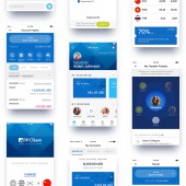
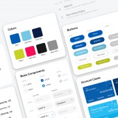
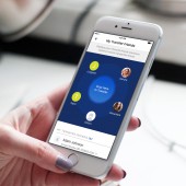
| DESIGN NAME: PPCB Personal Banking PRIMARY FUNCTION: Personal Banking INSPIRATION: It is a new personal banking service for individual customers at Phnom Penh Commercial Bank(PPCB) of Cambodia. At the time of design, banking application in Cambodia was a blue ocean market and because of this, the users had poor understanding of mobile banking services. In addition, it was the time when PPCB presented its new identity, thus, it was important to deliver the new corporate identity broadly. The primary goal was to present a design that displayed convenience for the users who were not familiar with the service, while fully capturing the new corporate identity. UNIQUE PROPERTIES / PROJECT DESCRIPTION: It was important for this application to meet the aesthetic desires of the users, but also it was important time for the bank to change its corporate in Cambodia. We focused on Design for Function to present a calm and reliable design rather than an experimental design by applying a solid layout and color, etc. As an element to liven up the design, a triangular pattern, which is the its graphic identity, was placed throughout the design, giving it a little rhythm. OPERATION / FLOW / INTERACTION: It was constructed with a simple layout to comfort the users who are unfamiliar with the mobile banking services. Yet, transfer service, which is one of the key features of this service, was designed in a drag-and-drop style to facilitate the transferring process. PROJECT DURATION AND LOCATION: The project started in November 2016 and finished in January 2017 in Seoul, South Korea. The application launched in 2017. FITS BEST INTO CATEGORY: Interface, Interaction and User Experience Design |
PRODUCTION / REALIZATION TECHNOLOGY: Adobe Photoshop, Illustrator, Invision SPECIFICATIONS / TECHNICAL PROPERTIES: It is a mobile application service that runs on Android and iOS-based devices in all resolutions. TAGS: Mobile, Application, UI, UX, Mobile app, Banking, Personal Banking, banking, Product design, Design system RESEARCH ABSTRACT: We identified the service usage pattern of the local users and the currently related market conditions. We then looked at positioning and awareness of PPCB and classified the aspects that the bank wants to gain from chaining its identity through director interviews. Based on this, it was determined that the most important focuses of the design were strengthening of the corporate identity and reflection of the design trend. Thus, we recognized that it was necessary to promote the image of trust and leadership. CHALLENGE: Since a gentle image, such as trust, and comfort, is required in the category of banks, we set the direction to a comfortable design rather than experimental design. Nevertheless, the greatest mission was to apply their own uniqueness within that comfort. The main color, blue, conveys a feeling of trust and comfort, however, due to its low color tone, it was difficult to maintain the direction of the design that adds the uniqueness without damaging the comfort level. ADDED DATE: 2019-02-22 03:04:40 TEAM MEMBERS (3) : Mihye Je, Seunghyun Kang and Eunkyul Lee IMAGE CREDITS: Creator Mihye Je, 2019 PATENTS/COPYRIGHTS: Copyrights belong to Phnom Penh Commercial Bank |
||||
| Visit the following page to learn more: http://bit.ly/2GMv18u | |||||
| AWARD DETAILS | |
 |
Ppcb Personal Banking Personal Banking by Mihye Je and Seunghyun Kang is Winner in Mobile Technologies, Applications and Software Design Category, 2018 - 2019.· Read the interview with designer Mihye Je and Seunghyun Kang for design PPCB Personal Banking here.· Press Members: Login or Register to request an exclusive interview with Mihye Je and Seunghyun Kang. · Click here to register inorder to view the profile and other works by Mihye Je and Seunghyun Kang. |
| SOCIAL |
| + Add to Likes / Favorites | Send to My Email | Comment | Testimonials | View Press-Release | Press Kit |
Did you like Mihye Je and Seunghyun Kang's Mobile Design?
You will most likely enjoy other award winning mobile design as well.
Click here to view more Award Winning Mobile Design.


