DESIGN NAME:
Light Luxury and Elegance
PRIMARY FUNCTION:
Reception Centre
INSPIRATION:
Inspired by conservative luxury, the curved and straight lines with the different materials bring out the light luxury and elegant spatial atmosphere.
UNIQUE PROPERTIES / PROJECT DESCRIPTION:
This is a commercial space project for a constructor’s sales reception center, the original base contained irregular shape with sharp corners differing to other reception centers, hence under this spatial limitation and the client’s Feng Shui concerns, the sharp corners were mainly demonstrated using curved surfaces in the design, thereby solving the criteria limitation while also keeping the simplicity as well as elegance of the entire space.
OPERATION / FLOW / INTERACTION:
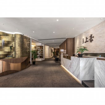
Besides the reception counter for the internal planning, the longitudinal space is allocated with several semi-independent discussion areas, with prototype displayed in the back. Other than enjoying the uninterrupted discussion and spatial experience, one may further experience the wonderful visual feast.
PROJECT DURATION AND LOCATION:
The project finished in Nov. 2017 in New Taipei City, Taiwan.
FITS BEST INTO CATEGORY:
Interior Space and Exhibition Design
|
PRODUCTION / REALIZATION TECHNOLOGY:
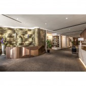
The entrance is designed with a large area of interlocked wavy bronze gold wall, which is matched with the arc-shaped copper gradated device at the lower part to enhance the majestic manner. The reception counter area used white spray-paint and dignified wood patterns as well as dark grey carpet as the base colors, which is complemented by graceful stone materials as well as the luster of the titanium-plated panels, allowing people to enjoy the luxury while being in the elegant atmosphere.
SPECIFICATIONS / TECHNICAL PROPERTIES:
The space is 433 square meters
TAGS:
Interior Design,Commercial Space,Public
RESEARCH ABSTRACT:
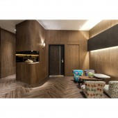
The columns in the space form a display-type space with the semi-hollowed style, cleverly keeping the support while adding the function of displaying objects, which is the ingenious part. The black classic sofa and the tea table are displayed in the corridor, creating an elegant resting space with the wooden facade.
CHALLENGE:
On the right side of the circulation is the partitioned discussion area, which uses matt glasses and wooden frame with iron pieces to accomplish the separation function. This area is free from interruptions and takes control over the overall atmosphere, besides conducting the discussions, the proprietor also hopes that the clients may discover the constructor’s control over the space, as well as the effort put into the details and techniques upon entering this space, thereby enhancing the clients’ knowledge towards the product. Dark colored wooden floor, wooden façade and exquisite lighting design are applied to the rear part to create a dainty resting venue. It subverts the rugged texture of spaces with temporary usage to demonstrate the elegant and exquisite quality.
ADDED DATE:
2019-02-21 08:02:56
TEAM MEMBERS (1) :
CHEN, JIA-RU
IMAGE CREDITS:
Jia-Ru Chen, 2018.
|


