DESIGN NAME:
Three Dimensional
PRIMARY FUNCTION:
Office
INSPIRATION:
This project is a two-storey interior design office planning, it was originally raised 7m high, and dividing one into two to create the two-storey space is the unique part of this planning project.
UNIQUE PROPERTIES / PROJECT DESCRIPTION:
The ground floor is the reception and discussion space, while the second floor is the work area; sophisticated designs are eliminated to structure the original looks of the space and the style using simple combination of materials, followed by careful handling of furnishing applications to place solid efforts towards the spatial layout as much as possible.
OPERATION / FLOW / INTERACTION:
Thereby creating layers for the space in order to accomplish a use space with appropriate spatial planning, as well as the symbiosis of multiple styles with functions.
PROJECT DURATION AND LOCATION:
The project finished in Mar. 2016 in Hsinchu City, Taiwan.
FITS BEST INTO CATEGORY:
Interior Space and Exhibition Design
|
PRODUCTION / REALIZATION TECHNOLOGY:
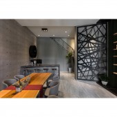
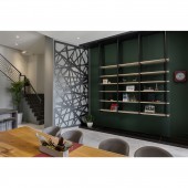
The ground floor space is organized as the open-style discussion area and reception area. The foyer by the entrance utilized Silver Fox marble combined with solid wood veneer grill fence, offering dignified lines and blocking off external interferences on the interior. The mild colored architectural concrete and light colored patterned flooring define a tranquil and simple tone for space. The wooden long table and the grey seats create the long discussion area, the display wall on the opposite uses blackboard to soften the atmosphere and create the main color visual contrast.
SPECIFICATIONS / TECHNICAL PROPERTIES:
The space is 125 square meters
TAGS:
Interior Design,Commercial Space,Office
RESEARCH ABSTRACT:
The ceiling uses white gradated overlapping design, crisscrossing with the stylish wall, the slanted surface of the staircase and the axis of the long table, forming a spatial atmosphere with stable visual effect enriched in variations, thereby attaining the scenery of majestic display hall.
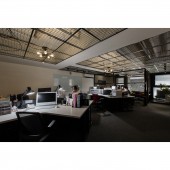
The second floor is planned as the work area and the office; the work area is the center of the space, where the use of three tables in parallel allows each designer with more sufficient use space. Grids are applied to build a unique styled ceiling that surmounts the boundary of spatial style.
CHALLENGE:
The reception area at the back uses bar-style space to enhance the modern ambience, which is continued with the grey wall at the end. On the left is the randomly patterned wall demonstrating order amongst chaos, just like the word “Ideas” which is graceful with order; the design of the stylish wall adequately hides the entrance to the staircase, accomplishing symbiosis between functional and visual effects, and the zigzag circulation design for the interior further adds a sense of smoothness.
ADDED DATE:
2019-02-20 08:35:19
TEAM MEMBERS (1) :
CHEN, JIA-RU
IMAGE CREDITS:
Jia-Ru Chen, 2018.
|


