KOS Labels by Juan Jose Montes |
Home > Winners > #77560 |
 |
|
||||
| DESIGN DETAILS | |||||
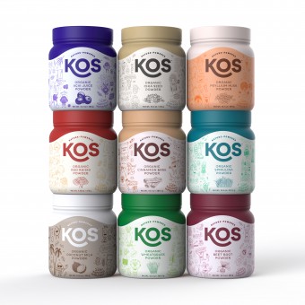
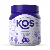
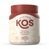
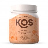
| DESIGN NAME: KOS PRIMARY FUNCTION: Labels INSPIRATION: We realized most of the competition fell under the same scheme, the apparent category's status quo: pictures of the ingredients and listed benefits on the front, all so similar between them that seemed to us like they wanted to blend rather than stand out. That's what KOS wanted to avoid at all cost, and that is why they dared stand out and communicate very dull, but important, information in a very whimsical and fun way that we realized was not being exploited by any of their competitors. UNIQUE PROPERTIES / PROJECT DESCRIPTION: KOS is a brand of plant based solutions created to provide easy and healthy nutritional alternatives. They boast a very clean, straightforward and colorful identity where doodle type illustrations are used to depict the specific benefits and characteristics of each product through the personification of their ingredients using situations from every day life, pop culture, TV shows and movies. Basically, each product has its very own set of customized illustrations that will for sure catch your eye. OPERATION / FLOW / INTERACTION: The label is filled with doodle-type illustrations that will get anyone's attention for sure. You won't resist to take a detailed look at it and discover everything the characters are doing in there. PROJECT DURATION AND LOCATION: Project started in September 2017 and is still running. FITS BEST INTO CATEGORY: Packaging Design |
PRODUCTION / REALIZATION TECHNOLOGY: Digital printing, sleeve labels on bottles and matte and glossy finishes. SPECIFICATIONS / TECHNICAL PROPERTIES: Cylindrical bottles: diameter: 113.5 mm, height: 132 mm TAGS: Packaging, Character, design, illustration, logo, identity, visual, graphic RESEARCH ABSTRACT: There was not much research in terms of design; the majority of the research for this project was about the benefits and characteristics of each product / ingredient to generate situations to represent them. CHALLENGE: To create almost 30 simple but discernible characters based on the looks of the ingredients they represent. Some, like Spirulina or Chlorella were challenging because they are basically cells (and microscopic) and some like Fo-ti and rhodiola roots were challenging because of their amorphous look. ADDED DATE: 2019-02-19 17:41:58 TEAM MEMBERS (1) : IMAGE CREDITS: Illustrator and designer: Juan Jose Montes |
||||
| Visit the following page to learn more: http://kos.com | |||||
| AWARD DETAILS | |
 |
Kos Labels by Juan Jose Montes is Winner in Packaging Design Category, 2018 - 2019.· Read the interview with designer Juan Jose Montes for design KOS here.· Press Members: Login or Register to request an exclusive interview with Juan Jose Montes. · Click here to register inorder to view the profile and other works by Juan Jose Montes. |
| SOCIAL |
| + Add to Likes / Favorites | Send to My Email | Comment | Testimonials | View Press-Release | Press Kit |
Did you like Juan Jose Montes' Packaging Design?
You will most likely enjoy other award winning packaging design as well.
Click here to view more Award Winning Packaging Design.


