Molding Space Retail Display by STUDIO ONE |
Home > Winners > #77553 |
 |
|
||||
| DESIGN DETAILS | |||||
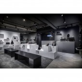
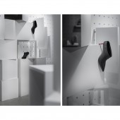
| DESIGN NAME: Molding Space PRIMARY FUNCTION: Retail Display INSPIRATION: The design inspiration of this project was derived from the client’s brand concepts that focus on urban sophistication. By reflecting this ideology, the urban landscape was introduced in as a design motif. The designer applied cubical module system and movable shelving system on pegboard to stack the contour of the space, by doing so, not only increased the possibilities and flexibilities towards display but also creates visual rhyme and layers. The existing concrete columns and beams embodied roughness from urban landscape that creates texture contrast between handmade-leather products and its surrounding, aiming to enhance the concept of sophistication that were sculptured and molded from roughness. UNIQUE PROPERTIES / PROJECT DESCRIPTION: The space could be transformed into two types. The first one is sale-based, which means the cubes were stacked on regularity that provides maximum display platforms and shows product diversities. The other type is concept-based, the cubes were stacked by using landscape-like or stage-like approach to emphasize on certain product or collection. For the display elements, not only the designer use module cubical system but also the moving shelves system that customized from the size of the products. The shelves on the pegboard could be moved or changed accordingly to meet different needs. The cubical modules were divided into different size and color scheme based on different categories of product and consumer behavior. OPERATION / FLOW / INTERACTION: For defining the boundaries between each zone, designer adopted the existing concrete columns to divide the space into three parts, which is front (window display), central (main display) and rear area (checkout counter), designer also applied different scale of gray floorings to separate the central display and the areas on its two sides, the light gray flooring also serves as a suggestion of main traffic flow. PROJECT DURATION AND LOCATION: The project started in March and finished in June 2018 in Taipei, Taiwan. FITS BEST INTO CATEGORY: Interior Space and Exhibition Design |
PRODUCTION / REALIZATION TECHNOLOGY: The distance between each holes on the pegboard were carefully calculated to meet the size of movable shelves that was studied from the product’s dimension. Designer designed joggling method between the pegboard and shelves, which leaves a sleek form of the shelving system yet with a good load bearing. The other interesting part is that designer sanded the columns and beams down in order to restore the roughness from existing architectural feature, trying to create a contrast between the refined product and it’s surrounding. SPECIFICATIONS / TECHNICAL PROPERTIES: 75 Sq m² TAGS: Retail Design, Interior Design, Module System, Flexibilities, Display RESEARCH ABSTRACT: The module system of cubes and shelves were introduced for increasing the possibilities and flexibilities in the space since it's movable and could be varied to meet different needs. After deciding the design elements, then the designer studied the size of the products and the most appropriate height that is easier to reach by customers. Different sections of products were designed by different height of cubes in order to meets consumer behavior. CHALLENGE: In this project, due to the brand is related to fashion industry that is known for rapid change, the client therefore wants to break out the rules of ordinary fixed display method and trying to optimize the space by introducing flexibilities that meets their sale needs and also reflects their brand identity. As for the color tone challenge in the space, the client wants the space could convey a sense of urban sophistication that aims on monochrome color scheme, so the designer adopted the various grays and gray-tone materials such as concrete and tiles to meets the color needs and also create visual variations. ADDED DATE: 2019-02-19 17:18:15 TEAM MEMBERS (1) : IMAGE CREDITS: Photographer: MD Pursuit |
||||
| Visit the following page to learn more: https://www.studiooneinterior.com | |||||
| AWARD DETAILS | |
 |
Molding Space Retail Display by Studio One is Winner in Interior Space and Exhibition Design Category, 2018 - 2019.· Read the interview with designer STUDIO ONE for design Molding Space here.· Press Members: Login or Register to request an exclusive interview with STUDIO ONE. · Click here to register inorder to view the profile and other works by STUDIO ONE. |
| SOCIAL |
| + Add to Likes / Favorites | Send to My Email | Comment | Testimonials | View Press-Release | Press Kit |
Did you like Studio One's Interior Design?
You will most likely enjoy other award winning interior design as well.
Click here to view more Award Winning Interior Design.


