Zanotti Bread Pastries and Coffee by Flussocreativo Design Studio |
Home > Winners > #77543 |
 |
|
||||
| DESIGN DETAILS | |||||
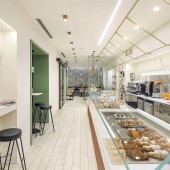
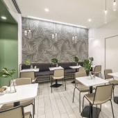
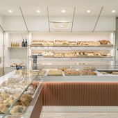
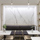
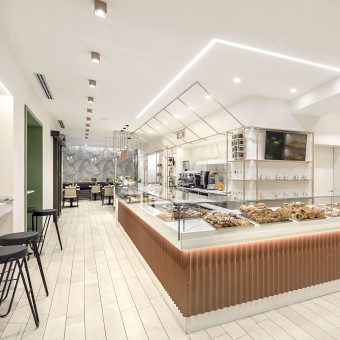
| DESIGN NAME: Zanotti PRIMARY FUNCTION: Bread Pastries and Coffee INSPIRATION: A combination of finishes and surfaces tending towards white meets the client’s will to highlight the warm and enveloping colour of the noble food: bread. UNIQUE PROPERTIES / PROJECT DESCRIPTION: The spiky counter is divided into three segments, each of which designed for a specific use: the bar area with attached tables for breakfast; the pastry area for brunch and snacks; and finally the bakery for lunches and takeaway bread. A element that you would link to nature is offered by the elegant golden frame, studied in parallel with the counter and which detaches from the wall, to create invisible surfaces to which they are hooked the signs that define the different areas of the Forneria. OPERATION / FLOW / INTERACTION: The idea is to make the user feel in a familiar place where the brightness of the space and the structures that recall the market stalls bring the consumer to a more intimate and sociable contact. PROJECT DURATION AND LOCATION: The project started in March 2017 and its implementation and completion phase lasted from July to August 2017 FITS BEST INTO CATEGORY: Interior Space and Exhibition Design |
PRODUCTION / REALIZATION TECHNOLOGY: Complete renovation of the building, project manager and contract supply SPECIFICATIONS / TECHNICAL PROPERTIES: 100 mq TAGS: Interior Design, Retail, Bakery, Cafe, RESEARCH ABSTRACT: The goal was to create an environment that, looking like a location in a square, could with its aesthetic appeal enhance the concept of the market. CHALLENGE: The real challenge was the fight against the time for the realization of a concetrated intervention in two months involving complete plant engineering and specialized craftsmen with bespoke furnishings and executive works to be displayed only when the intervention was carried out. ADDED DATE: 2019-02-19 15:42:38 TEAM MEMBERS (2) : Designer: Gianfranco Di Costanzo and Designer: Daniel Facchetti IMAGE CREDITS: Photographer: Mattia Aquila |
||||
| Visit the following page to learn more: https://bit.ly/2TnBHzC | |||||
| CLIENT/STUDIO/BRAND DETAILS | |
 |
NAME: Zanotti PROFILE: Bread Pastries and Coffee |
| AWARD DETAILS | |
 |
Zanotti Bread Pastries and Coffee by Flussocreativo Design Studio is Winner in Interior Space and Exhibition Design Category, 2018 - 2019.· Read the interview with designer Flussocreativo Design Studio for design Zanotti here.· Press Members: Login or Register to request an exclusive interview with Flussocreativo Design Studio. · Click here to register inorder to view the profile and other works by Flussocreativo Design Studio. |
| SOCIAL |
| + Add to Likes / Favorites | Send to My Email | Comment | Testimonials | View Press-Release | Press Kit |
Did you like Flussocreativo Design Studio's Interior Design?
You will most likely enjoy other award winning interior design as well.
Click here to view more Award Winning Interior Design.


