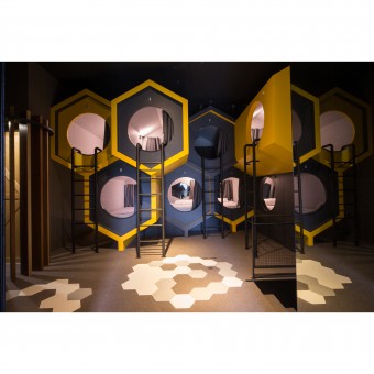
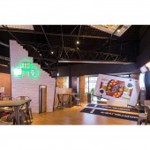
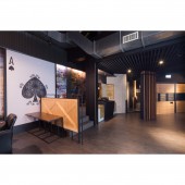
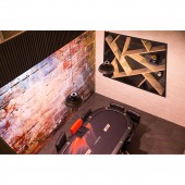
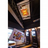
Texas Hold’em Theme Restaurant by Shou Jen Chen |
Home > Winners > #77491 |
| CLIENT/STUDIO/BRAND DETAILS | |
 |
NAME: Touch Space Interior Design PROFILE: "There is a romantic soul in my heart." When someone asks how to describe a designer in a sentence, I always use this sentence as my answer. Whenever the owner conveys the designer's inner dream through oral communication, I woven it with aesthetics and creativity, and weaving for the owner is the subtlety of the people in the season, the weather, the light and the shadow, the night and the night. Change, a different spark in the heart. I will come from the wonderful experience of life and the warmth of the user, through my interpretation of beauty, give each space a new meaning of form and energy. |
| AWARD DETAILS | |
 |
Texas Hold’em Theme Restaurant by Shou Jen Chen is Winner in Interior Space and Exhibition Design Category, 2018 - 2019.· Read the interview with designer Shou Jen Chen for design Texas Hold’em here.· Press Members: Login or Register to request an exclusive interview with Shou Jen Chen. · Click here to register inorder to view the profile and other works by Shou Jen Chen. |
| SOCIAL |
| + Add to Likes / Favorites | Send to My Email | Comment | Testimonials | View Press-Release | Press Kit |
Did you like Shou Jen Chen's Interior Design?
You will most likely enjoy other award winning interior design as well.
Click here to view more Award Winning Interior Design.


