|
|
|

|
|
| DESIGN DETAILS |
DESIGN NAME:
Water
PRIMARY FUNCTION:
Corporate Identity
INSPIRATION:
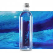
Aurika WATER is the result of the need for self-promotion item to communicate corporate activities and goals. These are stimulation of creativity and development of technologies for value-added packaging. Water was chosen due to its extensive use. Inspiration for labels occurred in the label production site itself. Printing inks waste tanks appeared to have artistic value and were captured in photos. Photos inspired the main idea of label graphic design- imitation of stroke.
UNIQUE PROPERTIES / PROJECT DESCRIPTION:
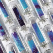
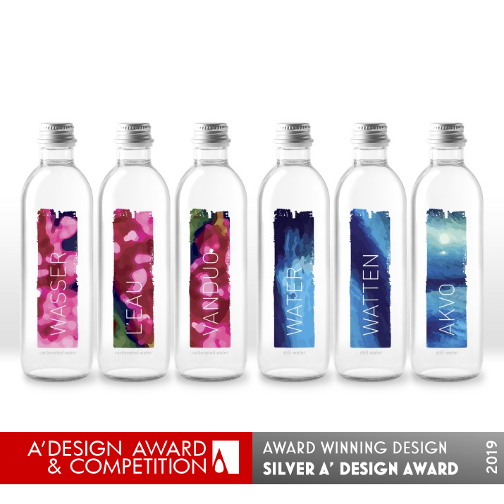
Each bottle is unique due to personalized label. Starting with 500 unique designs it evolved into unlimited amount. Graphic pattern changes on each bottle. Product name is given in 21 language that current company visitors speak. Visual identification for carbonated or still water is created by dominating active or passive colors respectively. Multi-layer printing enables opaque vivid graphics from both sides of the bottle. Visual impression is enhanced by spot wet-touch tactile surface.
OPERATION / FLOW / INTERACTION:
Personalization brings the highest engagement. Some visitors find it attractive to find WATER in their language far from their country of residence while others use a chance to learn WATER in different languages. Interaction is also enhanced by the possibility to choose a bottle with the image they prefer. Due to dominant colors visitors easily identify still or carbonated water without reading the label. Company visitors also recognize Aurika in WATER as it presents company with its personal approach, creativity, technological know-how and interest in sustainability, not to mention the story about converting inks waste into creative design.
PROJECT DURATION AND LOCATION:
This project started in November, 2017 in Kaunas and continues. It was published on one of the most prominent packaging design website Packaging Of The World.
FITS BEST INTO CATEGORY:
Packaging Design
|
PRODUCTION / REALIZATION TECHNOLOGY:
Variable data printing with automated algorithm was used to generate unique label designs during the print run. Label design in size and shape was adapted to the existing commercial product for contract manufacturing. Labels are printed by roll-fed digital printing. Primary packaging is glass bottle.
SPECIFICATIONS / TECHNICAL PROPERTIES:
Specially developed thinner glass bottle was one the main reasons when choosing the certain product to become branded Aurika WATER. One label was applied instead of two in order to reduce the consumption of virgin plastics. Thus final product combines aesthetics, packaging communication and sustainability. It also makes contract manufacturing easy and cost effective. Label raw material contains wash-off adhesive. It makes entire packaging a part of returnable packaging system.
TAGS:
Personalization, Variable data printing, Mosaic design, Design automation, Digital printing, Personalized labels, Water label
RESEARCH ABSTRACT:
The research was simple- a list of criteria was formed that new corporate item should comply with. Branded Water seemed to fit the best because it is practical (visitors often ask for water), cost-effective, widely used (used inside and outside company in corporate events, etc.), presents activities (label printing ), responds to market trends, evokes emotions ant communicates corporate values such as personal approach, technological know-how, creativity.
CHALLENGE:
This design originates from flexo printing inks waste. It depends on label printed. Time and creative thinking for printing operator were essential in order to notice the label with potentially right waste to be captured. Set up of algorithm for automated design generation during print run in order to create unique labels yet keep necessary colors for visual identification of water types also required additional effort. It was also needed to fit graphics and compulsory consumer information on one label instead of two.
ADDED DATE:
2019-02-19 08:55:00
TEAM MEMBERS (3) :
Creative direction: Justas Ivanauskas, Graphic design: Vytaute Zoviene and Inks waste photography: Marius Turauskas
IMAGE CREDITS:
Aurika UAB
|
| Visit the following page to learn more: http://www.aurika.lt/en/unique |
|
| CLIENT/STUDIO/BRAND DETAILS |
 |
NAME:
Aurika UAB
PROFILE:
Aurika UAB is flexo printing house, label and packaging manufacturer. Today it is mostly recognized for its ability to combine creative thinking and technological know-how that result in value-added labels and packaging. Located in Lithuania, Aurika was founded in 1991. With sales exceeding €44 mln. and staff around 400 employees across two production sites for primary and secondary packaging it is considered to be one of the leading flexo printing houses in The Baltic region. Over 70% of production is exported to western and northern Europe, particularly to Germany and Scandinavia.
|
|
|
| COMMENTS |
| Giulia Esposito |
Comment #8878 on December 26, 2022, 12:53 pm |
|
I am amazed by the creativity and uniqueness of this Corporate Identity that won the A' Design Award! Every element of the Packaging Design is carefully thought out and artfully presented, demonstrating the highest level of craftsmanship and attention to detail. It has a great balance between modernity and timelessness, while still being eye-catching. The color palette is also stunning, and the overall result is a stunning piece of design. Congrats to Aurika UAB for this incredible achievement!
|
| Paul Williams |
Comment #48224 on January 3, 2023, 4:26 pm |
|
What a stunning work! Water by Aurika UAB is an exemplary example of good design. This Corporate Identity work is truly remarkable and worthy of recognition. The unique personalized labels, multi-layer printing techniques, spot wet-touch tactile surface, and 21 different language options make this design stand out. It is inspiring to see how the creative thinking of the printing operator has been captured in the design and how an algorithm was used to generate unique labels during the print run. It is incredible that such a complex design was adapted to an existing commercial product for contract manufacturing. Water is a true testament to the power of creativity, technology, and corporate values.
|
| Paul Phillips |
Comment #55622 on January 3, 2023, 7:59 pm |
|
What a fantastic achievement! I'm so impressed with the level of creativity and craftsmanship that went into creating this Corporate Identity. The idea of creating 500 unique designs that can evolve into an unlimited amount is incredible and the multi-layered printing with opaque vivid graphics from both sides of the bottle is a real eye-catcher. The personalized label is also a great touch and the use of spot wet-touch tactile surface really gives the design an extra edge. On top of all of this, the product name is given in 21 different languages, a true testament to the scope of the project. All in all, what a well-deserved award! Congratulations Aurika UAB!
|
| Elena Petrenko |
Comment #59054 on January 3, 2023, 9:38 pm |
|
Aurika UAB's award-winning corporate identity design is a unique and stunningly creative example of packaging design that utilizes multi-layer printing and personalized labels to create an eye-catching and memorable product.
|
| Adam Harris |
Comment #60903 on January 3, 2023, 10:31 pm |
|
I am absolutely delighted to see this amazing work from Aurika UAB win an A' Design Award! Their creative solution for corporate identity and packaging design is truly remarkable. The product label is highly unique, with its personalized designs and language options, as well as the multi-layer printing and spot wet-touch tactile surface for visual impression. The idea for the design of the label was also quite inspired, with its origin from the label production site itself. The research and development behind the design was also quite impressive, as was the effort to create unique labels while still keeping the necessary colors for visual identification. It is clear that Aurika UAB put a great deal of thought and effort into this project, and the result is a stunning piece of design that is truly deserving of this award!
|
| Chloe Turner |
Comment #69732 on January 4, 2023, 2:34 am |
|
The design of Aurika WATER is simply stunning! The concept of the corporate identity was so cleverly executed with the use of waste tanks from the label production site. The imitation of stroke with the printing inks was a unique and creative way to showcase their values and goals. The result was a work of art that was able to stand out and capture the attention of viewers. It is no wonder why it was chosen as an award-winning work!
|
| Mark Allen |
Comment #71434 on January 4, 2023, 3:23 am |
|
This award-winning work is a remarkable example of how corporate identity can be communicated with a unique and innovative packaging design. Its use of personalized labels, multi-layer printing, and spot wet-touch tactile surfaces gives it a distinct visual appeal, while its use of 21 languages and colors to differentiate between carbonated and still water demonstrates an impressive amount of research and creativity. Truly, this is an outstanding example of how packaging design can be used to communicate a corporate identity.
|
| Elisabeth Clark |
Comment #72903 on January 4, 2023, 4:05 am |
|
As a design enthusiast, I am absolutely delighted to see that Aurika UAB has won the A' Design Award with their work titled "Water". I appreciate the innovation and creativity put into this corporate identity package design and the unique properties that it offers. It's amazing to see how the team was able to transform the inspiration from the photos of the printing ink waste tanks into a beautiful visual design that can be seen on both sides of the bottle. I also appreciate the attention to detail in the use of personalized labels that come in 500 unique designs with the product name written in 21 languages, as well as the use of active and passive colors to differentiate carbonated and still water. Above all, it is clear that the research behind the project was thorough and that the team had a clear understanding of their audience and the market trends. Congratulations to Aurika UAB for their well-deserved award!
|
|
|
Did you like Aurika Uab's Packaging Design?
You will most likely enjoy other award winning packaging design as well.
Click here to view more Award Winning Packaging Design.
Did you like Water Corporate Identity? Help us create a global awareness for good packaging design worldwide. Show your support for Aurika Uab, the creator of great packaging design by gifting them a nomination ticket so that we could promote more of their great packaging design works.
|
|

|
|
|
|


