Learning Bright Office by Tetsuya Matsumoto |
Home > Winners > #77255 |
 |
|
||||
| DESIGN DETAILS | |||||
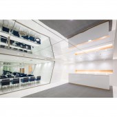
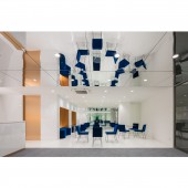
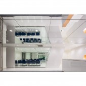
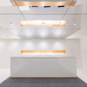
| DESIGN NAME: Learning Bright PRIMARY FUNCTION: Office INSPIRATION: This space was inspired by contemporary minimalistic and professional office spaces where companies showcase the best of their organizational spirits. here the students can already feel this kind of professionalism that is waiting for them by succeeding in their studies. The bright space with the golden touch offers a perspective of already being part of a productive society. UNIQUE PROPERTIES / PROJECT DESCRIPTION: Matsuo Gakuin preparatory school needed a new office space for its reception and meeting rooms. This design enhances the sensitivity of students by offering them a bright and sharp space as to suggest a bright and professional future waiting for them. The entire space is white and bright punctuated by a couple of surfaces treated in golden finishes. The very low ceiling was treated in a reflective aluminum panels doubling the height of the space between the entrance and the reception counter. OPERATION / FLOW / INTERACTION: The entrance door gives to a large white hall and faces the reception counter. The floor leading to the reception counter is finished in grey carpet tiles, the ceiling above is finished in reflective aluminum panels. to the right counseling tables are located and furnished in blue velvet chairs. To the left the meeting and conference room connected visually with a glazed wall to the entire reception space. the classes are located behind the counters backwall and are accessed from the right. PROJECT DURATION AND LOCATION: Project start: September 2018. Construction start: November 2018. Project/Construction End: December 2018. Location: Designed in Himeji City, Japan. Constructed in: Kyobashi, Osaka City, Japan. FITS BEST INTO CATEGORY: Interior Space and Exhibition Design |
PRODUCTION / REALIZATION TECHNOLOGY: This space uses common techniques of today's Japanese interiors. The walls were made by LGS structure covered in plasterboard panels. all walls were finished in white either by wall paper or decorative sheets. The golden colored parts on the walls and the reception counter is also made from these decorative sheets. For security reasons the ceiling could not be finished in mirrors, instead, reflective aluminum panels are used. SPECIFICATIONS / TECHNICAL PROPERTIES: Gross Built Area: 155sqm W14445mm x D10945mm TAGS: Japan, small, office, interior, contrast, minimalist, white, gold, sharp. RESEARCH ABSTRACT: The research in this project was conducted to find out how to promote a positive spirit and stimulate the learning processes in the students' mind. The gloomy image of the professional world can be very scary for students and even repulsive. For this purpose, this design explores the transition between educative and professional worlds and introduces brightness and sharpness as encouraging points of professional success. CHALLENGE: the biggest challenge of this space was the very low ceiling and the lack of natural lighting entering the space. the walls are treated in white, gold, and clear glass to create a bright and sharp looking space. the problem of low ceiling was solved by putting reflective aluminum panels on the ceiling part connecting the entrance to the reception counter visually doubling its height. ADDED DATE: 2019-02-18 11:17:33 TEAM MEMBERS (2) : Motoaki Takeuchi and Farid Ziani IMAGE CREDITS: Image #1: photographer ©Stirling Elmendorf, Pharmacy, 2018. Image #2: photographer ©Stirling Elmendorf, Pharmacy, 2018. Image #3: photographer ©Stirling Elmendorf, Pharmacy, 2018. Image #4: photographer ©Stirling Elmendorf, Pharmacy, 2018. Image #5: photographer ©Stirling Elmendorf, Pharmacy, 2018. |
||||
| Visit the following page to learn more: http://ktx.space/ | |||||
| AWARD DETAILS | |
 |
Learning Bright Office by Tetsuya Matsumoto is Winner in Interior Space and Exhibition Design Category, 2018 - 2019.· Read the interview with designer Tetsuya Matsumoto for design Learning Bright here.· Press Members: Login or Register to request an exclusive interview with Tetsuya Matsumoto. · Click here to register inorder to view the profile and other works by Tetsuya Matsumoto. |
| SOCIAL |
| + Add to Likes / Favorites | Send to My Email | Comment | Testimonials | View Press-Release | Press Kit | Translations |
Did you like Tetsuya Matsumoto's Interior Design?
You will most likely enjoy other award winning interior design as well.
Click here to view more Award Winning Interior Design.


