Kailani Magnesium Packaging by Arome Agency |
Home > Winners > #76945 |
 |
|
||||
| DESIGN DETAILS | |||||
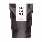
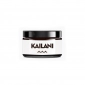
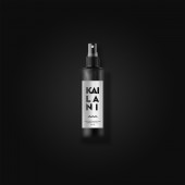
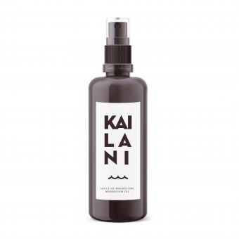
| DESIGN NAME: Kailani PRIMARY FUNCTION: Magnesium Packaging INSPIRATION: Inspired by minimal packaging like health and sport's one. Arome Agency tried to create modern identity and packaging, attractive to young people who tried to live a healthy life. UNIQUE PROPERTIES / PROJECT DESCRIPTION: Kailani was created to offer you a 100% natural magnesium supplementation method that is easily absorbed through the skin. Transdermal application is the safest and most effective way to raise bodies magnesium level. Kailani takes pride in the quality and effectiveness of its products. Presented in environmentally friendly packaging, the Kailani product range is suitable for the whole family and has been designed to promote health and well-being. OPERATION / FLOW / INTERACTION: Arome has created a modern packaging that is really attractive and in the mood of our time. The packaging needs to be reassuring and understandable really easily cause it targets consummers that are looking for a healthy and athletic life. The use of the products is very easy and quick. PROJECT DURATION AND LOCATION: The project started on november 2018 in Avignon. And it ended on april 2019 in Avignon too. it takes us 5 months to create the identity, the packagings and also a website shop for Kailani products. FITS BEST INTO CATEGORY: Packaging Design |
PRODUCTION / REALIZATION TECHNOLOGY: Arome Agency has created waterproof and oilproof labels for a better and easier use of the product. Arome wanted usefull packagings that can be both used at home and in traveling. Arome needed small and resistant packagings that fits every style of use. SPECIFICATIONS / TECHNICAL PROPERTIES: Magnesium oil and gel : 100 ml Size of the labels : 3,5 x 8 cm Magnesium flakes : 500g Size of the labels : 7 x 11,5 cm TAGS: Minimal, Health, Sport, Modern, Natural RESEARCH ABSTRACT: The labels are composed of the identity of Kailani, created by us, and the name of the product. We have combines the modernity, the sobriety and a reminder of the sea, where does this magnesium comme from, with the wave. The new consumer trends is centered on the search of well being, staying healthy and used the most natural products you can. The use of the wave on our label is also really important cause the sea is a symbol of well being and peace. It reminds the consumer that the product is natural and good for him and is body. CHALLENGE: The challenge for the creation of this packaging is that this product is new market. So we needed to work on a design that is in tune with our times, and our values : sobriety, efficiency... But on another side, customers that are looking for that kind of product known what they wanted. So we needed to be right on the promise of the product and create a packaging who will meet all the customer's expectations. ADDED DATE: 2019-02-16 16:17:02 TEAM MEMBERS (3) : Delphine Goyon, Catherine Alamy and Rémi Vicente IMAGE CREDITS: Arome Agency, 2019. |
||||
| Visit the following page to learn more: http://www.arome.fr/ | |||||
| AWARD DETAILS | |
 |
Kailani Magnesium Packaging by Arome Agency is Winner in Packaging Design Category, 2019 - 2020.· Read the interview with designer Arome Agency for design Kailani here.· Press Members: Login or Register to request an exclusive interview with Arome Agency. · Click here to register inorder to view the profile and other works by Arome Agency. |
| SOCIAL |
| + Add to Likes / Favorites | Send to My Email | Comment | Testimonials | View Press-Release | Press Kit | Translations |
Did you like Arome Agency's Packaging Design?
You will most likely enjoy other award winning packaging design as well.
Click here to view more Award Winning Packaging Design.


