Gather Market Supermarket by Anne Qin |
Home > Winners > #76885 |
 |
|
||||
| DESIGN DETAILS | |||||
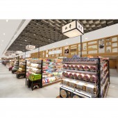
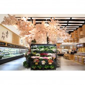
| DESIGN NAME: Gather Market PRIMARY FUNCTION: Supermarket INSPIRATION: Our design is inspired from "Riverside Scene at Qingming Festival" by Zeduan Zhang in Song dynasty, and we think this painting can reflect the traditional Chinese market life. We want build a unique oriental market that inherits the millennium of the Chinese nation, Give design ideas to Chinese supermarket design, Create a interesting business space, in order to struck a responsive chord in the hearts with consumers. UNIQUE PROPERTIES / PROJECT DESCRIPTION: For a long time, the style of Chinese supermarket design is dominated by following the style similar as western boutique supermarkets. Even use the western design in Chinese supermarket design directly. So that the atmosphere is short of humanity, the design is short of theme. In this supermarket design of "Gather Market", Onewe design trying to stand out from the same business environment, build a brand new, interesting business space. OPERATION / FLOW / INTERACTION: The Chinese believe that the state of natural development is the best. So we turned this idea into the shape of the ceiling light and the decorative pattern of the ground, in order to express the designer's understanding of the market's culture. PROJECT DURATION AND LOCATION: The project started in April 2017 in Chengdu and finished in November 2018 in Chengdu. FITS BEST INTO CATEGORY: Interior Space and Exhibition Design |
PRODUCTION / REALIZATION TECHNOLOGY: As a brand image, bamboo image is not only used in the entire VI visual design, but also used in the decorative design of ceilings and floor tiles. In terms of design language and decorative materials, designers adopt a combination of eastern and Western cultures to extract tenon and mortise structural elements from traditional Oriental architecture, which runs through the space design of Gather Market such as smallpox, shelves, props and so on. SPECIFICATIONS / TECHNICAL PROPERTIES: Most of the height in the supermarket is 4 meters, but there is a 248 square meters area with 2 meters height. Initially, the owner wanted to build the low-rise area into an office area. Later, after communication, in order to maximize the value of space, the design team built the area into a snack area. TAGS: Interior, Commercial, Supermarket, Modern, Simple, Oriental elements, Mortise and tenon RESEARCH ABSTRACT: For a long time, the design style of Chinese supermarkets has mostly followed the imitation of Western boutique supermarkets, lacking humanism, subjectivity and brand recognition. In the project design of Gather Market, Onewe Design tries to break away from the same business environment and build a brand new and interesting business space. CHALLENGE: Because this project is an innovative design project, our designers and owners in order to achieve the final effect, We spent a year and three months, we repeated proofing fixture again and again, from the shape of the lamp to the choice of the brightness of the light, from the selection of ground materials to the embodiment of construction, the material of the wall decoration has been repeatedly scrutinized by different sizes and so on. ADDED DATE: 2019-02-16 12:10:29 TEAM MEMBERS (2) : Main Designer: Anne Qin and Assistant Designer: Chang Liu IMAGE CREDITS: Image #1: Photographer Onewe Design, Fruit Area, 2018. Image #2: Photographer Onewe Design, Non-staple Food Area, 2018. Image #3: Photographer Onewe Design, Basic Food Area, 2018. Image #4: Photographer Onewe Design, Flower Area, 2018. Image #5: Photographer Onewe Design, Wine Area, 2018. PATENTS/COPYRIGHTS: Copyrights belong to Anne Qin, 2018. |
||||
| Visit the following page to learn more: http://c7.gg/fteA4 | |||||
| AWARD DETAILS | |
 |
Gather Market Supermarket by Anne Qin is Winner in Interior Space and Exhibition Design Category, 2018 - 2019.· Read the interview with designer Anne Qin for design Gather Market here.· Press Members: Login or Register to request an exclusive interview with Anne Qin. · Click here to register inorder to view the profile and other works by Anne Qin. |
| SOCIAL |
| + Add to Likes / Favorites | Send to My Email | Comment | Testimonials | View Press-Release | Press Kit |
Did you like Anne Qin's Interior Design?
You will most likely enjoy other award winning interior design as well.
Click here to view more Award Winning Interior Design.


