Sunrise Interior Experience by Vulca Studio |
Home > Winners > #76837 |
 |
|
||||
| DESIGN DETAILS | |||||
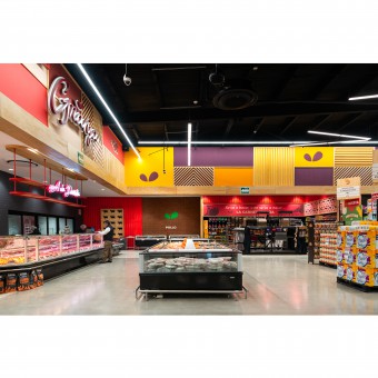
| DESIGN NAME: Sunrise PRIMARY FUNCTION: Interior Experience INSPIRATION: The design team was inspired on a street market essence, conceptualizing small stores within the store concept, creating each area with its own interpretation and at the same time wrapping a homogeneous atmosphere with different ecosystems living in harmony. The color palette and mood was inspired on a multicolor sunrise which, according to various interviewers, it is one of the must relaxing and fulfilling experiences to watch. UNIQUE PROPERTIES / PROJECT DESCRIPTION: Their client s stores have always been focused on working class consumers, but for this project they wanted to upgrade to middle class consumers, with a strong mission to become the best supermarket in the city. The design team had to create an original concept upgrading the interpretation of the brand and making it look more appealing and comfortable to the consumers all over the store. OPERATION / FLOW / INTERACTION: Socially speaking, this design has the potential to reach and influence thousands of people every day, making good memories and linking the brand to a comfortable shopping experience. PROJECT DURATION AND LOCATION: This project is located in Monclova, Coahuila, Mexico. The time to develop this was 12 weeks from june 22th 2018 to september 14th 2018 FITS BEST INTO CATEGORY: Interior Space and Exhibition Design |
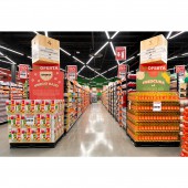
PRODUCTION / REALIZATION TECHNOLOGY: The first challenge the designers faced was the floor plan and circulations. There were 3 main factors to consider for the layout, 1 The clients income by department and profit margin, 2 observation of customers behaviors, 3 the customers experience and input. After the layout was approved the next challenge was the proposed look and feel on the interior of the store, achieved by using natural plywood as the main material for walls and furniture, to create a cohesive atmosphere. SPECIFICATIONS / TECHNICAL PROPERTIES: The store s area is 3,726.95 square meters. 65.5 meters by 56.9 meters. TAGS: retail, design, store, supermarket, interior, vulcastudio, award, lighting, trend, merco RESEARCH ABSTRACT: The design team had to benchmark supermarkets in main cities around the country, taking as a reference Mexico City and comparing with the city of Monclova where the new store will be located. The team went to visit more than 10 stores within those two cities, mostly looking for trends to brake and make new ones. The floor plan was based on previous stores data and insights provided by the client, like sales by department, profit margin, wants and must haves. Among other things the team found that apparently the warmer and focused the lighting in the store was, the most expensive the store feels, avoiding a warehouse type of feeling. CHALLENGE: They were different challenges along the project, 1. Design a better store without looking expensive, 2. Express the values of the already existing brand throwout 3. Finish on time with a little to none time for changes. ADDED DATE: 2019-02-16 03:02:17 TEAM MEMBERS (6) : Environmental graphic designer: Leyda Luz, Industrial Designer and interior: Tadeo Presa, Architect: Angel Garza, Project Manager: Ernesto Garrido, Lighting Designer: Ernesto Ballesteros and Creative Director: Jorge Saucedo IMAGE CREDITS: Image #1: Photographer Nydia Cavazos Image #2: Photographer Nydia Cavazos Image #3: Photographer Nydia Cavazos Image #4: Photographer Nydia Cavazos |
||||
| Visit the following page to learn more: https://bit.ly/2FL3UHM | |||||
| AWARD DETAILS | |
 |
Sunrise Interior Experience by Vulca Studio is Winner in Interior Space and Exhibition Design Category, 2018 - 2019.· Read the interview with designer Vulca Studio for design Sunrise here.· Press Members: Login or Register to request an exclusive interview with Vulca Studio. · Click here to register inorder to view the profile and other works by Vulca Studio. |
| SOCIAL |
| + Add to Likes / Favorites | Send to My Email | Comment | Testimonials | View Press-Release | Press Kit |
Did you like Vulca Studio's Interior Design?
You will most likely enjoy other award winning interior design as well.
Click here to view more Award Winning Interior Design.


