DESIGN NAME: Retro Punk
PRIMARY FUNCTION: Salon
INSPIRATION: Located amongst the old military dependents’ village, this townhouse is a two-storey hair salon commercial space and residential space planning design, the fresh and simple facade design on the exterior is fused into the original buildings.
UNIQUE PROPERTIES / PROJECT DESCRIPTION: The house is 5 decades old, and the old housing is renovated based on extremely slim budget, the interior layout is reorganized while keeping the sense of history of the original building, the old staircase as well as the architectural structure, which is renovated using industrial punk sentiment, symbolizing the implications of being retro, innovative and unique, which are the three indispensable spirits to fashion hair design, and this is how the design concept of “Retro Punk” was originated.
OPERATION / FLOW / INTERACTION: The overall space boldly combines different materials for the pursuance of aesthetical balance, allowing it to become the hair salon and residential space deviating from the stereotypical style.
PROJECT DURATION AND LOCATION: The project finished in Dec. 2018 in Taichang City, Taiwan.
FITS BEST INTO CATEGORY: Interior Space and Exhibition Design
|
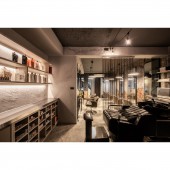
PRODUCTION / REALIZATION TECHNOLOGY: Due to the narrow interior layout, the reception counter by the entrance is pushed outwards to combine with the façade design, using imitation marble counter and glass, Southern pine façade as well as internal imitation rust texture to create a fresh quality, and vintage texture is further created using coating to correspond with the internal space.
SPECIFICATIONS / TECHNICAL PROPERTIES: The space is 89 square meters
TAGS: Interior Design,Commercial Space,Public,Hair salon
RESEARCH ABSTRACT: Moreover, iron piece lighting equipment and retro seats are selected to depict the vintage ambience. The dye conditioning and washing area at the back demonstrates a scruffy punk style with the metallic partitioning curtain and irregular hand painted wall, which further applied black leather seats and metallic countertop to present the micro fashion looks. A massive amount of scruffy texture is used with space and the illumination design, while the staircase of the old building extended this rugged style from the ground floor to the second floor.
CHALLENGE: The arrangement variation for the second-floor residential space is for the possibility of future extension in becoming a hair salon space; the overall utilized space to sculpt the venue, the master bedroom and the dining room/kitchen form a small-scale rest area through the combination of passageway and sofa, replacing the installation of door; the glossy coating on the new brick wall and the dim light create a cozy atmosphere.
ADDED DATE: 2019-02-15 02:51:36
TEAM MEMBERS (2) : CHIU, WEI-CHENG and TU, HUEI-MIN
IMAGE CREDITS: Huei-Min Tu and Chiu Wei Cheng, 2018.
|