Up And Alive Packaging by Mario Alejandro Stephens |
Home > Winners > #76559 |
 |
|
||||
| DESIGN DETAILS | |||||
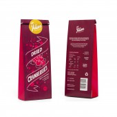
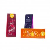
| DESIGN NAME: Up And Alive PRIMARY FUNCTION: Packaging INSPIRATION: Inspiration came from a variety of 2D, illustrative vector artworks. Additionally, research on hand-drawn letterings was also carried out to consider an appropriate typeface for the package titles. This was also conducted for the creation of the Up and Alive logo. The goal of the package art was to combine both type and graphics to entice the buyers and stand Up and Alive out from competing brands. UNIQUE PROPERTIES / PROJECT DESCRIPTION: The project required the designs of surface graphics for three dried fruit snack packages, sold by the (fictitious) company, Up and Alive. These snacks are targeted to the niche audience concerned for healthy lives and consuming nutritious meals. The company favoured a style of bold vectors and lettering, all working in unison to elicit excitement and energy. All three bags are presented in a vibrant fashion with eye-catching fruit vectors scattered across the fronts accompanied by large hand-drawn letters. OPERATION / FLOW / INTERACTION: When shoppers enter grocery stores they are immediately drawn to the overall aesthetics of the paper bags and sense of energy. A personal connection to the product has been made at this point, meaning that are motivated to pick up the product to read the information. Up and Alive’s trick is to utilise feelings as a tactic to engage with its customers to establish a strong, immediate connection. PROJECT DURATION AND LOCATION: The project started in March 2016 and finished in June 2016. |
PRODUCTION / REALIZATION TECHNOLOGY: The package templates were supplied by the client so no design process was required as part of the project. Colour was a vital component to set up. The surface graphics and background colours are two different PMS hues set-up in Adobe Illustrator and in order to separate for the required CMYK digital printing. The final packages are printed on high-white matt 200 gsm stock. An uncoated stock would result in less light reflecting off the surfaces. Such a thickness resulted in neat folding for the bags. The company log is printed on high-white 150 gsm adhesive uncoated stock. SPECIFICATIONS / TECHNICAL PROPERTIES: 85 mm x 46 mm x 225 mm TAGS: Packaging, Typography, Digital Artwork, Illustration, Vector Artwork RESEARCH ABSTRACT: A key component involved researching existing brands selling similar products and inspecting their package designs. Brainstorming and wordlists for both the company logo design and packages were vital to consider distinctiveness in the designs. This is the point in which the concept of an aesthetic style making a quick personal connection to the audience arose. Hand drawn sketches followed, beginning with logo concepts. These were evaluated with the best ideas refined and then digitised as vectors for more evaluation and eventually a final result. The process of developing the package artworks followed a parallel process. CHALLENGE: The biggest challenge arose in finding ways to make all the aspects in the package graphics work in unison to elicit an overall rewarding feel to customers. The banner shape was not originally part of initial ideas earlier on in the sketching stage. Time was running out to make a start on constructing all the package artworks digitally by the time this shape came into thought. By the time it was included in ideas it made a huge contribution in improving the overall layouts of each design and quickening the final digital-making process. ADDED DATE: 2019-02-14 16:48:12 TEAM MEMBERS (1) : IMAGE CREDITS: Image #1, Image #2, Image #3, Image #4, Image #5: Photographer Mario Alejandro Stephens (Communication Designer), Up & Alive Packaging Artworks, 2016. |
||||
| Visit the following page to learn more: https://www.i-am-jandro.com/ | |||||
| AWARD DETAILS | |
 |
Up and Alive Packaging by Mario Alejandro Stephens is Winner in Packaging Design Category, 2018 - 2019.· Read the interview with designer Mario Alejandro Stephens for design Up And Alive here.· Press Members: Login or Register to request an exclusive interview with Mario Alejandro Stephens. · Click here to register inorder to view the profile and other works by Mario Alejandro Stephens. |
| SOCIAL |
| + Add to Likes / Favorites | Send to My Email | Comment | Testimonials | View Press-Release | Press Kit |
Did you like Mario Alejandro Stephens' Packaging Design?
You will most likely enjoy other award winning packaging design as well.
Click here to view more Award Winning Packaging Design.


