I Never Use Foundation Breakfast Club Retail by CTRC Design Consultant Ltd. |
Home > Winners > #75830 |
 |
|
||||
| DESIGN DETAILS | |||||
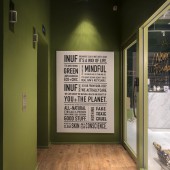
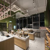
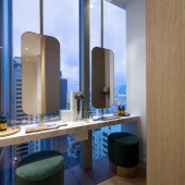
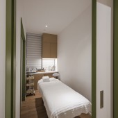
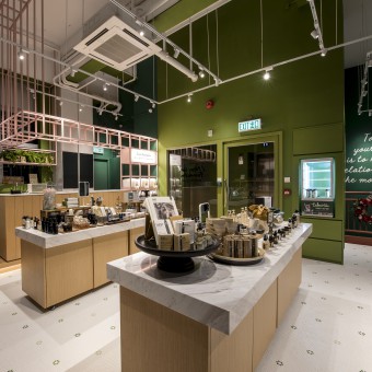
| DESIGN NAME: I Never Use Foundation Breakfast Club PRIMARY FUNCTION: Retail INSPIRATION: To be in line with the youthfulness of INUF, our designer created a young and fresh feeling on the store design. INUF positioned to advertise all natural products, targeted at young and healthy female customers who focus on quality of life. As such, wood color is used mainly in the design to create a sense of comfort. Different shades of green and red are also applied to highlight the nature and feminine side of the brand which topped the brand with a vibrant feeling. UNIQUE PROPERTIES / PROJECT DESCRIPTION: Bright colors are used to divide the different areas which bring feeling of exploration experiences to customers. They would find it refreshing and positive when walking pass these areas. When customers step out of the elevator, they will enter a light green box. At the end of the wall, the concept of the brand will be displayed. When looking through the glasses into the store, customers will see a relatively wide and spacious area, amusingly in contrast with the narrow entrance. The simple-shaped checkout counter is topped with white marble, presented in the form of a box. The cash register is decorated with a pink curved shape, and the color echoes the display stand on the opposite side. Customers will reach the treatment area after the deep red staircase. With a relatively small area, colour is not used as much as on the upper floor. On the contrary, white colour and simple color lines are used to enhance the interior design effect. Enough spacing is allowed to avoid oppression and to bring out a comfortable feeling. The design of the washroom is simple and beautiful. Like placing a small wooden box inside the white box. The ratio of white to wood color help bringing out a cozy feeling. At the end of the corridor is a small dressing room which is situated in front of the floor-to-ceiling glass window. The pairing up of white marble stone tables with golden mirrors made the washroom exquisite and beautiful. When customers step out of the elevator, they will enter a light green box. At the end of the wall, the concept of the brand will be displayed. When looking through the glasses into the store, clients will see a relatively wide and spacious area, amusingly in contrast with the narrow entrance. OPERATION / FLOW / INTERACTION: There are two half-height display stands in the middle of the store, which showcases the brand's products openly. At the end of the store is a Mixing Bar counter, where customers can adjust the taste of the products according their preferences. As an environment protection measure, the pink colored checkered display rack on the right hand side allows guests to self-replenish the required products. The pink display stand is connected to the entire Mixing Bar counter and extended to the ceiling. The small linear structure forms a visual conflict with the large color wall, which enhances the transparency of the space. PROJECT DURATION AND LOCATION: The project was started in January 2018 and finished in July 2018, located in Hong Kong. FITS BEST INTO CATEGORY: Interior Space and Exhibition Design |
PRODUCTION / REALIZATION TECHNOLOGY: Linear lines with high contrast of colour usage are the most important design elements. Visually, this will make the utmost of the high ceiling and reduce the disadvange of the narrow space. We tried to maximize the proportion of glass window, use light proportion of design elements to minimize the blockage of the window, in order to let the sunlight come through and customers could enjoy the nice view which bringing to the space. SPECIFICATIONS / TECHNICAL PROPERTIES: - TAGS: INUF, I never use foundation breakfast club, Interior, natural, green, fresh, pink, lifestyle, skincare, shop, retail, red staircase, treatment room, CTRC Design RESEARCH ABSTRACT: Since the building itself has full height glass window and the location is having a very nice view, so we make use of these advantages when we did the design. Keeping the transparency to see the view without blocking the sunlight, the design elements are using linear lines with very light proportion at the eye-level or above, so customers can enjoy the view on both floors whenever day and night. CHALLENGE: Hong Kong is the most densely packed city, both floors are required to have a lot of rooms and functions in limited space, the challenge is how to enhance the sense of space and avoid the oppression feeling in such a narrow space. ADDED DATE: 2019-02-09 14:35:15 TEAM MEMBERS (2) : Ryan Cheung and Christine Tsui IMAGE CREDITS: Ryan Cheung PATENTS/COPYRIGHTS: Copyrights belong to CTRC Design Consultant Ltd., 2019 |
||||
| Visit the following page to learn more: https://www.ctrc.design/copy-of-6th-proj |
|||||
| AWARD DETAILS | |
 |
I Never Use Foundation Breakfast Club Retail by Ctrc Design Consultant Ltd is Winner in Interior Space and Exhibition Design Category, 2018 - 2019.· Read the interview with designer CTRC Design Consultant Ltd. for design I Never Use Foundation Breakfast Club here.· Press Members: Login or Register to request an exclusive interview with CTRC Design Consultant Ltd.. · Click here to register inorder to view the profile and other works by CTRC Design Consultant Ltd.. |
| SOCIAL |
| + Add to Likes / Favorites | Send to My Email | Comment | Testimonials | View Press-Release | Press Kit |
Did you like Ctrc Design Consultant Ltd's Interior Design?
You will most likely enjoy other award winning interior design as well.
Click here to view more Award Winning Interior Design.


