Aeril Lab Package by Anastasia Dunaeva |
Home > Winners > #74638 |
| CLIENT/STUDIO/BRAND DETAILS | |
 |
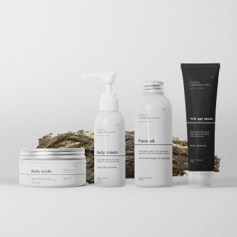
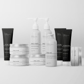
NAME: Aeril Laboratory PROFILE: Client: Aeril Lab Aeril Laboratory is medical cosmetic brand based in Greece with manufacture in France. Their main goal is to provide healthy, based on medical researches, solution for any type of problem skin. All products clinically tested and proved. Aerilab starting hitting the market with full new skincare products and were in need of holistic brand development. The main challenge of this work was to show connection between scientific side of brand and lifestyle. Create brand that will be connected with young audience, make cosmetics products that could become objects of target audience’s lifestyle. |
| AWARD DETAILS | |
 |
Aeril Lab Package by Anastasia Dunaeva is Winner in Packaging Design Category, 2018 - 2019.· Read the interview with designer Anastasia Dunaeva for design Aeril Lab here.· Press Members: Login or Register to request an exclusive interview with Anastasia Dunaeva. · Click here to register inorder to view the profile and other works by Anastasia Dunaeva. |
| SOCIAL |
| + Add to Likes / Favorites | Send to My Email | Comment | Testimonials | View Press-Release | Press Kit |
Did you like Anastasia Dunaeva's Packaging Design?
You will most likely enjoy other award winning packaging design as well.
Click here to view more Award Winning Packaging Design.


