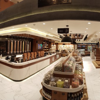
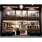
Izhiman Premier Apothecary Shop by Emad Salameh |
Home > Winners > #74065 |
| CLIENT/STUDIO/BRAND DETAILS | |
 |
NAME: SADDA design and build PROFILE: SADDA design and build was first launched in 2008. Founder/CEO Emad Salameh’s passion for modern, minimal design was reflected in projects to come and further asserted as the company grew. The company’s focus was on creating experiences that users can enjoy through visionary and advanced design solutions. Today, SADDA design and build offers a complete design and construction process with an extensive range of services that include: Architecture, Interior Design, Construction Management, Facility Management, and Branding. SADDA handle major projects & accounts in Jordan providing smooth and reliable design process with boundless innovation & creativity. SADDA introduced Izhiman Premier in 2017 with a new trendy and modern design. Izhiman premier extended roots from the nineteenth century and Jerusalem's heritage were met in Bab Al Amud when the first store was established under Izhiman family based brand. It was a pioneer project in the field of coffee making shop as it was the first shop in Jerusalem then. Izhiman Premier concern is always to be distinguished by choosing the best sources green coffee and using best methods of preparation, and follow up the most recent techniques and technologies. |
| AWARD DETAILS | |
 |
Izhiman Premier Apothecary Shop by Emad Salameh is Winner in Interior Space and Exhibition Design Category, 2018 - 2019.· Read the interview with designer Emad Salameh for design Izhiman Premier here.· Press Members: Login or Register to request an exclusive interview with Emad Salameh. · Click here to register inorder to view the profile and other works by Emad Salameh. |
| SOCIAL |
| + Add to Likes / Favorites | Send to My Email | Comment | Testimonials | View Press-Release | Press Kit | Translations |
Did you like Emad Salameh's Interior Design?
You will most likely enjoy other award winning interior design as well.
Click here to view more Award Winning Interior Design.


