Towngas Sustainability Report Sustainability Report by Ng Wai Ming Chris |
Home > Winners > #73974 |
 |
|
||||
| DESIGN DETAILS | |||||
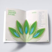
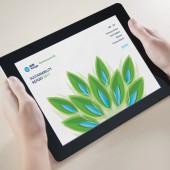
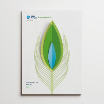
| DESIGN NAME: Towngas Sustainability Report PRIMARY FUNCTION: Sustainability Report INSPIRATION: Peacock has a special feature that the male peacocks expand their feathers when they are facing some challenges. In Chinese, this phenomenon implies growing and expanding. With concrete foundation, Towngas has been actively exploring opportunities for long-term business growth without compromising any negative influences to the nature. Towngas has a strong believe that sustainability is a guiding principle to drive the business success. UNIQUE PROPERTIES / PROJECT DESCRIPTION: The design concept was inspired by the corporate logo of Towngas. The cover layout featured the flame as the major visual element, playing around with Towngas iconic logo. We applied layers of paper artwork to form the flame logo and the feathers of a peacock. The feathers opening animation of a peacock implied the meaning that Towngas has been extending its past corporate vision to a new - Vision for a Greener Future as the theme of this year report. OPERATION / FLOW / INTERACTION: The bold feather image presented upfront which makes a statement of the corporations commitment that Towngas is ready to fly for the extra miles ahead with strong sustainability vision and concrete foundation. PROJECT DURATION AND LOCATION: The project started in March 2018 in Hong Kong and finished in August 2018 in Hong Kong, and was published in Hong Kong in November 2018. |
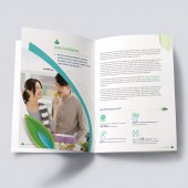
PRODUCTION / REALIZATION TECHNOLOGY: To create a visual impact to the audience yet without sacrificing the humanity touch of the design, muted and vivid colours are well integrated to give a harmonic look and feel to the report. Green and blue have been adopted throughout the report not only for consistency purpose but also implies Towngas is turning to a brighter and greener future. To enhance the consistency and continuity of the design concept, the peacock feather has been used as a key graphic element adopted as supporting graphics or has been used in customised infographic design throughout the report. SPECIFICATIONS / TECHNICAL PROPERTIES: Brochure Width 210mm x 297mm Height TAGS: sustainability, report, web, design, brochure, green RESEARCH ABSTRACT: Towngas is one of the oldest public utility providing reliable energy suppliers for millions of families in Hong Kong since 1862. Over the past 150 years, Towngas has been playing an important role in economic growth and continuous contribution to livelihood improvement for the society. With this company background, we need to find an element that can represent those vision, therefore we take the Feather of Peacock as the core idea, which in Chinese culture, this phenomenon implies growing and expanding. CHALLENGE: For feather of peacock is the key idea of this design, we need to figure out how to show the way that Peacock expand the feather. Finally we make it work as a spread gatefold inside cover, we also applied layers of paper artwork to form the flame logo and the feathers of a peacock. The feathers opening animation of a peacock implied the meaning that Towngas has been extending its past corporate vision to a new Vision for a Greener Future as the theme of this year's report. Towngas will continuous create a glittering future to the community with embracing innovative solutions. ADDED DATE: 2019-01-07 08:45:37 TEAM MEMBERS (3) : Sin King Man Kelly, Rao Amandeep and Tse Kin Wah Jeff IMAGE CREDITS: Ng Wai Ming Chris, 2018. PATENTS/COPYRIGHTS: Copyrights belong to The Hong Kong and China Gas Company Limited Towngas, Year 2018. |
||||
| Visit the following page to learn more: http://bit.ly/2GZzfuf | |||||
| AWARD DETAILS | |
 |
Towngas Sustainability Report Sustainability Report by Ng Wai Ming Chris is Winner in Print and Published Media Design Category, 2018 - 2019.· Read the interview with designer Ng Wai Ming Chris for design Towngas Sustainability Report here.· Press Members: Login or Register to request an exclusive interview with Ng Wai Ming Chris. · Click here to register inorder to view the profile and other works by Ng Wai Ming Chris. |
| SOCIAL |
| + Add to Likes / Favorites | Send to My Email | Comment | Testimonials | View Press-Release | Press Kit |
Did you like Ng Wai Ming Chris' Print Design?
You will most likely enjoy other award winning print design as well.
Click here to view more Award Winning Print Design.


