DESIGN NAME:
Junlan Tingan
PRIMARY FUNCTION:
Sales Center
INSPIRATION:
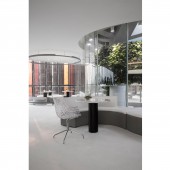
The sales center is in shape of an oval floating on the forest. The design team takes the sales center as landscape terrace of the show area which offers panoramic perspective of the mock-up and park.
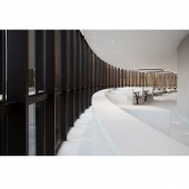
Bevelled bronze-colored perforated louver is applied to the facade which presents a permeable and flexible elevation. Just a breathing seed, the architecture, together with special modesty of the land, grows out from the soil and breathes fresh air for photosynthesis.
UNIQUE PROPERTIES / PROJECT DESCRIPTION:
The sales center covers an area of 1700 sqm and has 3 floors. The designer applies materials which are as simple as possible to show structure of the building and design which is as less as possible to endow the space infinite imagination.In this case, light, nature and building are penetrated to each other by the designer to create a comfortable and eco-friendly microclimate group and a community of riverside elite model life.
OPERATION / FLOW / INTERACTION:
The design team takes the sales center as landscape terrace of the show area which offers panoramic perspective of the mock-up and park.
PROJECT DURATION AND LOCATION:
Design time:July, 2017 ,Completion time: December, 2017 .Project location: Huiyang
FITS BEST INTO CATEGORY:
Interior Space and Exhibition Design
|
PRODUCTION / REALIZATION TECHNOLOGY:
Bevelled bronze-colored perforated louver is applied to the facade.The andscape is marked with the concrete show wall and white show platform .
SPECIFICATIONS / TECHNICAL PROPERTIES:
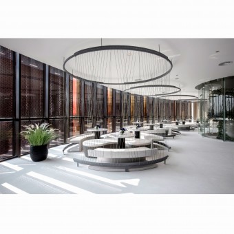
The sales center covers an area of 1700 sqm and has 3 floors.1st Floor is the service counter of sand map area and multimedia exhibition hall.2nd floor contains business meeting, show and entertainment area of the sales center.
TAGS:
sales center, color, line, consistent, landscape
RESEARCH ABSTRACT:
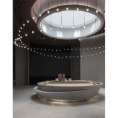
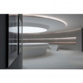
1st Floor is the service counter of sand map area and multimedia exhibition hall. The sand map is oval-shaped which is in consistent with shape of the sales center. The specifically designed art ceiling light above the sand map looks like the bright milky way which makes the cold concrete warm and soft.In contrast with the thickness and weight on 1st floor, 2nd floor is more pure and lithe. White is the key tone, mixed with the colorful lights penetrated in, this is no doubt the best decoration for the space.
CHALLENGE:
The designer applies materials which are as simple as possible to show structure of the building and design which is as less as possible to endow the space infinite imagination.The designer guides moving line planning through reasonable sales and achieve interaction between behavior of people and the space. Steel line soft partition is applied to create a semi-private meeting area. Abnormal-shaped sofa in plain color, elegant finishes and artworks, all these creates more relaxed atmosphere for the business meeting area.
ADDED DATE:
2018-12-17 03:02:31
TEAM MEMBERS (2) :
Gary Zeng and Gwen Tan
IMAGE CREDITS:
Image #1,2,3,4,5:Photographer Gary , 2017
|
