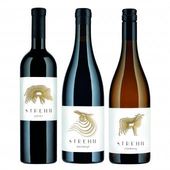
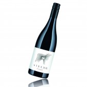
Strehn Winery Packaging Design Packaging Design by Nikolaus Eberstaller |
Home > Winners > #72850 |
 |
|
||||
| DESIGN DETAILS | |||||
| DESIGN NAME: Strehn Winery Packaging Design PRIMARY FUNCTION: Packaging Design INSPIRATION: Literally animated by animals. "Going deeper" as a reminiscation, that we should explore the multiple treasures under the surface. Everything consists of several levels and each of them are worthful to explore. It's the same with excellent wine, which delights with significantly more flavors than one. Furthermore these animals visualize the clients devotion to nature. UNIQUE PROPERTIES / PROJECT DESCRIPTION: The label design stands out due to its range of key visuals. The animal motifs create a multidimensional, mysterious image. The distinctive packaging design is supplemented by a font called Piroska, designed by Nikolaus Eberstaller. OPERATION / FLOW / INTERACTION: The challenge was to create a label that appears concise on the sales shelf alongside its competitors. Wine drinkers are aesthetically-sensit PROJECT DURATION AND LOCATION: The project started in January 2016. The design process lasted until November 16, when the clean drawing has been sent to the printer. The labels and the boxes were realized in 2017. FITS BEST INTO CATEGORY: Packaging Design |
PRODUCTION / REALIZATION TECHNOLOGY: The labels were printed on coated self-adhesive paper with partial gloss varnish. The wine boxes (content: 6 bottles/750ml in bordeaux or burgundy shape) were printed in four colors on uncoated cardboard. SPECIFICATIONS / TECHNICAL PROPERTIES: Labels: 225x85mm (single label, no backlabel) Wine Boxes: 255x175x1302mm TAGS: Winelabel, Optic Illusion, 3D, Labeldesign, Packaging Design, Animals RESEARCH ABSTRACT: The design is inspired by the impossible worlds of M.C. Escher. He designed, among other things, stairs that never ended. Our illustrations lead to a depth that is not real, but still visible. We used a similar technique: The deep illusion is created only by shadows. CHALLENGE: In order to ensure a purposeful design, we checked the competitors. We wanted to develop a "honest" design that best supports the character of the wines, which are not opulent, but complex and full of finesse. Labels are ideal areas to visualize the attitude of the femal vintner: her access to formal aesthetics, to art, to life. Standing out from the mass was our goal. Sales confirmed us: they increased with the new design, new markets were opened up. ADDED DATE: 2018-11-27 12:05:08 TEAM MEMBERS (1) : IMAGE CREDITS: Image #No 1: Strehn Winery Image #No 2: Strehn Winery Image #No 3: Strehn Winery Image #No 4: Strehn Winery |
||||
| Visit the following page to learn more: http://www.eberstaller.at | |||||
| AWARD DETAILS | |
 |
Strehn Winery Packaging Design Packaging Design by Nikolaus Eberstaller is Winner in Packaging Design Category, 2018 - 2019.· Read the interview with designer Nikolaus Eberstaller for design Strehn Winery Packaging Design here.· Press Members: Login or Register to request an exclusive interview with Nikolaus Eberstaller. · Click here to register inorder to view the profile and other works by Nikolaus Eberstaller. |
| SOCIAL |
| + Add to Likes / Favorites | Send to My Email | Comment | Testimonials | View Press-Release | Press Kit |
Did you like Nikolaus Eberstaller's Packaging Design?
You will most likely enjoy other award winning packaging design as well.
Click here to view more Award Winning Packaging Design.


