DESIGN NAME:
Treasure Island
PRIMARY FUNCTION:
Book Design
INSPIRATION:
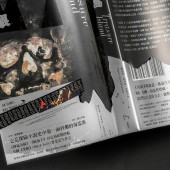
The black triangle implies a "crown" or "mountains on Treasure Island". The Chinese typography of Treasure Island is printed by Pantone 877C silver with the sharp and cubic design to express the solidity of silver bricks. The filled gaps are used to symbolize the "fully loaded" treasure. The designer broke the tradition of rectangle belly band and replaced it with an irregular mountain-shaped one, and he emphasizes the idea that the book itself is Treasure Island.
UNIQUE PROPERTIES / PROJECT DESCRIPTION:
Print the three elements: "waves", "skeleton" and "boats" with the extra quantity of Pantone 873C golden ink which let the golden color. If you remove the book cover, you will see the golden treasure.
The designer chose a picture of an island to be applied at the fore-edge and split the painting into pieces and implant each piece in order according to the page number. The slight shifts during binding pages into a book have been used intentionally to convey "the foggy view of the Treasure Island".
OPERATION / FLOW / INTERACTION:
Book Design, Graphic Design, Layout Design, Treasure Island
PROJECT DURATION AND LOCATION:
The project started in September 2018 in Taiwan and finished in September 2018 in Taiwan.
|
PRODUCTION / REALIZATION TECHNOLOGY:
The black triangle implies a "crown" or "mountains on Treasure Island". Print it by dark black (cyan 30%, black 100%) to make it recognizable in the background (black 100%). Spot varnishing is used to raise the brightness and enrich the texture.
The Chinese typography of Treasure Island is printed by Pantone 877C silver with the sharp and cubic design to express the solidity of silver bricks. The filled gaps are used to symbolize the "fully loaded" treasure.
5% Pantone 877C silver is both applied at the cover and the back cover. The quality of the pictures has been advanced to a different level by spreading sliver powder in it.
SPECIFICATIONS / TECHNICAL PROPERTIES:
148mm x 210mm, 392 pages.
TAGS:
Book, Design, Fore-edge painting, Graphic, Typography
RESEARCH ABSTRACT:
To abandon any images related to "glittering treasure" was the first decision (this decision indicates that some elements are used as metaphors instead of expressing by pictures). "talking about Treasure Island without indicating treasure, what's else?".
The designer thinks the treasure in the story is not real treasure. Rather than speaking of people's imagination on wonderful things, the treasure is more possible to indicate the "unpredictable characters" of humanity or the "fatal charm" brought by unknown things which are gorgeous and extremely dangerous. "Skeleton" is ideally matched my concept.
CHALLENGE:
There are some difficulties in the preliminary stages of the visual communication if you want to redesign the masterpiece which was first published in 1883 and has been widely rewritten into new scripts for numerous animations and movies. Those classic scenes have been implanted into people's minds. Obviously, how to rearrange or replace the specific scenes or elements is a point to convey a new classic of the brand new translation of Treasure Island.
ADDED DATE:
2018-11-24 17:40:59
TEAM MEMBERS (3) :
Copywriting: Chen, Pei-Xuan, Editor: Lin, Chia-Ho and
IMAGE CREDITS:
Illustration: Jiang, Hong-Da
Photography: Liu, Jun-You
PATENTS/COPYRIGHTS:
Copyrights belong to Hong Da Design Studio, 2018.
|


