Grades Don't Matter Mobile Application by Lollypop Design Studio |
Home > Winners > #72575 |
 |
|
||||
| DESIGN DETAILS | |||||
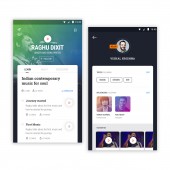
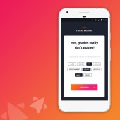
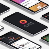
| DESIGN NAME: Grades Don't Matter PRIMARY FUNCTION: Mobile Application INSPIRATION: In India, there are over 2000 career alternatives that do not require a degree but are high in demand and pays better compared to traditional degrees. The app aims to inspire and encourage creativity and instill a sense that every skill matter. Grades Don’t Matter is not a master class, it focuses on learning the basics from the pros and making a sound career decision. It also aims to change the parent’s perception of new career options by providing a cost-benefit analysis. UNIQUE PROPERTIES / PROJECT DESCRIPTION: Grades Dont Matter is an alternative education platform and is conceptualized with an aim to bridge the gap between degrees and skills. The app provides an in-depth learning from the legends themselves for 30 odd careers and is divided into a three-phased approach for ease of learning. The app also considers short attention span of youth and hence, fast-paced lessons have been designed with only 3 -5 minutes of videos and a module can be completed within 45 minutes. OPERATION / FLOW / INTERACTION: The app is extremely simple and leverages the existing tech behavior of the target audience. It is visually attractive and has a card-based layout. The complete course is listed in a list format making it easy to grasp and understand. The swipe gesture allows scrolling through a multitude of learning options while keeping the interface engaging. Every module has a trailer that speaks about what is it about and sets clear expectation of what will be learned. PROJECT DURATION AND LOCATION: Project began in April 2017 and ended in December 2017 in India FITS BEST INTO CATEGORY: Interface, Interaction and User Experience Design |
PRODUCTION / REALIZATION TECHNOLOGY: Grades Dont Matter posed extreme challenges as the app required creative team and crafting of the modules strategically. We used ADHD specialist for crafting modules and for the design we used photoshop, illustrator, sketch, and invision. For video production, voice artists, adobe premiere pro and filmmaking software’s were used. SPECIFICATIONS / TECHNICAL PROPERTIES: We designed UX, UI for the website and the android/ iOS app. TAGS: Design, UX, UI, Education, App design, Digital Design RESEARCH ABSTRACT: We conducted two-fold research with the target audience and the influencers; questionnaires, focused group discussions, and interviews were done with the target audience to gauge their field of interest, observe their online learning pattern and discover the pain points with the existing platform. While the influencers were researched to ideate on the feasibility of learning the skill online and to discover the best module that would help learn the career fundamentals. CHALLENGE: The main challenge was to craft a course that would fit the short attention span of the youth. Second, was to craft an engaging platform that could break-through the existing clutter in the education domain. Research helped us gauge that youth were looking to learn the practical fundamentals in the domain that would help them land a job. Hence, the app combined these requirements and serve as a one-stop solution. While it also breaks the traditional stereotype of Indian parents and helps them understand the earning capabilities of these contemporary careers. ADDED DATE: 2018-11-16 05:36:56 TEAM MEMBERS (2) : Design Director: Anil Reddy and Cinematographer: Rakesh Reddy IMAGE CREDITS: Lollypop Design Studio, 2018. |
||||
| Visit the following page to learn more: https://www.lollypop.design | |||||
| AWARD DETAILS | |
 |
Grades Don't Matter Mobile Application by Lollypop Design Studio is Winner in Mobile Technologies, Applications and Software Design Category, 2018 - 2019.· Read the interview with designer Lollypop Design Studio for design Grades Don't Matter here.· Press Members: Login or Register to request an exclusive interview with Lollypop Design Studio. · Click here to register inorder to view the profile and other works by Lollypop Design Studio. |
| SOCIAL |
| + Add to Likes / Favorites | Send to My Email | Comment | Testimonials | View Press-Release | Press Kit |
Did you like Lollypop Design Studio's Mobile Design?
You will most likely enjoy other award winning mobile design as well.
Click here to view more Award Winning Mobile Design.


