IRIS Ceramic Store Shop by Yao Xiaobing |
Home > Winners > #72121 |
 |
|
||||
| DESIGN DETAILS | |||||
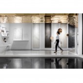
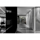
| DESIGN NAME: IRIS Ceramic Store PRIMARY FUNCTION: Shop INSPIRATION: It is the first step for us to sort out the brand image. Interior design is only a sales prop for a mall store, and whether the image of a brand store matches the temperament of the brand product itself, which is especially important for the establishment of a brand store's initial market recognition impression. The purpose of our project is to build an image of an Italian import brand. UNIQUE PROPERTIES / PROJECT DESCRIPTION: IRIS Ceramic Store is a tile shop for Italian imports. It is composed of three small shops, whose functions are exhibition hall A, exhibition hall B, general service desk and IRIS business center. In the case of very small storefronts, the primary problem to be solved in the design is how to improve the brand image in a small space, and solve the product display and sales links of cross-store mode. OPERATION / FLOW / INTERACTION: It takes time for a brand to enter ordinary people's daily life, and time for a brand to find loyal customers who belong to its own brand. What we want to do now is to let a small store get out of the same category of many brand images. Let the brand store have the free guest when the shopping mall stores sell The role of the customer, so that more suitable for the brand target customers into the store, so that the brand's product temperament more in its display space to show their unique charm and temperament. PROJECT DURATION AND LOCATION: The project started in April 2018 in Chengdu and finished in July 2018 in Chengdu. FITS BEST INTO CATEGORY: Interior Space and Exhibition Design |
PRODUCTION / REALIZATION TECHNOLOGY: In the design, the senior sense of space is mainly expressed with gray, and the decoration is made with golden materials, so that the overall image can create a sense of value for the brand. The inclined frame porch of the entrance has a variable visual effect, enhancing the privacy of the space and attracting passing customers into the store. SPECIFICATIONS / TECHNICAL PROPERTIES: The project covers a total of 276 square meters. As a 72 square meters exhibition hall, exhibition hall A is the smallest one. The space of exhibition hall B is square meters, which divided into three parts: exhibition hall, general service desk and business negotiation room. TAGS: Interior, Commercial, Exhibition Hall, Modern, Simple, Brand image RESEARCH ABSTRACT: For an imported brand image, we have made a lot of new attempts and explorations in terms of space design language skills and new materials. Both the expansion of the application area of tiles in the sample space, the use of new customized linear lamps, and the combination of space materials' artistic visual effects and tile display have made breakthroughs relative to the traditional design. CHALLENGE: For a small store of only 100 to 200 square meters, it is the first problem to make an Italian import brand image store that mainly based on sample display, meeting the functions of high-level conference, design area, sales reception and so on. Store A and store B are 20 meters apart. The second difficulty is how to make the two stores output the same brand impression. ADDED DATE: 2018-10-23 09:48:01 TEAM MEMBERS (3) : Main Designer: Yao Xiaobing, Assistant Designer: Xiao Yuqing and Assistant Designer: Luo Baoan IMAGE CREDITS: Image #1: Photographer Ji Guang, IRIS Ceramic Store, 2018. Image #2: Photographer Ji Guang, IRIS Ceramic Store, 2018. Image #3: Photographer Ji Guang, IRIS Ceramic Store, 2018. Image #4: Photographer Ji Guang, IRIS Ceramic Store, 2018. Image #5: Photographer Ji Guang, IRIS Ceramic Store, 2018. PATENTS/COPYRIGHTS: The copyrights belong to Yao Xiaobing, 2018. |
||||
| Visit the following page to learn more: http://uee.me/a9GH8 | |||||
| AWARD DETAILS | |
 |
Iris Ceramic Store Shop by Yao Xiaobing is Winner in Interior Space and Exhibition Design Category, 2018 - 2019.· Read the interview with designer Yao Xiaobing for design IRIS Ceramic Store here.· Press Members: Login or Register to request an exclusive interview with Yao Xiaobing. · Click here to register inorder to view the profile and other works by Yao Xiaobing. |
| SOCIAL |
| + Add to Likes / Favorites | Send to My Email | Comment | Testimonials | View Press-Release | Press Kit |
Did you like Yao Xiaobing's Interior Design?
You will most likely enjoy other award winning interior design as well.
Click here to view more Award Winning Interior Design.


