SG Design Office Office by Xie Yinqiu |
Home > Winners > #71900 |
 |
|
||||
| DESIGN DETAILS | |||||
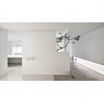
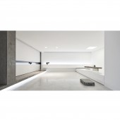
| DESIGN NAME: SG Design Office PRIMARY FUNCTION: Office INSPIRATION: In terms of functional layout, the designer advocate openness and changeability, which can be reflected in the design of multi-functional conference hall. The long tables, lamps, cabinets, etc., are almost custom-made to allow soft fitting into the building space itself. UNIQUE PROPERTIES / PROJECT DESCRIPTION: This case is designed for the office of the design company. Minimalist and white space is full of fun. In this case, it only uses spatial angles and lighting, and the rest is almost endless white. The designer designs the space with architectural language and the way of light, shade, and line. A white wall that enters place and corridor area, can give a person with sharp concise feeling. OPERATION / FLOW / INTERACTION: It is a feature using cool technology and objects to express temperature. For example, in the founder's office, there are countless stories about the birth of ideas. And clear xuan paper lamp, it is to use contemporary way to express deeper traditional lasting appeal. PROJECT DURATION AND LOCATION: The project started in December 2017 in Hangzhou and finished in April 2018 in Hangzhou. FITS BEST INTO CATEGORY: Interior Space and Exhibition Design |
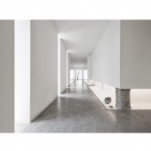
PRODUCTION / REALIZATION TECHNOLOGY: In the aisle, there are constantly changing wall relationships. Natural light is introduced through the way of wall grooving and electrified atomized glass, and some unavoidable areas use high-end imported small-size spotlights, gypsum lamps or concealed lamps to weaken artificial light sources. Thus achieve the modern minimalist style of seeing lights without lamp. SPECIFICATIONS / TECHNICAL PROPERTIES: The project area is 350 square meters. The trees, dry mountains and rivers, the electrified glass at the end of the corridor and the moonlight projection lamp add a sense of technology and future to the quiet and plain space. TAGS: Office, White, Minimalist, Cool, Technology, Contemporary, Multi-functional RESEARCH ABSTRACT: This project is the office space of a design studio. The whole three-dimensional space uses only space corners and lights, and the rest is almost endless white. The designer uses architectural language and the way of light and dark, line-to-line dialogue to design space, the entrance and corridor area of a white wall, can give people a sharp and concise feeling. CHALLENGE: In the design of this project, the designer needs to improve the degree of refinement between the elevated floor and the wall of latex paint, and achieve the modern minimalist style of seeing lights without lamp. ADDED DATE: 2018-10-11 03:11:38 TEAM MEMBERS (1) : Main Designer: Xie Yinqiu IMAGE CREDITS: Image #1: Photographer Wang Dachou, Reception Desk, 2018. Image #2: Photographer Wang Dachou, Niche, 2018. Image #3: Photographer Wang Dachou, Corridor, 2018. Image #4: Photographer Wang Dachou, Reception Room, 2018. Image #5: Photographer Wang Dachou, Founder Office, 2018. |
||||
| Visit the following page to learn more: http://www.hzsgdesign.cn/ | |||||
| AWARD DETAILS | |
 |
Sg Design Office Office by Xie Yinqiu is Winner in Interior Space and Exhibition Design Category, 2018 - 2019.· Read the interview with designer Xie Yinqiu for design SG Design Office here.· Press Members: Login or Register to request an exclusive interview with Xie Yinqiu. · Click here to register inorder to view the profile and other works by Xie Yinqiu. |
| SOCIAL |
| + Add to Likes / Favorites | Send to My Email | Comment | Testimonials | View Press-Release | Press Kit |
Did you like Xie Yinqiu's Interior Design?
You will most likely enjoy other award winning interior design as well.
Click here to view more Award Winning Interior Design.


