
|
|
| DESIGN DETAILS |
DESIGN NAME:
Please, Don't Stay Hungry
PRIMARY FUNCTION:
Magazine
INSPIRATION:
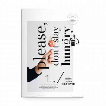
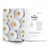
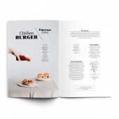
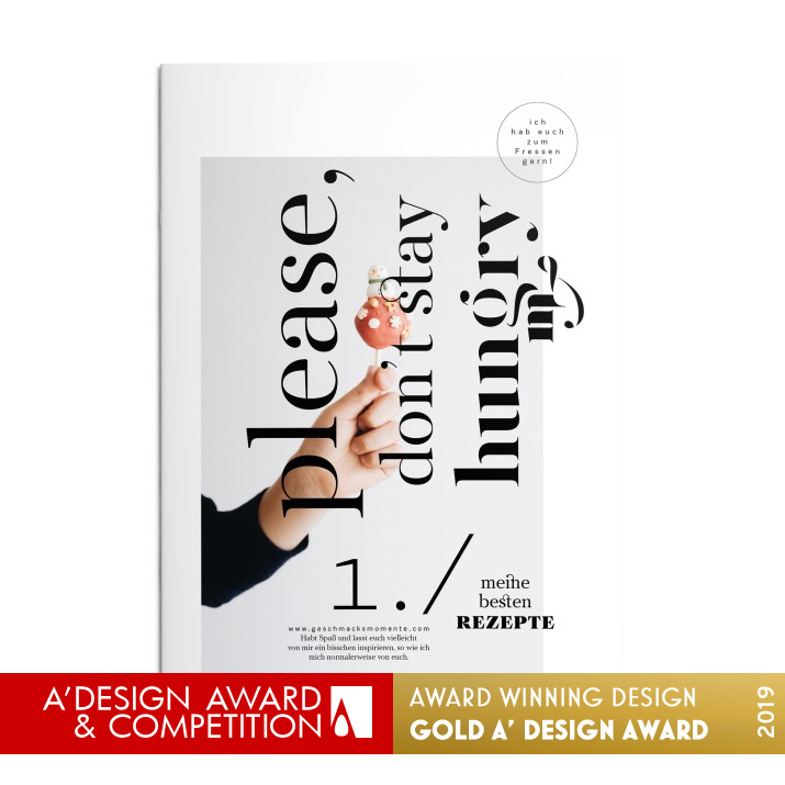
The creative recipes are presented with aesthetic photos and detailed text design. The layout serves to convey special taste experiences and the social pleasure which eating together brings. Photographed on white plates against a white background, the focus is on the visually appealing food.
UNIQUE PROPERTIES / PROJECT DESCRIPTION:
This brochure features the favourite recipes of Karin Stoettinger from her food blog geschmacksmomente.com in printed form. The playfully designed title please, do not stay hungry is true to the personal way of speaking to the target group which characterises the blog.
OPERATION / FLOW / INTERACTION:
We print the online foodblog www.geschmacksmomente.com. A finely designed magazine on paper as an alternative to online. Offline moments that will be remembered. The recipes are linked to the food blog.
PROJECT DURATION AND LOCATION:
Austria, 6 month, December 2018 to May 2019
|
PRODUCTION / REALIZATION TECHNOLOGY:
4 colour print, saddle sewn binding
SPECIFICATIONS / TECHNICAL PROPERTIES:
8.268x12 inch, 28 pages
TAGS:
magazin, foodblog, typography, editorial design, graphic design
RESEARCH ABSTRACT:
The idea was to put the photos and recipes of the food blog on printed paper. The magazine should invite to interact with the website.
CHALLENGE:
Combination of font and image, typographic details, open type features, font mixing
ADDED DATE:
2018-09-30 07:28:22
TEAM MEMBERS (2) :
Graphic Designer: Gerhard Kirchschlaeger and Photo: Karin Stoettinger
IMAGE CREDITS:
Gerhard Kirchschläger, 2018.
|
|
| COMMENTS |
| Giulia Esposito |
Comment #8054 on December 26, 2022, 8:17 am |
|
I'm absolutely in awe of the stunning visuals in "Please, Don't Stay Hungry". The magazine design is so eye-catching, with each page filled with incredible illustrations and typography. I'm especially impressed by the way the designer has managed to capture the spirit and message of the magazine in the design. It's truly an impressive feat of creativity and skill. Congratulations to Gerhard Kirchschläger for their amazing work!
|
| Victoria Hill |
Comment #29209 on January 3, 2023, 9:14 am |
|
I am absolutely enthralled by Please, Don't Stay Hungry! This magazine is a wonderful example of good design, with a playful title and aesthetically pleasing photos of the food recipes. The layout cleverly conveys special taste experiences and the social pleasure of eating together. Combining fonts and images, typographic details, and open type features together, this magazine is a true testament to the designer's skill. I also appreciate how the magazine invites to interact with the website. The 4 colour print and saddle sewn binding make it an even more special piece of work.
|
| Valentina Rossi |
Comment #32978 on January 3, 2023, 10:32 am |
|
This award-winning work creatively combines aesthetically pleasing photos and fonts to create a visually stunning magazine that conveys special taste experiences and the joy of eating together. The thoughtful layout and typographic details help to capture the target group's personal way of speaking.
|
| Patricia Miller |
Comment #37396 on January 3, 2023, 12:01 pm |
|
This magazine is an outstanding example of good design, expertly combining font and image, typographic details, open type features, and font mixing for a highly aesthetic and interactive outcome.
|
| Paul Williams |
Comment #46102 on January 3, 2023, 3:25 pm |
|
The design work Please, Don't Stay Hungry by Gerhard Kirchschläger is a stunning example of creativity and talent. The magazine is a beautiful blend of Karin Stoettinger's favourite recipes, aesthetic photos and thoughtfully designed text, creating a platform to explore special taste experiences. The combination of font and image, typographic details, open type features, font mixing and 4 colour printing, among other features, make this magazine a truly unique and captivating work. Congratulations to Gerhard Kirchschläger for this incredible achievement of winning the A' Design Award in the Print and Published Media Design category.
|
| Paul Phillips |
Comment #53061 on January 3, 2023, 6:45 pm |
|
I am absolutely in awe of Gerhard Kirchschläger’s ‘Please, Don’t Stay Hungry’ magazine design! The concept of featuring the favourite recipes of a food blog in printed form is so clever and creative. The title itself is playful and inviting and I think it’s true to the personal way of speaking to the target group which characterises the blog. The design of the magazine is visually stunning and really captures the essence of the blog and its content. This magazine design is truly deserving of the A' Design Award and I am so happy for Gerhard Kirchschläger’s success!
|
| Elena Petrenko |
Comment #56501 on January 3, 2023, 8:24 pm |
|
This award-winning work skillfully combines aesthetically pleasing photos, typographic details and open type features to create an inviting interactive experience.
|
| Adam Harris |
Comment #57192 on January 3, 2023, 8:44 pm |
|
I'm in awe of this fantastic work! The magazine 'Please, Don't Stay Hungry' is a beautiful example of good design and a perfect representation of how creativity and attention to detail can be combined to create something truly special. The aesthetic photos, detailed text design and playful title capture the social pleasure of eating together and provide a great source of inspiration for all design enthusiasts. Congratulations to the designer for winning the A' Design Award!
|
| Chloe Turner |
Comment #65413 on January 4, 2023, 12:31 am |
|
I was absolutely mesmerized by the beautifully presented recipes and photos in Gerhard Kirchschläger's work "Please, Don't Stay Hungry". The attention to detail in the text design was remarkable and the use of white plates against a white background really highlighted the visually appealing food. It was clear that the designer had put a lot of thought into conveying the special taste experiences and social pleasure that eating together brings. This work is truly a masterpiece and a deserving winner of the A' Design Award.
|
| Mark Allen |
Comment #66527 on January 4, 2023, 1:02 am |
|
This award-winning work demonstrates a creative combination of font and image, detailed typographic details, open type features, and font mixing. The playfully designed title and the aesthetic photos of the food blog create an inviting magazine that celebrates the social pleasure of eating together. The layout conveys the special taste experiences and invites to interact with the website. This work is a wonderful example of the beauty of print and published media design.
|
| Elisabeth Clark |
Comment #67792 on January 4, 2023, 1:38 am |
|
I am so pleased to see Gerhard Kirchschläger's beautiful work "Please, Don't Stay Hungry" being honoured with the A' Design Award! This magazine is a wonderful example of how design can bring out the best in a project, as it captures the food blogger's personal way of speaking to the target group and conveys special taste experiences in a visually appealing manner. It is clear that a lot of research and effort has gone into the production of this magazine, and the results are truly amazing. Congratulations to Gerhard Kirchschläger for creating such a wonderful piece of work!
|
| Hien Nguyen |
Comment #78360 on January 4, 2023, 6:50 am |
|
I am truly impressed by Gerhard Kirchschläger's work "Please, Don't Stay Hungry". This award-winning design is truly remarkable and demonstrates exceptional skill and creativity. It is an honor to see such outstanding work be recognized with such a prestigious award.
|
|
|
