AD Architecture Office Space by Peihe Xie |
Home > Winners > #71476 |
 |
|
||||
| DESIGN DETAILS | |||||
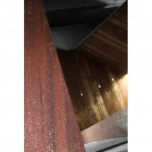
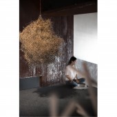
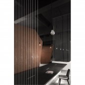
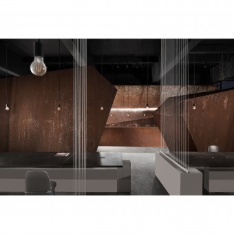
| DESIGN NAME: AD Architecture PRIMARY FUNCTION: Office Space INSPIRATION: The office of AD ARCHITECTURE is located in a creative park renovated from an old factory in Shantou. These old houses have witnessed the rise and fall of the city, and with the rapid development and expansion of the city. We decided to transform it into a space that can represent itself. We perceived the inspiration given by space and listened to it instead of changing too much. In this design, what we need to do well is to respect the original ideology of space and inject new vitality inside. UNIQUE PROPERTIES / PROJECT DESCRIPTION: While satisfying the functional needs in the office, the designer also added some bold spaces where people can think quietly. Taking the public working area as the core, the designer created two functional areas to inject new vitality. The small attic formed by space division enhances the shaping sense, and the originally tall space becomes very interesting through the intersection of different volumes. Each individual volume is penetrated with another instead of absolutely segmented. OPERATION / FLOW / INTERACTION: The office is located in a creative park renovated from an old factory, where designer hopes to create a perceptive space. The original structure of the building was preserved. In the 5m high space, designer used abstract mountain shape to reflect the dramatic sense of the space. While satisfying the functional needs, designer also added some bold spaces where people can think quietly. Taking the public working area as the core, the designer created two functional areas to inject new vitality. PROJECT DURATION AND LOCATION: The project is started in October 2017 in Shantou, China and finished in March 2018 in Shantou, China. FITS BEST INTO CATEGORY: Interior Space and Exhibition Design |
PRODUCTION / REALIZATION TECHNOLOGY: In order to pursue the sense of scale brought by large space, we abandoned excessive partitions and adornments, and naturally extended the fusion of original space and new force through the composition of materials. Apart from preserving the original structure and satisfying the functional needs in the office, we also added some bold spaces where people can think quietly. Main Materials: Steels, Matt Black Paints, Cement Floors, Technical Wood Veneers, Transparent Glasses SPECIFICATIONS / TECHNICAL PROPERTIES: Architectural Area: 850 sqm Category: Office TAGS: Office, AD ARCHITECTURE, Xie peihe, Firm's Own Office, transformed RESEARCH ABSTRACT: Whether it is day or night, the experience brought by space is full of endless possibilities, and we see it as the perceptual power that we always pursue. AD ARCHITECTURE has been insisting on the concept of abandoning designs that are over complicated, and, in order to pursue this kind of perception, we designed our own office as a habitat for soul. CHALLENGE: In the original space, concrete peeled off from the original pillars, only broken glass shards left for the skylight and double sided windows, and the terrazzo ground was heavily rusty. We started to think about it, and we decided to transform it into a space that can represent itself. We perceived the inspiration given by space and listened to it instead of changing it too much In this design, what we need to do well is to respect the original ideology of space and inject new vitality inside. ADDED DATE: 2018-09-29 03:37:04 TEAM MEMBERS (3) : Design Company: AD ARCHITECTURE, Chief Designer: Xie Peihe and IMAGE CREDITS: Photographer: Ouyang Yun |
||||
| Visit the following page to learn more: http://t.cn/EfKQTnW | |||||
| AWARD DETAILS | |
 |
Ad Architecture Office Space by Peihe Xie is Winner in Interior Space and Exhibition Design Category, 2018 - 2019.· Read the interview with designer Peihe Xie for design AD Architecture here.· Press Members: Login or Register to request an exclusive interview with Peihe Xie. · Click here to register inorder to view the profile and other works by Peihe Xie. |
| SOCIAL |
| + Add to Likes / Favorites | Send to My Email | Comment | Testimonials | View Press-Release | Press Kit |
Did you like Peihe Xie's Interior Design?
You will most likely enjoy other award winning interior design as well.
Click here to view more Award Winning Interior Design.


