Farmrise Mobile Application by Lollypop Design Studio |
Home > Winners > #71284 |
 |
|
||||
| DESIGN DETAILS | |||||
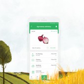
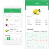
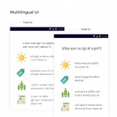
| DESIGN NAME: Farmrise PRIMARY FUNCTION: Mobile Application INSPIRATION: More than 50% of the Indian population is dependent on agriculture and almost 85% of the farms are below 2 hectares. These marginal farmers often struggle to receive agronomic training or access to credit; this negatively affects their productivity and income. The app empowers farmers by providing access to scientific knowledge and reduces middlemen monopoly by connecting marketplace. This initiative also aims to increase the productivity and prepare farmers to feed the growing world population. UNIQUE PROPERTIES / PROJECT DESCRIPTION: Farmrise empowers the Indian farmer community by helping them overcome the historic obstacle of isolation and gives them access to educational, scientific information for the first time. Application successfully binds the fragmented ecosystem providing a one-stop solution and improves farmers decision making. The app runs smoothly on low-speed 2g/3g as it uses google fonts and has intelligent caching. For increased familiarity, the app uses lifelike illustrations without increasing asset weight. OPERATION / FLOW / INTERACTION: The app is extremely simple and employs the existing tech behavior of the target audience. It personifies google feed like structure and makes use of tap functionality as farmers were comfortable with this interaction. Bottom navigation has main app features (learning, crop prices, community, and events). Every action sends an update to keep the users informed. Farmrise has preloaded google fonts for enabling language localization and information is cached so it loads even during zero connectivity. PROJECT DURATION AND LOCATION: The project started in June 2017 in India and finished in March 2018 in India FITS BEST INTO CATEGORY: Interface, Interaction and User Experience Design |
PRODUCTION / REALIZATION TECHNOLOGY: Farmrise posed extreme challenges as the app posed many tech limitations while users demanded high visual elements. The research team used questionnaires, focused group discussions, and observation techniques while wireframes were created on sketch. Lifelike illustrations were made to compensate visual demand while maintaining asset size. Illustrator, photoshop, and invision were used for visual design and prototyping. SPECIFICATIONS / TECHNICAL PROPERTIES: We designed UX, UI for the android app TAGS: Design, UX, UI, Agriculture, App design, Digital Design RESEARCH ABSTRACT: We conducted Ethnographic research, with 150+ farmers across India over a period of 3 months. Insights were gained on farmers day to day activities, processes, crop cycles, and the cognitive factors that conditioned their decision making. Insights clarified the tech savviness, psyche and real pain points of farmers. The most essential revelation was that our app had to be ecosystem-centric as the influencers played a crucial role in the decision making of our target audience. CHALLENGE: The main challenge was to acquire an understanding of the farming process and discretely identify the critical decision points a farmer needs to make for attaining profitable and sustainable yield. Second, project scope was not defined and as we progressed with our research, we identified the real challenges that design and technology together could solve. Finally, we were designing for an unconventional audience, hence, understanding their thought process and behavior posed a big challenge ADDED DATE: 2018-09-27 11:49:42 TEAM MEMBERS (5) : Design Director: Anil Reddy, Researcher: Shrut Kirti, Lead Designer: Jennifer Sharmila, Illustrator: Preethika Asokan and Project Manager: Deepa Mani Subbarayan IMAGE CREDITS: Video Credits: Tamil Selvan |
||||
| Visit the following page to learn more: https://www.lollypop.design | |||||
| AWARD DETAILS | |
 |
Farmrise Mobile Application by Lollypop Design Studio is Winner in Mobile Technologies, Applications and Software Design Category, 2018 - 2019.· Read the interview with designer Lollypop Design Studio for design Farmrise here.· Press Members: Login or Register to request an exclusive interview with Lollypop Design Studio. · Click here to register inorder to view the profile and other works by Lollypop Design Studio. |
| SOCIAL |
| + Add to Likes / Favorites | Send to My Email | Comment | Testimonials | View Press-Release | Press Kit |
Did you like Lollypop Design Studio's Mobile Design?
You will most likely enjoy other award winning mobile design as well.
Click here to view more Award Winning Mobile Design.


