Quinta Maria Izabel 1001 Wine Packaging by Omdesign |
Home > Winners > #71281 |
 |
|
||||
| DESIGN DETAILS | |||||
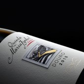
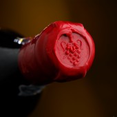
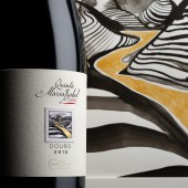
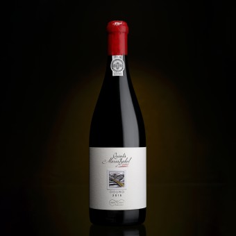
| DESIGN NAME: Quinta Maria Izabel 1001 Wine PRIMARY FUNCTION: Packaging INSPIRATION: This special edition of Quinta Maria Izabel transposed to a labeling an accurate reproduction of a painting representing the landscape of this emblematic estate in the Douro Valley. Offered by a close friend, this project was a reward of this pleasant gesture. Sharing a bottle of wine is also a synonym for friendship. This wine has this particular name because there were made precisely 1001 bottles of Quinta Maria Izabel Grande Reserva wine. Nothing more, nothing less. UNIQUE PROPERTIES / PROJECT DESCRIPTION: The painting showing the shapes of the Douro Valley using contrast, textures and reliefs, enhances the important meaning of the Douro river through the colour associated with passion, wisdom, magic and grandeur. The special painting that Quinta Maria Izabel keeps in their estate was perfectly transposed to the labeling, with all of its special details, as well as the magnificent and premium aspect that it conveys. OPERATION / FLOW / INTERACTION: This packaging evokes the magnificence of Douro and, particularly, the outstanding scenery filled with the vineyards and the river that can be seen at Quinta Maria Izabel, here shown in a perfectly reproduction of the painting. PROJECT DURATION AND LOCATION: The project started in November 2017 in Oporto (Portugal) and finished in March 2018. FITS BEST INTO CATEGORY: Packaging Design |
PRODUCTION / REALIZATION TECHNOLOGY: In order to reproduce the painting in the middle of the labelling, with all of its texture, squareness, brightness and deepness, there were used a background fine paper with 3 different layers, to accurately mirror the painting and its components, namely the shapes and frame. SPECIFICATIONS / TECHNICAL PROPERTIES: Wine bottle of 75 cl Height 30 cm x Diameter 8,5 cm TAGS: Omdesign, Design, Packaging, Wine, Quinta Maria Izabel, Port wine, Port producer, Douro, Wine design, Portugal RESEARCH ABSTRACT: Quinta Maria Izabel has in their estate a painting reflecting their landscapes, that was offered by a close friend. In order to celebrate the Douro distinction and greatness, as well as to immortalize this gift, Omdesign, the creative agency responsible for this project, chose to perfectly create and transpose the painting to the labelling of a very special wine. CHALLENGE: The main goal was to frame the painting in the middle of the labeling, with all of its texture, squareness, brightness and deepness, without losing the sublime touch of the original piece of art. ADDED DATE: 2018-09-27 11:28:01 TEAM MEMBERS (1) : IMAGE CREDITS: Omdesign |
||||
| Visit the following page to learn more: http://www.omdesign.pt | |||||
| AWARD DETAILS | |
 |
Quinta Maria Izabel 1001 Wine Packaging by Omdesign is Winner in Packaging Design Category, 2018 - 2019.· Read the interview with designer Omdesign for design Quinta Maria Izabel 1001 Wine here.· Press Members: Login or Register to request an exclusive interview with Omdesign. · Click here to register inorder to view the profile and other works by Omdesign. |
| SOCIAL |
| + Add to Likes / Favorites | Send to My Email | Comment | Testimonials | View Press-Release | Press Kit |
Did you like Omdesign's Packaging Design?
You will most likely enjoy other award winning packaging design as well.
Click here to view more Award Winning Packaging Design.


