DESIGN NAME:
Transbatur
PRIMARY FUNCTION:
Office
INSPIRATION:
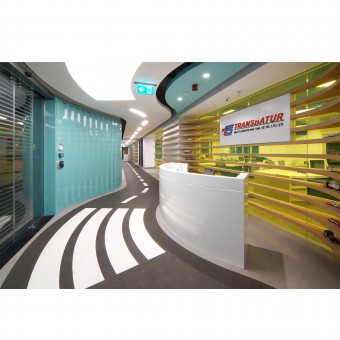
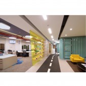
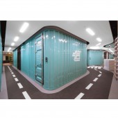
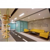
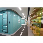
The main concept of the project was to create the integrity of corporate identity and interior design. In order to achieve this result, Serhan Bayık inspired mostly the transportation items themselves such as container and road. We used the trapezoid metal sheets as wall partition covering which is the same as container. The doors on this wall were also designed completely the same as container’s door in order to increase the visual reality. Additionally the floor covering was designed as having a road effect which connects the integration between container, logistic and relatedly company’s corporate identity. In order to increase the visual depness, two mirrors were used at the ends of the entrance hall’s corridors which makes the space as twice. Moreover the yellow glazing partition is also another important point of this project. This seperation was choosen as transparent in order to increase the visual depness which is also using as shelving support as truck models display.
UNIQUE PROPERTIES / PROJECT DESCRIPTION:
Transbatur office project is located in Istanbul-Turkey within an area of 500 sqm. The office was designed for an international logistic company who makes only road transportation service. The main concept of this project is to create an interior ambiance that it’s completely belong to this logistic company. Accordingly the integration of interior design and company’s corporate identity was determined to designer's main concern. So starting from the company’s fields of bussiness, Serhan Bayık adapted road’s and container’s identical forms & materials into the entrance hall especially. Then the first impression and idea about company which is directly refers to the company’s field of bussiness has been gained to all visitors and users. Consequently the usage of container materials as wall partition and also having a road ambiance within a harmony to the space, create a unique belonging sense. So the successful integrity and the belonging sense which Serhan Bayık pay attention so much are the unique features of his design.
OPERATION / FLOW / INTERACTION:
We can mention about the interaction in between the interior spaces for office personnels and visitors. The container walls and road pattern floor surround the users with the logistic related ideas in order to be felt the corporate identity. This interaction has been setting up not only visually but also physically with having the real container doors for two rooms. When they are being used, they give the same feelings as using the real container door. The visual interaction was enhanced by using wall to wall mirrors at the ends of the corridors. So the user interaction has been doubled.
PROJECT DURATION AND LOCATION:
The project has finished in 2017 in Istanbul.
FITS BEST INTO CATEGORY:
Interior Space and Exhibition Design
|
PRODUCTION / REALIZATION TECHNOLOGY:
Serhan Bayık has used materials mostly related with the transportation items. Trapezoid metal sheets used as wall partition covering in the project. The doors in the project has designed completely the same as container's. For the curvy shelves in the entrance hall has prefered as transparent yellow glass.
SPECIFICATIONS / TECHNICAL PROPERTIES:
An area of 500 sqm
TAGS:
Office Interior, Corporate Identity, Integration Between The Corporate Identity and Design, Interior Design, Office Design, Architecture
RESEARCH ABSTRACT:
Serhan Bayık's main concern about the conceptual design was to set up 100% integrity in between the interiors and company’s corporate identity. So he started to make research about logistic related ideas which is company’s field of business. He’d searched lots of different items such as trucks, roads, lifting machines, sunset, sunrise, mountains, containers, the interior ambiance of the trucks so on… Then he choosed the most related items that are relevant to the company’s field. These are truck, container and road itself. Then he made lots of searching to find the proper materials for reaching to the real road effect. Additionally he also researched different companies who are producer of the real containers in order to having a wall covering and also real container doors. But unfortunately none of their products are suitable for cury wall system. So he decided to produced them as custom made. The whole trapezoid surfaces even the container doors was produced in this method.
CHALLENGE:
He came across some difficulties during the design phase and also in the construction phase. He recognized on the design phase that, the lenght of the container panels will be changed because of having some curvilinear forms on the walls. This changes will also effect to the whole system including the doors. So he prepared lots of 3d models to determine the lenght difference and to find the proper joint connections with doors and also end panels of the walls. Additionally there is a transparent partition glass between the corridor and open office. This glass partition is also supports the shelves on it. Which means Serhan Bayık had to be very precise on the construction process in order to have nice relation on the joint connections between glasses, wooden shelves and also columns and walls. Moreover the road pattern on the floor and relatedly the ceiling’s border are following with each other. So the coordination of lighting, ventilation, fire security, sound system etc. needed to be very well coordinated to be fit inside of that border.
ADDED DATE:
2018-09-25 07:21:42
TEAM MEMBERS (1) :
Serhan Bayik
IMAGE CREDITS:
Serhan Bayık
|


