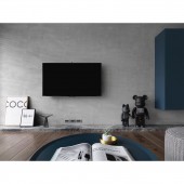
Mutualism Residential Apartment by Cheng Hsuan Huang |
Home > Winners > #71074 |
 |
|
||||
| DESIGN DETAILS | |||||
| DESIGN NAME: Mutualism PRIMARY FUNCTION: Residential Apartment INSPIRATION: The clients prefer calm and generous of space atmosphere and emphasize the relationship between each space so that creates a simple and individual spatial style. The designer flexibly uses the changes in color and materials to hide storage space in every corner of the space. To expand the public zone, we remove the wall between kitchen and study therefore beneficial to the clients to go to each space. UNIQUE PROPERTIES / PROJECT DESCRIPTION: This building has the good natural light condition. Therefore, the designer just removes the wall between kitchen and study room to let it penetrate into each corner of the space. Furthermore, the lamplight is moderately distributed in the space to balance the beauty of natural and artificial. OPERATION / FLOW / INTERACTION: To expand the public zone, the designer removes the wall between kitchen and study. At the same time, enough natural light introduces the kitchen by the big window. The division of the ground material separate the different spatial functions in the public zone. One is the light color tile which used for entrance extends to the private zone, another one is the dark color solid wood floor from living room to study. Finally, the designer uses the glass partition to make an undisturbed study room. The whole color system is achromatic collocate with a few light wood veneers. It gives the simple and clean space. PROJECT DURATION AND LOCATION: The project started in January 2018 and finished in July 2018 in Taichung City, Taiwan. FITS BEST INTO CATEGORY: Interior Space and Exhibition Design |
PRODUCTION / REALIZATION TECHNOLOGY: The whole color system is achromatic collocate with a few light wood veneers. The large white area of the wall is matched with the warm wood texture of the cabinet. It gives the space a simple and neat sense of vision. Lotos (one material which is made by reusing sludge from Taiwan) TV wall and public area's gray Italian tiles not only highlight the area but also maintain a balance between the colors of the space. Finally, use the deep darkness iron to outline the contours of all objects in the space. Designer selects the simple and individual furniture to give the owners the most perfect space to live. SPECIFICATIONS / TECHNICAL PROPERTIES: Size of the apartment: 100 m2, Area Property: 1 Foyer, 1 Living room, 1 Reading room, 1 Master bedroom, 1 Bedroom for guest, 1Locker room, 3 Bathrooms, 1 Dining room, 1 Kitchen TAGS: Residence, Apartment, Home, Gray, Mutualism, Art, Family RESEARCH ABSTRACT: We uses recycled eco-friendly materials and comply with national standard's healthy green building materials. According to research, residents are average at least staying home 16 hours, so that we choose the wood veneer painted which is characterized by low toxicity and low risk of health risks. The Lotos plaster's predecessor is reservoir sludge. Many water reservoirs have the serious problem of silting up in Taiwan. This is a special new technology to place the traditional mode. New build material has greater air permeability and also waterproof. It can prevent the efflorescence and wall mold. CHALLENGE: This building has the good natural light condition. Therefore, the designer just removes the wall between kitchen and study room to let it penetrate into each corner of the space. Furthermore, the lamplight is moderately distributed in the space to balance the beauty of natural and artificial. Finally, the color in the space uses black, gray and white to create a simple and generous interior ambiance. ADDED DATE: 2018-09-25 04:27:38 TEAM MEMBERS (1) : IMAGE CREDITS: Moooten Studio |
||||
| Visit the following page to learn more: http://bit.ly/2D8atUB | |||||
| AWARD DETAILS | |
 |
Mutualism Residential Apartment by Cheng Hsuan Huang is Winner in Interior Space and Exhibition Design Category, 2018 - 2019.· Read the interview with designer Cheng Hsuan Huang for design Mutualism here.· Press Members: Login or Register to request an exclusive interview with Cheng Hsuan Huang. · Click here to register inorder to view the profile and other works by Cheng Hsuan Huang. |
| SOCIAL |
| + Add to Likes / Favorites | Send to My Email | Comment | Testimonials | View Press-Release | Press Kit |
Did you like Cheng Hsuan Huang's Interior Design?
You will most likely enjoy other award winning interior design as well.
Click here to view more Award Winning Interior Design.


