Ganesh Snacks Retail Shop by Amruta Thakkar |
Home > Winners > #70773 |
 |
|
||||
| DESIGN DETAILS | |||||
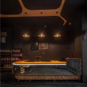
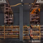
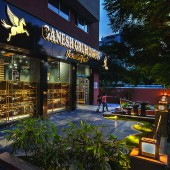
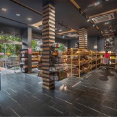
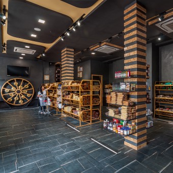
| DESIGN NAME: Ganesh PRIMARY FUNCTION: Snacks Retail Shop INSPIRATION: Client’s only brief was, the product should be highlighted. The immediate thought was - How a performer is highlighted with dark background and focused light. Hence, A stage and a light to highlight the performer, inspired to transform the brief to the reality. Throughout the space, the design team discreetly and respectfully restrained the materials, forming a palette of Dark Grey and Bronze-Golden shades, subtly different. Appropriate use of different lighting typologies helps to achieve the desired result. UNIQUE PROPERTIES / PROJECT DESCRIPTION: Ganesh Showcases stratified homogeneity. Ganesh sits proudly on a busy urban street of Ahmedabad. The retail character of space is highly valued by openness, brightness and outward views. The interior space was maximised with the design; finishes in clean and contemporary materials and details providing ample storage. The circulation in this project is kept simple to help people move between core spaces. The layout of retail store has employed minimalist design language which generates a strong sense of order, conveying a feeling of permanence and purity. Throughout the space, the design team discreetly and respectfully restrained the materials, forming a palette of Dark Grey and Bronze-Golden shades, subtly different. All the products are displayed in focus on expressing essence of the brand while meeting the pragmatic needs. The limited colour scheme offers a distinct atmosphere helping to focus attention to the display. Each shelf & display is illuminated with different lighting strategies to ensure a best display effect. OPERATION / FLOW / INTERACTION: We just had a single side of facade, which is the only source of natural light. We wanted to take in the maximum natural light but did not wanted the harsh sun to affect our product. The product is very fresh and sensitive to harsh sun light. So, as a design solution we used full highted clear glass so the sun light is taken in & visual connectivity between interior & exterior is well established. This glass storefront also reflects the public nature of the space. The retail character of space is highly valued by openness, brightness and outward views. The landscape is designed very carefully so that it reduces the harshness of sun & also do not disturb the visual connection of inside & outside. PROJECT DURATION AND LOCATION: The project started in september,2017 & finished in march,2018. The entire process took place in Ahmedabad. The site is situated on a busy urban street of Ahmedabad, Gujarat,India. the plot is a south facing plot with low rise buildings on all three sides, and one longer side faces the road. FITS BEST INTO CATEGORY: Interior Space and Exhibition Design |
PRODUCTION / REALIZATION TECHNOLOGY: Most of the product range stacked along the walls. The flow is all linear, very simple and tried, not to keep confusing for the customers. This has resulted into a very clean floor plate and user friendly space.We custom designed it’s storage racks understanding the product scale & human anthropometrics. So that it’s easy for the customers to select & pick the desired product. Bronze mirrors are installed on walls as well as on ceilings which helps to enhance the ambience. SPECIFICATIONS / TECHNICAL PROPERTIES: The shop is a pure rectangular envelope measuring 14mx8m and 3.8m height. The flooring- Porcelain tiles Lighting - Track down lighters,floor mounted profile leds, decorative fixtures with neon light, led strips Walls- Textured walls with dark grey paint, glass panel cladding storage racks -m.s. powder coated frames with bronze glass ceiling-gypsum TAGS: Snacks, Bronze Mirror, Dark, Product Oriented, Greenery, Urban RESEARCH ABSTRACT: The products ranges from Khakhara, Wafers, Sev and many more flavours of traditional snacks. Hence the attempt is to develop a thoughtful display storage rack, which is a direct dialogue with the product and the interior elements. The dimensions of the storage racks are derived from the circumference of the Khakhara and it also addresses to the anthropometric concerns. Tasting wheel is a special bespoke design feature, which offers experiencing a celebration of flavour and creativity. It has functional values and along with that it engages customer and evolves into an interactive environment. The display screens are provided to feature the manufacturing process, ensuring the usage of fresh natural ingredients, attention given to details in cooking and packaging; which in turn reinforces the connection with the customers. The attempt is made to work on details like fixing of bronze glass panels with wall and ceiling, allowing the backlight text to shine and attract customers. The material combination details of billing counter is also interesting as wood and glass is chamfered to give a groove effect at the junctions. The two columns in the space is cladded with the wood. These help to direct the eye line to the ceiling. It acts as a connection between floor and ceiling, maintaining the homogeneity. Lighting is an important and emphasised part of the design. Carefully and thoughtfully designed variety of light fixtures on floors, walls and ceilings enhances the experience of the space.Idea is to tell a story, which is carried through this physical space. All used elements helps to slow down the journey of the customer and connects him/her with the space. The floor lights mark outs the customers pathway around the store. CHALLENGE: The challenge is to break the stereotypes of typical indian snack stores. We wanted to give a fresh, modern look to a very traditional product selling shop but taking lessons from the traditional arrangements and off course anthropometrics. We wanted the customers to connect with the space and the used elements should slow down the journey of the customers. Another challenge was to use the natural light but not allow the harsh sun to come in as the product is fresh and sensitive to harsh sunlight. ADDED DATE: 2018-09-17 10:34:14 TEAM MEMBERS (8) : "Designer: Amruta Thakkar", "Architect: Kartik Acharya", "Assistant Designer: Dhruvi Panchal" , "Carpentry: Vishnu Gajjar", "Contractor: Rajni Patel", "Lights: J.K.Lights", "Photography: Shilpa Gavane" and IMAGE CREDITS: Image#1: Photographer Shilpa Gavane, 2018 Image#2: Photographer Shilpa Gavane, 2018 Image#3: Photographer Shilpa Gavane, 2018 Image#4: Photographer Shilpa Gavane, 2018 Image#5: Photographer Shilpa Gavane, 2018 PATENTS/COPYRIGHTS: The design is copyright of Architect- Designer Amruta Thakkar. When these layouts are published on websites or magazines,we request to inform us. For credits, please write:"Amruta Thakkar-Spacecraft Studio". The use, distribution and transfer of ownership of designs without permission is strictly prohibited by copyright law. |
||||
| Visit the following page to learn more: http://www.spacecraftstudio.in | |||||
| AWARD DETAILS | |
 |
Ganesh Snacks Retail Shop by Amruta Thakkar is Winner in Interior Space and Exhibition Design Category, 2018 - 2019.· Read the interview with designer Amruta Thakkar for design Ganesh here.· Press Members: Login or Register to request an exclusive interview with Amruta Thakkar. · Click here to register inorder to view the profile and other works by Amruta Thakkar. |
| SOCIAL |
| + Add to Likes / Favorites | Send to My Email | Comment | Testimonials | View Press-Release | Press Kit |
Did you like Amruta Thakkar's Interior Design?
You will most likely enjoy other award winning interior design as well.
Click here to view more Award Winning Interior Design.


