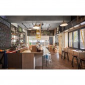
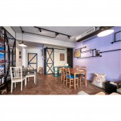
Choosy Restaurant by Ciao-Ling Yang |
Home > Winners > #70277 |
| CLIENT/STUDIO/BRAND DETAILS | |
 |
NAME: Gowin Space Design Studio PROFILE: The fun of design lies in challenging the infinite possibilities of each space. We love the old house design like hardcover and revision, and we also love the lively and free-spirited house, and we are more willing to challenge the colorful and varied commercial space, but no matter what kind of property, The ultimate goal is to bring every space and bring out the personality that belongs to them. The owner himself creates his own life track, and the space itself tells its spiritual idea. This kind of appearance is sincere. False, even after a long time, it will not be replaced or eliminated. |
| AWARD DETAILS | |
 |
Choosy Restaurant by Ciao-Ling Yang is Winner in Interior Space and Exhibition Design Category, 2018 - 2019.· Read the interview with designer Ciao-Ling Yang for design Choosy here.· Press Members: Login or Register to request an exclusive interview with Ciao-Ling Yang. · Click here to register inorder to view the profile and other works by Ciao-Ling Yang. |
| SOCIAL |
| + Add to Likes / Favorites | Send to My Email | Comment | Testimonials | View Press-Release | Press Kit |
Did you like Ciao-Ling Yang's Interior Design?
You will most likely enjoy other award winning interior design as well.
Click here to view more Award Winning Interior Design.


