DESIGN NAME:
House With Stillness
PRIMARY FUNCTION:
Interior Design
INSPIRATION:
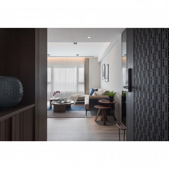
The most important feature of this project is that the demonstration of interior visual balance can be seen between of the bright light and the arrangement of dark materials.
UNIQUE PROPERTIES / PROJECT DESCRIPTION:
The main door and the design style of the entry area all made of dark materials can compare with the bright feeling of the living room; that is the spatial metaphor which can demonstrate the graceful interior scenes with clean and brisk senses. The main style of the floor is made of white lumber which is a moderate way to compare with other furniture.
OPERATION / FLOW / INTERACTION:
Design concerns the connections between the humanity inclinations and natures that gratify the clients’ preferences on the basis of the multiple values of design.
PROJECT DURATION AND LOCATION:
The project finished in Mar. 2018 in Taipei City, Taiwan.
FITS BEST INTO CATEGORY:
Interior Space and Exhibition Design
|
PRODUCTION / REALIZATION TECHNOLOGY:
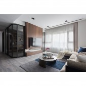
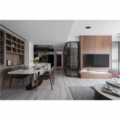
There are no exact separations in the public area; all the sub-areas are defined by the arrangement of furniture and smooth traffic flow. The family can enjoy their leisure and dining time in between of the living and dining rooms, since these two rooms are connected smoothly. The wooden material applied to the main TV wall and the cabinets can balance the interior visual sight. The kitchen island connects the cooking area and dining area with the background of white cabinets, which can enhance the bright atmosphere with clean spatial visual effect and simple traffic flow.
SPECIFICATIONS / TECHNICAL PROPERTIES:
The project is 165.5 square meters
TAGS:
Interior Design, Residential, Visual balance, Family, Minimalism
RESEARCH ABSTRACT:
The urbanization of society has intensified the population density, which forces the architectural and interior design to fight for the size of lands. The phenomenon of pseudo industrialization has an influence on the essence of buildings, the impact extending the spaces upward. Based on the aesthetic perspectives and design skills, the design work extraordinarily harmonizes the relationships between the human sensations and natures, the ultimate perfection of design energy displaying the backbones and qualities of the spaces.
CHALLENGE:
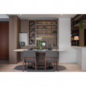
The entry area and the dining area are merely divided by wooden cabinets, which is the moderate way to create clean and easy spatial separation. The cabinets in the entry and dining areas are decorated by the same wooden material, and composed by L shapes to show the comprehensive design intention. In the dining area, the left side of the cabinet composed with interesting slabs arrangement is the best places to demonstrate the owner’s collections of classic wines. The right side of the cabinet which has the regular slabs arrangement and embedded lights can set delicate glass and porcelain artifacts in order to display the elaborate spirt. The dining table made of white marble compared with the same texture of white and shiny kitchen island can generate the peaceful atmosphere; these two white objects can generate the visually contrasting effect by the comparison of the wooden cabinets.
ADDED DATE:
2018-08-14 09:52:42
TEAM MEMBERS (1) :
Rachelle Chen
IMAGE CREDITS:
HHLY
|
