Pitti Bimbo Exhibition Booth by Irirna Rif |
Home > Winners > #70171 |
 |
|
||||
| DESIGN DETAILS | |||||
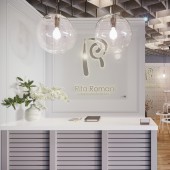
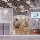
| DESIGN NAME: Pitti Bimbo PRIMARY FUNCTION: Exhibition Booth INSPIRATION: Happy kids, place where a child feels needed and loved. A creative freedom of a child imagination. Lifestyle: games, studies, preferences in leisure, hobbies, food. Parents love and care for their children. The desire of adults to create an atmosphere of comfort, coziness and security. UNIQUE PROPERTIES / PROJECT DESCRIPTION: The creation of a positive mood of comfort, coziness, naturalness, harmony, destiny creativity, self-expression were a distinctive features . It is on this basis the design of this space contains fresh flowers decor hand-made children's toys and sketches. Architectural lighting allowed to highlight the presented collections, while the muffled light created a sense of home, everyday comfort and harmony. The place for negotiations is separated from the main exposition. OPERATION / FLOW / INTERACTION: At the entrance there is a reception area for greeting visitors and TV playing videos dedicated to the company culture and brand collections. The shelves are placed along the walls in the center of the room. This gives convenience and comfort of free movement throughout the booth. A merchandising plan for collections has been developed for a qualitative and complete acquaintance with the presented collections and the brand. Merchandising plan is to present clothing by age groups. Laconism and thoughtful arrangement of collections does not overload the space. For more convenience signs with age had been used along the perimeter of the booth. The negotiation area is equipped at the far end of the room, it has two independent entrances. It's separated from the main hall by the device in the center of the technical room. There are two tables for 4 people each. PROJECT DURATION AND LOCATION: The project started in April 2018 in Novosibirsk and finished in June 13th 2018 in Florence, and was exhibited in Pitti Immagine Bimbo in April 21th 2018. FITS BEST INTO CATEGORY: Interior Space and Exhibition Design |
PRODUCTION / REALIZATION TECHNOLOGY: Development of the booth was time constrained, 3 days for a full installation of the booth and its design. Therefore panels from the eurolight panel that easy to mount and dismantle were chosen for the construction of partitions. In the places where the equipment was fastened, strengthening reinforcement elements were provided. The final coating of the wall was non-woven wallpaper with digital photo printing. Imitation of decorative molding on the wallpaper was created specially for the company of our customer, the corporate style, pattern and color of the brand were used. The flooring was made of laminate of natural wood color to create an atmosphere of coziness. Laminate is also easy and quickly to install and dismantle, which was an important element in the design of the project. The entrance decor is made of hand-made children's toys fixed on the wall. Lighting, was mounted on rails and fixed to the main ceiling of the exhibition pavilion. SPECIFICATIONS / TECHNICAL PROPERTIES: FaroBarcelona LAO LED White and copper track projector:Width 50mm x Length 140mm x Height 180mm. LaForma Smogen poef: Width 500mm x Height 300mm x Depth 500mm. LaForma Shore poef: Width 450mm x Height 350mm x Depth 450mm. Omelette Table Bison: Height 450mm x Diameter 450mm. Omelette Table Bison: Height 310mm x Diameter 710mm. INCLASS round table Flat: Height 730mm x Diameter 800mm. LaForma round table Daw: Width 100mm x Height 730mm x Depth 100mm. LaForma chair ROOXIE : Width 480mm x Height 880mm x Depth 560mm. ClassiCon lamp Selene : Height 560mm x Diameter 270mm. TAGS: rita romani, rif interiors, rif design, pitti bimbo, rif interiors pitti, retail design, interior design, RESEARCH ABSTRACT: The values, mission of the customer, positioning on the market are basic things for the development of the design of the exhibition booth. A number of studies have also been carried out to formulate a conceptual solution. The analysis of the target audience was conducted such as the number, age, gender, status, country of residence. The analysis of the presented collections - style, prints, subjects, textures. As a result, the developed design allowed the customer to adequately present the goods enter the markets of Europe get new sales channels get feedback from customers and competitors from around the world. CHALLENGE: Strict rules of the exhibition operator. They limit a lot of opportunities for the use of materials, technical solutions, equipment. Also they obliged to have a full package of certificates and permits for any material used. Time constraint of booth installation and the need for subsequent dismantling gives a number of limitations on construction technology and the economic feasibility of using materials. An essential difficulty is the language barrier (the complexity of translation and negotiation it is necessary to coordinate the project with the Italian speaking exhibition operator ). ADDED DATE: 2018-08-03 17:38:57 TEAM MEMBERS (7) : Head of Design/Decorator: Irirna Rif , Designer Assistant/3DArtist: Alyona Boykiv, Floor Plan Designer: Natalia Osipova, Merchandiser/Marketer: Elena Gritzuk, Graphic Designer/Illustrator: Julia Olenich, Videographer: Elena Vasilenko and Contractor: Emilio Ragazzi IMAGE CREDITS: Irirna Rif, 2018. PATENTS/COPYRIGHTS: Copyrights belong to Irirna Rif, 2018 |
||||
| Visit the following page to learn more: http://www.rif-interiors.com/ | |||||
| AWARD DETAILS | |
 |
Pitti Bimbo Exhibition Booth by Irirna Rif is Winner in Interior Space and Exhibition Design Category, 2018 - 2019.· Read the interview with designer Irirna Rif for design Pitti Bimbo here.· Press Members: Login or Register to request an exclusive interview with Irirna Rif. · Click here to register inorder to view the profile and other works by Irirna Rif. |
| SOCIAL |
| + Add to Likes / Favorites | Send to My Email | Comment | Testimonials | View Press-Release | Press Kit |
Did you like Irirna Rif's Interior Design?
You will most likely enjoy other award winning interior design as well.
Click here to view more Award Winning Interior Design.


