DuVine Website Redesign by Tank Design |
Home > Winners > #70126 |
 |
|
||||
| DESIGN DETAILS | |||||
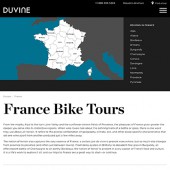
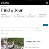
| DESIGN NAME: DuVine PRIMARY FUNCTION: Website Redesign INSPIRATION: DuVine’s target customer is an avid traveler who seeks to experience a country beyond typical tourist attractions. We focused on creating various navigational elements to encourage this: For the site’s primary navigation, within Destinations, we wanted to highlight the popularity of regions like France & Italy while still showcasing the breadth of tour offerings. It needed to be usable for all site visitors, regardless of destination, while also being sure that branded tours still resonated. UNIQUE PROPERTIES / PROJECT DESCRIPTION: Great design delights in its intuitive navigation and distinct communication. DuVine’s website conveys a sophisticated brand that inspires wanderlust with the possibilities offered for international cycling and adventure tours. The site accommodates an incredible amount of information in a design system that feels manageable for a user. OPERATION / FLOW / INTERACTION: From our research, we understood that visitors were looking for answers to these questions: Do you go where I want to go? Do you go when I want to go? With this knowledge, we added a prominent search utility tool and focused on expanding how hard the search tool could work for our visitors to get them to the tours they were looking for. The streamlined approach to displaying information and incorporating multiple paths to purchase has driven a huge growth in website conversions. In the five months post-launch, the new site has driven four times as many bookings compared to the old site, a 65% increase in visits from mobile devices, and a 20% increase in traffic from organic search. Sales are up 40% year over year, that lift is fully attributed to the work done on the DuVine site by Tank. PROJECT DURATION AND LOCATION: The project kicked off in December of 2016 and it launched in X? |
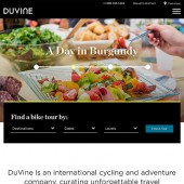
PRODUCTION / REALIZATION TECHNOLOGY: In addition to landscape research, we interviewed customers, staff, and tour guides to understand their needs and expectations, both from a tour and from an online booking perspective. We used this data specifically and to shape overarching themes that served as design guidelines. We then leveraged this information in order to understand and prioritize objectives on a task level and an experience level to optimize the site for our visitors. We conducted a competitive analysis, including out-of-category but analogous digital experiences, to identify a baseline and opportunities for differentiation in positioning, branding, and site design. The site is built in WordPress. SPECIFICATIONS / TECHNICAL PROPERTIES: The design was implemented with a custom built, responsive theme and uses the Advanced Custom Fields module to enable a more intuitive experience for the site’s content editors. TAGS: Travel, Luxury, Usability, Navigation, Website, User experience, Conversion, DuVine, Redesign, Web design RESEARCH ABSTRACT: We started with stakeholder interviews followed by customer interviews. We then conducted third party research to create a foundation in trends around travel, wellness, and authenticity. We conducted a heuristic analysis of existing tool to establish a baseline for our redesign. We then architected the new experience, created functional wireframes to define functionality, and then explored visual design in order to create a design system for the experience. We iterated on the experience design, built out the site, pressure tested, QA’ed, launched, and have since continued with ongoing site optimization based on stakeholder and user feedback. CHALLENGE: Capturing the intangible quality of local experiences online that resonate with DuVine’s target customer, an avid traveler, who loves to cycle, eat, drink, indulge in luxury hotels and restaurants was a primary challenge for the redesign. Solved for with immersive imagery layouts, personalization through the “Find a Tour” tool, and small nods to the experience like “Eat” & “Drink” in every tour overview. We knew that driving users to the trip detail pages as efficiently as possible was critical. We focused on creating various navigational elements to encourage this path: For the sites primary navigation, within destinations, we wanted to highlight the popularity of regions like France and Italy while still showcasing the breadth of tour offerings. It needed to be usable for all site visitors, regardless of their destination focus. We also wanted to be sure that branded tour categories would still resonate by providing descriptive text within the primary navigation. ADDED DATE: 2018-07-30 19:36:23 TEAM MEMBERS (7) : Brandon Washington, Account Lead, Amanda Saulino, Design Lead, John Hemminger, Design Director, Laurel Marcus, Data Insights and Analytics Lead, Nick Braica, Development Lead, Libby Safford, User Experience Lead and Megan Riley, Designer IMAGE CREDITS: Tank Design, 2018. |
||||
| Visit the following page to learn more: https://www.duvine.com | |||||
| AWARD DETAILS | |
 |
Duvine Website Redesign by Tank Design is Winner in Website and Web Design Category, 2018 - 2019.· Press Members: Login or Register to request an exclusive interview with Tank Design. · Click here to register inorder to view the profile and other works by Tank Design. |
| SOCIAL |
| + Add to Likes / Favorites | Send to My Email | Comment | Testimonials | View Press-Release | Press Kit |

