Mapper Website Website by Colin Kent |
Home > Winners > #69645 |
 |
|
||||
| DESIGN DETAILS | |||||
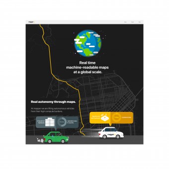
| DESIGN NAME: Mapper Website PRIMARY FUNCTION: Website INSPIRATION: We are a map building company so we decided to use maps and cars to navigate the viewer's way through our story. We wanted to create a fun and engaging experience for the viewer. UNIQUE PROPERTIES / PROJECT DESCRIPTION: The objective of this project is to create an easy and engaging way to explain the need for mapper’s products & services. This is achieved by using an automobile that drives through a map filled with information. The story begins with the needs of autonomous vehicles, how mapper makes products to meet those needs, and how their services will make autonomous vehicles lighter and less expensive. OPERATION / FLOW / INTERACTION: We wanted to create a website that was engaging. One concept to make this happen was to have a scrolling landing page. We placed a map into the webpage and saw that the entire San Francisco Peninsula would fit nicely into a tall scrolling format. The story would begin on the north side of the Golden Gate bridge and move south through San Francisco and beyond. We wanted to use the mapper colors of black, white, grey and saffron to brand the website. Saffron, the strongest color, is to be used the least. This is why we made the background black with a grey map texture. The scrolling would leave a saffron driving trail, which has the viewer create a map of their journey through the landing page. Through the route south we made places for the viewer to stop and read a factoid about mapper’s work. When the viewer reaches the bottom of the page they will have an education of autonomous vehicles and how mapper will help that industry develop. PROJECT DURATION AND LOCATION: The design began in November of 2017 and was published in May 2018 in San Francisco, CA. |
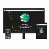
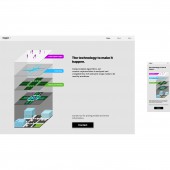
PRODUCTION / REALIZATION TECHNOLOGY: We traced over a map of the San Francisco Bay Area to create the background texture. This texture is a signature part of our corporate identity & branding. SPECIFICATIONS / TECHNICAL PROPERTIES: This website was created to fill ALL size screens, from 1080 x 1920 to the smallest 320 x 480 screens. In other words, we can fill a 72" TV screen or a 3.5" iPhone 3 screen. TAGS: technology, AI, autonomous, illustration, UI, UX, startup, responsive, website RESEARCH ABSTRACT: Mapper uses a large amount of unique technology to create our products and services. We needed to find a way to explain ourselves to the average person. First we spoke with our CEO and Engineers to figure out exactly what makes our products unique. Then we had to dig a little deeper to find out how they are made and how we deliver the information as a service. Next, we made a story from our organized information.. Then we researched which metaphors would best describe our story. Tracing a map was already in our branding so we decided to use that as our background texture, it also served as a grid for our design. Then we placed the metaphors in the order that they needed to appear in the story. Everything began to come together after that. We refined the design to fit the large screen first. Then we made designs for the tablet and phone screens that would move items placement, but not move them out of context. It was much more work than an average website design, but it was worth the effort. CHALLENGE: The objective of this project was to create an easy and engaging way to explain the need for mapper’s products & services. The first challenge was to define each of the different products & services that mapper, a start-up company, was developing. This was done at a time when their technology was rapidly evolving, which changed their business model several times. We had to meet with each team and discuss their current work (i.e. hardware, research & development, software, science, sales, and business development). Every detail had to be noted because an item that an engineer considers small can be considered valuable to another team. After a list of work was compiled we had to make a timeline for a prototypical assignment, which helped us prioritize each item and put everything into an understandable order. Then we edited each task and compiled the “story.” ADDED DATE: 2018-07-03 15:32:25 TEAM MEMBERS (1) : Colin Kent, Kyle McGill, Alicia Tang, Joe Pea IMAGE CREDITS: All images were created by Colin Kent PATENTS/COPYRIGHTS: All artwork and technology copyrights are the property of mapper.ai |
||||
| Visit the following page to learn more: http://mapper.ai | |||||
| AWARD DETAILS | |
 |
Mapper Website Website by Colin Kent is Winner in Website and Web Design Category, 2018 - 2019.· Read the interview with designer Colin Kent for design Mapper Website here.· Press Members: Login or Register to request an exclusive interview with Colin Kent. · Click here to register inorder to view the profile and other works by Colin Kent. |
| SOCIAL |
| + Add to Likes / Favorites | Send to My Email | Comment | Testimonials | View Press-Release | Press Kit |
Did you like Colin Kent's Web Design?
You will most likely enjoy other award winning web design as well.
Click here to view more Award Winning Web Design.


